How you want and need the house to function will determine the room design, and how they will connect to one another.
In this article we cover:
- Room uses and sizes and how to think about space in the home
- Living room: seating arrangements and what to include
- Kitchen: how to think of organising the space, standard dimensions
- Utility room: minimum sizes and what to include
- Bathrooms: what to include and dimensions for different configurations
- Conservatory: a thing of the past?
Unless you have some experience in building design, I would advise that you keep your floor plan sketches as simple as possible. After all, it’s your designer’s job to get your requirements worked into the floor plans.
A simple list of rooms, their sizes, functions and preferred relationships to each other is usually sufficient to provide the freedom that a designer really needs to create spaces which work and to tie together a usable and efficient layout along with the external appearance of the dwelling.
Room uses and sizes
Do not be too worried about naming rooms at the start, it can lead to dangerous assumptions and misconceptions about what is really meant by the name. Instead, start with a brief list of uses for rooms and see where that leads.
You could find that a number of rooms share a common use that could be better provided by a separate room, or conversely, that one room’s principal use could be shared between others, so that the room could be removed from the design.
Homeworkers might not need a whole room as an office. For instance, if an office is used only during the day and another room (living room or bedroom, etc.) only in the evening and night time, perhaps a closable home office cabinet at one end of one of those rooms will be all that is required.
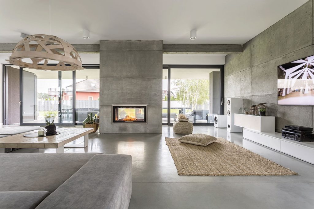
Keeping your self-imposed total floor area in mind, you can start to make up a list of rooms with your preferred sizes for each one, not forgetting to add areas required for storage spaces, corridors and stairs, etc., but more on that later.
Perhaps the easiest way to arrive at preferred room sizes is to look at the dimensions of the rooms where you currently live and decide whether to go larger or smaller in each case.
A bit of research on furniture sizes would be useful too. For example, the seats in a day room can be noticeably smaller overall than a suite of furniture for the lounge, maybe by as much as 30 per cent less.
And a reasonably sized six person dining room table with access space around it will get by with about 7.5sqm of floor space whereas an eight person one will occupy about 33 per cent more of a footprint. Remember what all those little bits of extra floorspace will cost you to build.
Internal room sizes must also coordinate with external wall dimensions. If the external walls are finished with components conforming to standard sizes (e.g. brick or composite wall panels, etc.) then to reduce wastage of materials, due consideration must be given to wall heights, opening sizes and the distances between openings.
For instance, brickwork wall dimensions should usually be in multiples of 225mm horizontally and 75mm vertically. In blockwork walls, I would also try to aim for dimensions that avoid excess cutting of blocks, so the dimensions should ideally be in multiples of 225 or 450mm horizontally and 225mm vertically. These dimensions allow for typical 10mm mortar joints, so when using lightweight or insulating blocks which require a thin-joint building method (for optimal thermal efficiency), the difference needs to be allowed for.
Living room
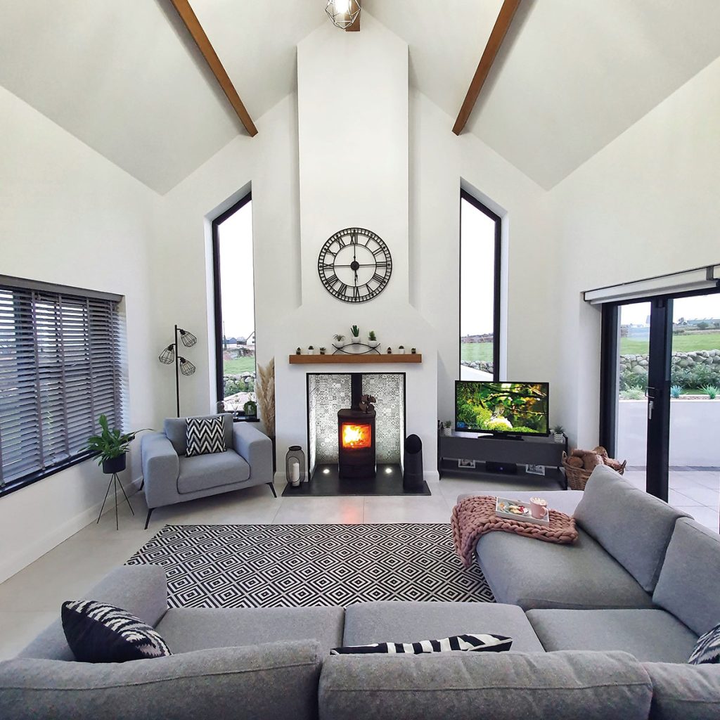
Little things can be very important for comfort and usability. For example, positioning the TV correctly in a living room so that people are still seated facing the wood burning stove, whilst the sunlight is not creating blinding effects through glass or off other reflective surfaces onto the screen.
I think that it is much too gloomy when curtains are closed on sunny days just to allow the occupants to watch TV.
On the subject of TVs, they are also related to room size. The optimum viewing distance is related to the screen size and resolution. Sony for example, recommends a minimum viewing distance of six times the vertical screen size for standard resolutions, three times the vertical screen size for high definition (HD) TVs and 1.5 times the vertical screen size for 4K or 8K TVs.
These are minimum recommended distances, relating to the distance at which the human eye can differentiate individual pixels. Whichever room the TV goes into, the maximum viewing distance may be more relevant and would depend on how many people would be likely to be watching at the same time so that the seating layout would work.
Kitchen
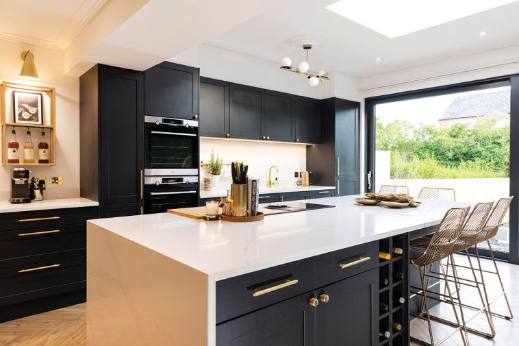
The kitchen is the focal point within the house and the heart of the home because of its social functions, so always receives keen attention during the design process. We spoke of the problems of naming rooms earlier and this is true especially of kitchens.
Your understanding might be that a kitchen is a place for storing utensils and cooking food with some living space attached. Someone else might take it to be primarily a living room with a food preparation section attached.
I believe that whatever the layout, the kitchen should be connected to the garden when possible, both for picking fresh herbs, fruit and vegetables just when you need them, and for linking to an outdoor eating area.
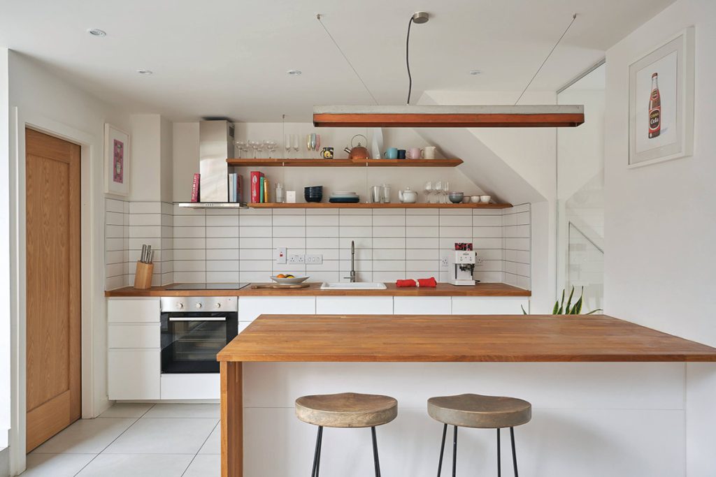
Kitchen floor size is always important; too big and it becomes tiring with excessive moving around, too small and people get in the way of each other. For more on this, see the triangle rule page 115.
The length of wall that is to be fitted with kitchen units will usually be designed in multiples of 600mm because that is the length of most units, except for appliances such as large refrigerators and storage cupboards or larders.
To calculate the depth of a simple kitchen, allow 600mm for worktop depth out from the wall, then a suitable width of floor, perhaps 1800mm, then another worktop width on the opposite wall to give a total of 3m.
That might seem small for a modern kitchen but it is sufficient when space is limited. You might well ask why many modern kitchens are so much larger. It’s partly to do with the trend of the kitchen island, which will be somewhere around 0.9m wide x 2.1m long and will require a clear working minimum space of 900mm on each side of it, so that the kitchen width becomes 600 + 900 + 900 + 900 + 600 = 3.9m.
For more comfortable proportions and to reduce potential trip hazards such as an open dishwasher door, the widths might be 1200mm each side of a 1200mm island, which, added to the two worktops each side, gives a total kitchen width of 4.8m.
As soon as, or even before, the required floor and wall space is known, it can be useful to go along to a specialist kitchen manufacturer who can give you good ideas for a fitted kitchen. If that is what you want.
If you intend to include nonstandard sized appliances and storage units, i.e. larger or smaller than 600 x 600mm, do your homework and find out what dimensions they require. Don’t forget to allow for internal wall finish thicknesses when doing the sums.
When space is at an absolute premium, consider space saving appliances. It is actually possible to have a complete working kitchen that is contained within a 900mm wide cupboard. Although these products are primarily aimed at the bedsit or office market, it does show how much function can be fitted into a small space.
The new kitchen is a multifunctional place and most will include space for a sofa or two in addition to the dinner table and a TV. That is fine and works well when cooking and chatting to visitors or keeping an eye on children, all at the same time.
But do consider that cooking smells and noise from the dishwasher or kettle are just a few things which may intrude on the ability to relax on the sofa.
A walk in pantry or larder is often requested. Ideally this needs to be cool with no windows and plenty of shelving space. A width of 1.8m will comfortably allow shelves beside each side of the door. If the door opens into it, the depth needs to be similar to the width; if not then 1.2m would suffice.
If we take a kitchen that incorporates a family dinner table and some living space then perhaps start with an overall floor area of 4 metres by 8 or 9 metres. Get your designer to show what different layouts of furniture and fittings look like when properly drawn to scale.
The total length of a combined kitchen, family room and dining area could feasibly work out at anywhere between 8m and 12m or more. It doesn’t have to be rectangular, so think about L and T shaped open plan layouts. For a kitchen on its own, 4m by 4m would be a good starting point.
The ceiling height of the kitchen all depends on the features that you want. If a cathedral ceiling is desired, perhaps with skylights or clerestory windows, then thought is required on how (or whether) to incorporate high level storage units.
The main issues are of aesthetics and practicality. If the cupboards are taken up into the ceiling, they can be too high to be of any use, whilst if they are stopped with flat tops below the ceiling, they can look odd. One answer is to keep the wall height low so that high level cupboard fronts can blend into the sloping ceiling.
Voids concealed behind the tops of the cupboard fronts can come in useful for routing ducts and services. Another solution may be to fit shelves, plate racks or hanging racks for pots, pans and other utensils. Instead of high level cupboards.
The presence of window sills set above a kitchen worktop might not contribute to the vertical emphasis that is desired on a specific elevation. For these reasons, you might wish to opt for room layouts so that window heights are not compromised by internal fixtures and fittings.
It has also been common to have a conservatory or sun lounge directly linked to the kitchen.
Conservatories
The newly published (June 2022) version of Part F1 of the NI building regulations dealing with conservation of heat and power in dwellings, which should create a step change in how houses should be heated and cooled.
One casualty of the new regulations may prove to be sun lounges or conservatories. Let’s face it, with our climate and the cost of energy, do we really need to be trying to heat rooms which have large expanses of glazed walls?
I would suggest that yes, conservatories can be delightful rooms. But they should perhaps be returned to the type of usage for which they were originally intended, i.e. as a garden room for sitting out in cool or damp days and for sheltering tender plants during winter, but keep them outside of the thermal envelope of the dwelling.
They can certainly be made a lot less expensive to build if you do so. Any inner door linking the conservatory to the dwelling should perform as an external door in terms of U-value and airtightness, etc. You could also use these highly glazed areas to trap solar heat and transfer it to cooler parts of the dwelling, using smart controls.
Utility room
As unlikely as it may seem, the utility room can often be the most difficult room to design in a house. It is frequently perceived as a smaller room and can become almost an afterthought in the design brief. Yet it can have more functions than any other room and may contain a number of doors (which all eat up valuable wall and floor space) leading into connected spaces.
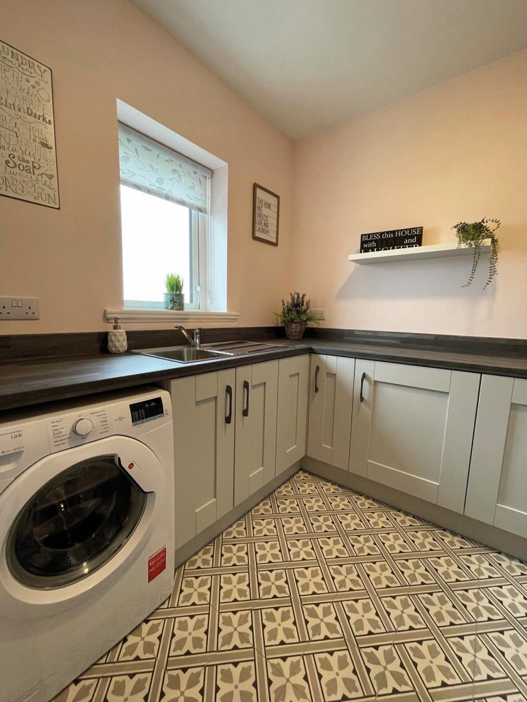
We know that utility rooms that doubled up as a rear or side entrance hallway are now almost a thing of the past and they now tend to be kept separate.
This allows them to function as places where noisy appliances such as washing machines and driers don’t intrude upon the rest of the house. They can also be used to house a freezer, especially useful if the kitchen refrigerator is tall with no freezer space.
Spaces or rooms which I have been asked to include, within or linked to the utility room, include:
- laundry room
- drying room
- boots / mud room
- dog washing room
- plant room,
- wc
- shower/wetroom
One way of economising on costs and resources is to try to keep all the wet rooms together as much as possible so that plumbing and drainage does not get spread about too much. This also works on different storeys, for example positioning bathrooms above utility rooms.
By all means combine the utility room with adequate laundry space so that the processing of clothes (washing, drying, ironing and storage) can take place in one self contained area, but make it user friendly.
A person doing the ironing might like to watch an old film, listen to a podcast, catch up with friends on social media or simply look out the window. This space could also contain a drying room for hanging up wetsuits or to drip dry textiles if you need it. Clothes storage is obviously needed for both clean and dirty clothes.
The wetroom (or boots room / mud room / dog washing room) that is quite often requested these days could all be incorporated together with, but perhaps not within, a wc / shower room.
Do you access this area from the utility room? It’s up to you, but I would suggest not, or at least think about potential user preferences. Toilets and washing facilities grouped in one room may work well for a young family, until those more chaotic times when you have a few teenagers all trying to get ready for school together.
With the above suggestions, we are trying to group so called wet spaces together, separate from dry spaces. They don’t have to be interconnected or accessible from one another. Storage can also be attached to, or within, the utility room.
The old style of utility room could exist in a space as small as 1.5m x 2.4m. Nowadays, yes, if all you need is a sink, washing machine and drier, it still could be kept to these dimensions, but add in a few extra things and it grows rapidly.
Let’s take a suggested utility room layout to contain a sink and worktop, washing machine, drier, chest freezer, ironing space, broom cupboard and laundry storage space. That lot would require a floor area of at least 3m x 3.6m.
Bathrooms
Of the many people that I know, few can seem to recall exactly when they last had a bath. This is not a reflection on their personal hygiene, you understand, but is simply because their busy lifestyle only allows time for showers.
So, not many (busy) people use baths regularly, yet everyone wants one in their home. I can understand this when there is a young family, children frequently do need a deep de-grunge, but whilst there are still a few adult bathing addicts, there doesn’t really seem to be a huge demand.
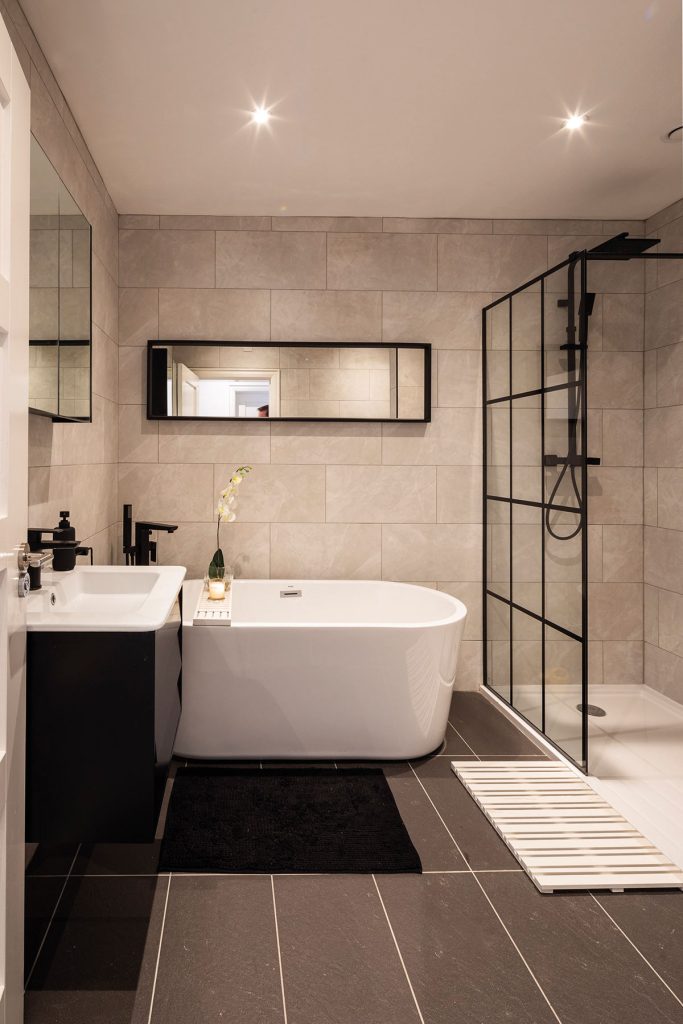
Additionally, as we age further, getting in and out of a standard bath can become difficult, although there are solutions available. Anyhow, take it as read that the bathroom will almost certainly contain a bath, so the next thought is to determine the type.
There are thousands of versions out there so I won’t labour the point, but the main considerations will be position and size. All baths will obviously need access space on at least one side. A full size stand alone traditional shaped bath will need up to 1900 x 900mm of floor space.
A large whirlpool bath may require 1900 x 1500mm and Japanese soaking tubs will typically range upwards from 1050 x 750mm. To save space, a bath can be fitted with a shower and screen, but there is a growing trend for walk in wet rooms or open ended showers.
Whatever you like to call them, the design usually incorporates an open shower floor space of around two to three metres long against one wall, with a safety glass screen or tiled partition parallel to that about one metre out on the opposite side, with one or both ends open and with no doors, for easy access.
A large rain showerhead (you can have more than one) is usually centred right above the shower space to provide you with an invigorating drench.
The other usual sanitaryware, i.e. washbasins, bidet and wc might also be included in the bathroom, but some prefer a wc with a small washbasin to be in a separate space with its own access. The walk-in wet room can also be kept within a separate space.
There’s no real right or wrong here; as long as the regulatory requirements for an accessible wc are satisfied, it’s all down to the individual.
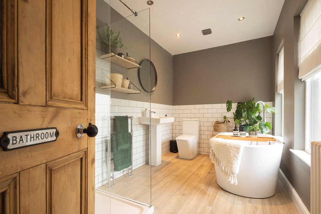
For a bathroom with all of the above in it and including a whirlpool bath, you could probably allow a floor area of 4.5 metres by 3.5 metres to begin with. A bath on a plinth with stepped access would need at least 600mm extra depth for each step out from the bath.
Space savings can be made by blending or sharing space between the shower area, bath, and washbasin; so that less overall floor area is needed.
Wall hung floating vanity units and wcs can give a cleaner less cluttered impression, with the feeling of more floorspace. If wall space is to be uted as much as possible, dispense with the conventional window and fit a skylight above the shower area. That’s if the location of the bathroom allows.

