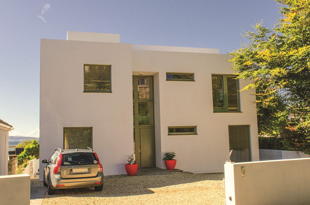
What looks like a simple modernist cube is actually a carefully crafted split level two storey house with five levels.
In this article we cover:
- Working with the architect to get a design on five levels
- Layout on each level to cater to family life
- Details of house height and width
- Floor plans, elevation, professional photographs
- Planning process and hurdles
- Tendering for a builder and choosing the right one
- Storage requirements and where they put equipment
- Day to day on site
- Rendering versus painting
- Kitchen design details
- Details of geothermal heat pump system plus stove
- Energy consumption of the A2 rated building
- Choice of interiors from floor coverings to bathrooms
- Full specification, supplier list, along with professional photographs
A contemporary home is what Julie and Robert Sturgeon of Co Galway always dreamed of, something that was individual and unique, suited to their lifestyle.
“There was an old bungalow on the site and rather than renovate we decided to knock it down and start from scratch,” says Julie. The couple spoke with a few architects and ended up hiring someone who was recommended by a friend. “Our architect recognised that we wanted something a bit different,” adds Julie.
House size: 300 sqm
Plot size: ¼ acre
BER: A3
“Robert had seen a crisp, white house that he liked the look of and told her about it. She immediately appreciated what it was we were after. This despite the fact that we really only had a vague idea at this point; something minimalist and open plan were the two main requirements.”
Squared up
The house is in a stunning location, overlooking the sea, but the site is sloping and relatively narrow, which called for some creative thinking.
“The architect suggested a design on five levels and we immediately responded to that idea. We played around with it and asked for a few modifications to her scheme but as she was fully aware of our requirements, there weren’t many.”
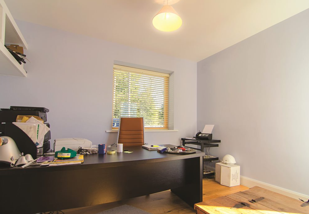
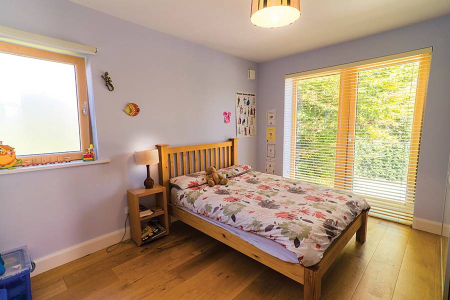
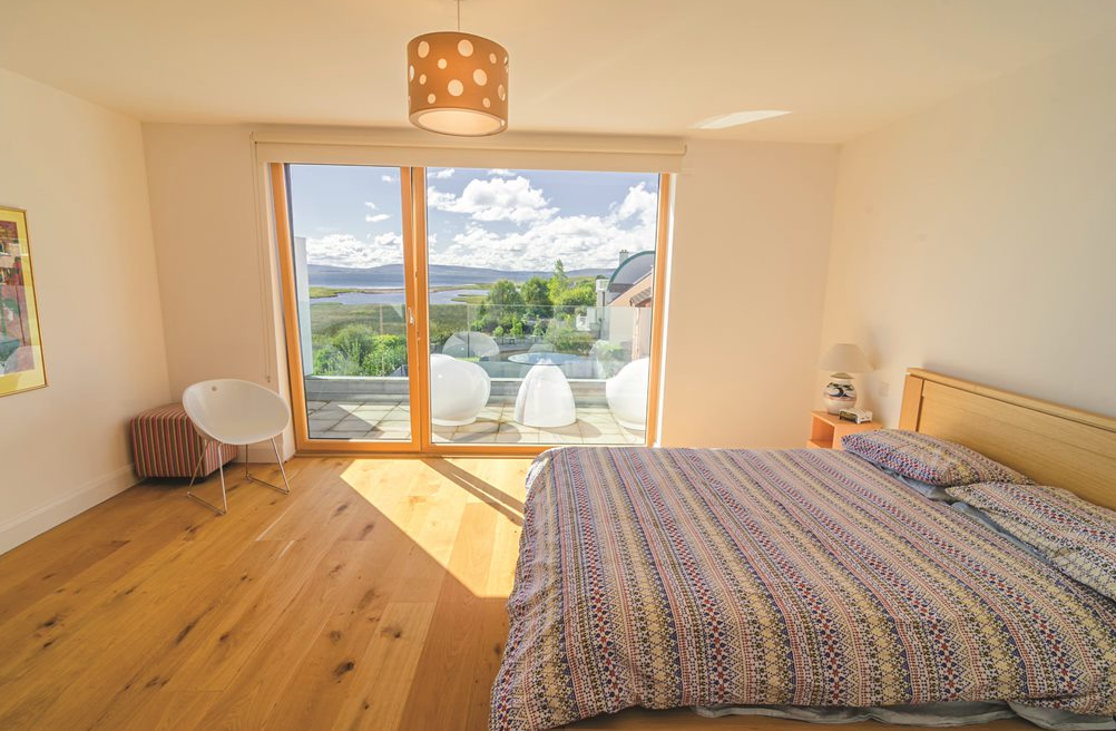
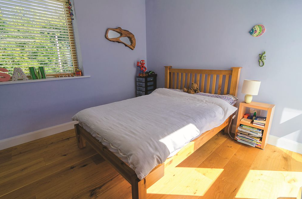
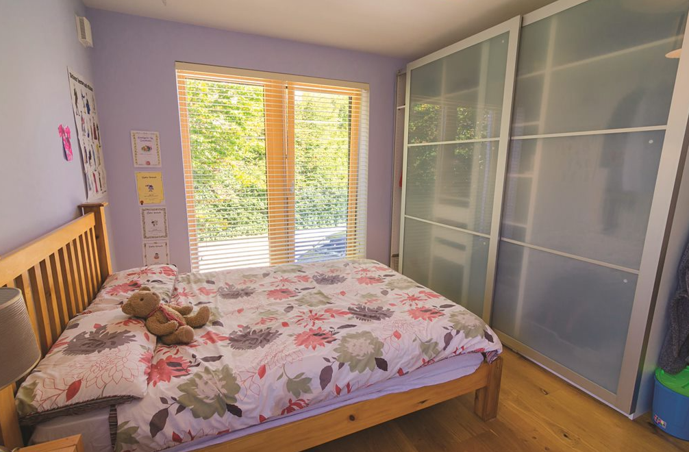
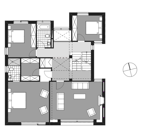
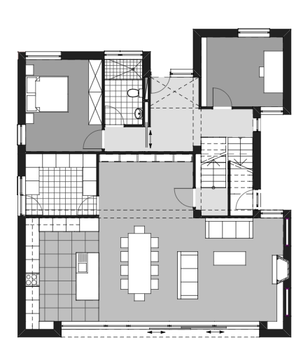
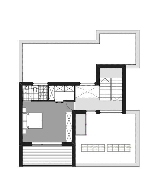
Downstairs is the open plan living area; the office and main bathroom are above that, then comes the drawing room with a view of the sea which it shares with the master bedroom with ensuite and walk-in closet. On the fourth floor are the children’s bedrooms and bathroom while the top floor consists of guest quarters.
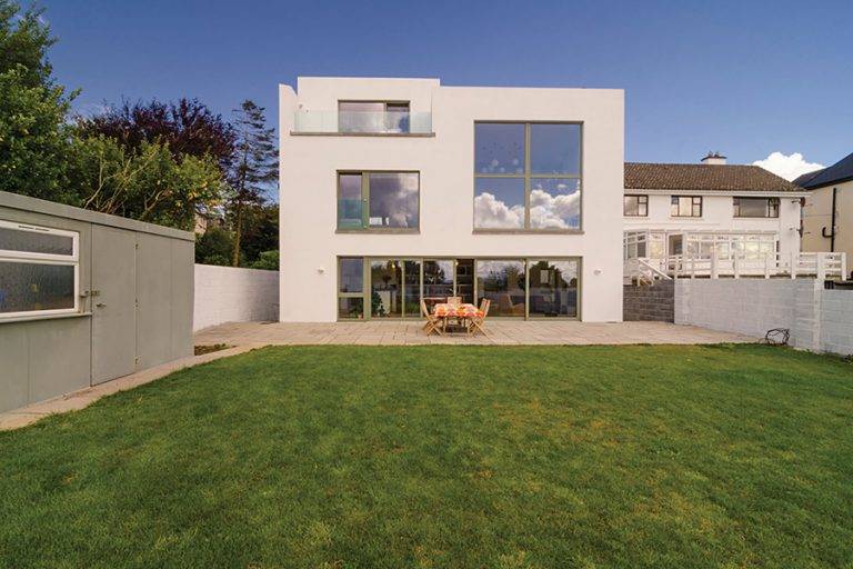
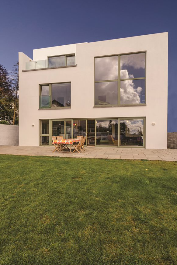
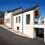
There’s two storeys from the front of the house, three from the back. “The split level design may seem complicated but it’s actually very simple,” says Julie. “The layouts are minimalist and access to each floor very straightforward.”
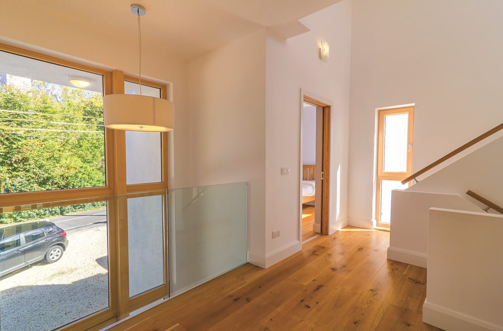
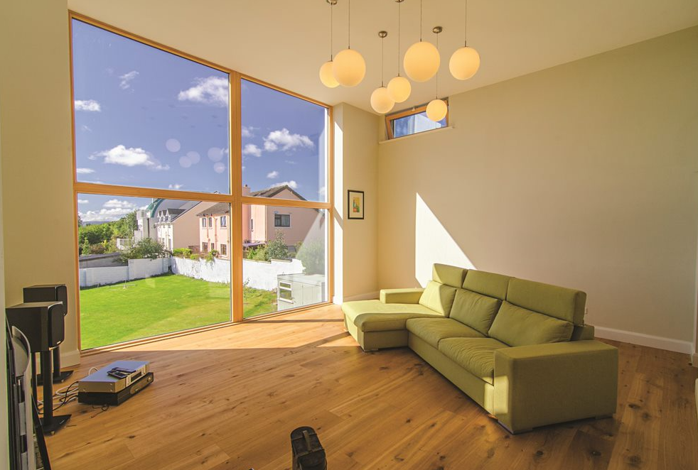
The two-storey side of the house is only 8m high at the front and the three-storey side at the back is only 12m high. The windows at the front, which is street facing, are tinted which makes them slightly opaque when looking out. “We showed the neighbours our plans and got them involved from the beginning, none of them objected to our planning application, I think in large part because they were consulted in advance and their privacy wasn’t affected by the design,” adds Julie.
The square look was important to Robert and Julie which meant all of the utilities had to be put inside the house, including the rainwater pipes. “We had a few minor leaks but the builder came back straight away to fix them,” she says.
Another requirement was a high performing flat roof. “It’s clad with a rubber membrane and is working fine so far.”
A square is the best shape you can choose from a thermal point of view; compact spaces are easier to heat than sprawling ones and there’s the added benefit that warm air rises. Indeed, as with all contemporary homes, heating was a major consideration on this project.
“In addition to insulating the house really well, we wanted a very efficient way of producing heat and hot water,” says Julie. “After a bit of research we chose a geothermal heat pump; we dug two vertical holes into the ground as we didn’t have room in the garden to go for a horizontal system.”
“In terms of cost, considering the size of the house, it balances out well. We’re paying roughly the same amount as we were for oil in our previous house, which was half as big.”
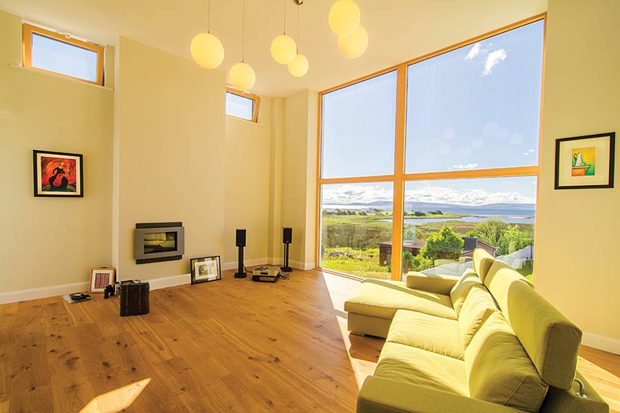
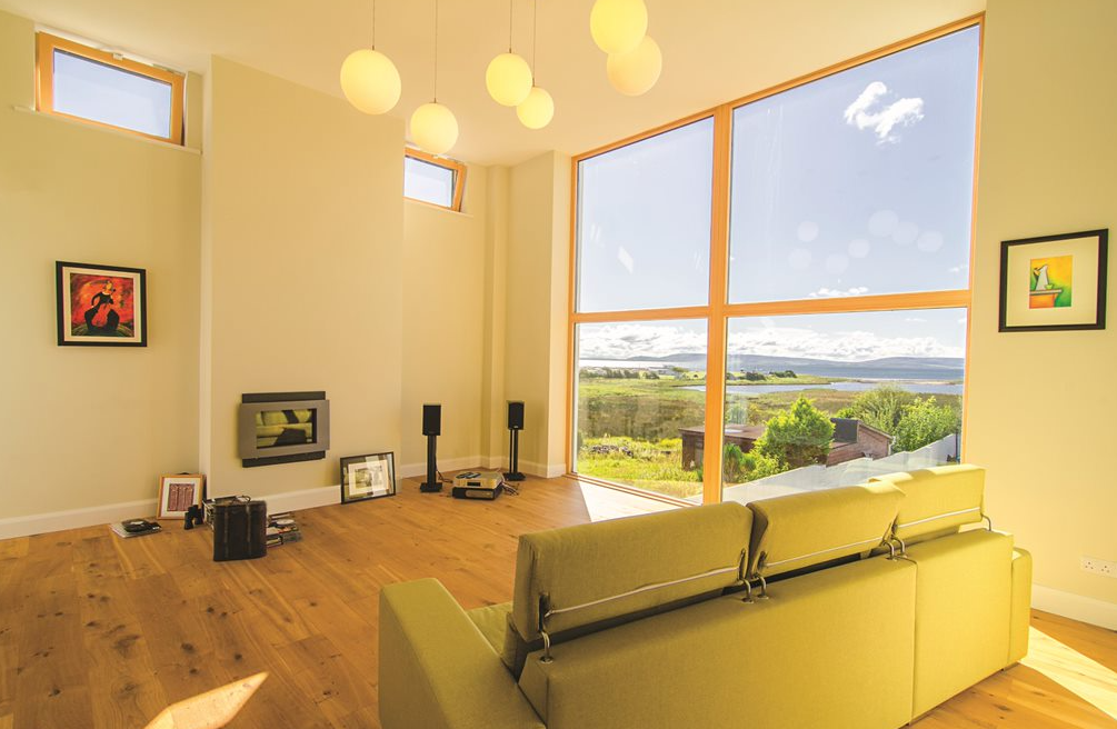
“We have a wood burning stove in the open plan area and in the drawing room but we rarely light them. The windows really bring in warmth, even in winter we find no need for a fire. But it’s still nice to have.”
The heat pump equipment is stored in the shed along with the gas cylinders they require for cooking. “We also store things like bicycles and other bulky items in there,” adds Julie. Ventilation is by way of simple ‘hole-in-the wall’ grilles and intermittent fans in the bathrooms and kitchen.
Having lived in the house for two years, Julie realised the best way to operate the heating system was to leave it to Robert. “There are controls in each of the rooms but the kids were meddling with them too much; Robert sets the temperature from the central controls and the kids aren’t allowed to touch the thermostats in their rooms. That way it works perfectly well, we’re very happy with the system.”
Contemporary split level two storey home
The builder they chose from a tender process had experience building modern houses and been recommended by a friend of theirs. “We had a very good relationship with the contractor; Robert knew exactly what he wanted and he discussed everything in detail,” says Julie. “In some instances he was told things couldn’t be done but they then realised they could, they found a way to make it work.”
The dormer bungalow was knocked in a day; new foundations were put in and everything was built up from scratch. A row of Leylandi trees were removed during the works. “I’m not fond of those trees, they tend to take over, so we’re now in the process of replanting the garden,” adds Julie. “It’s a blank canvas!”
The build started in February 2011 and was project managed by the same practice that designed the house. “We had regular site meetings and were down looking at it all the time,” says Julie. “I remember thinking that the walk-in wardrobe seemed small but was reassured by the builders and the project manager that it wasn’t. And they were right. It’s funny how an empty room can seem much smaller than one that’s furnished.”
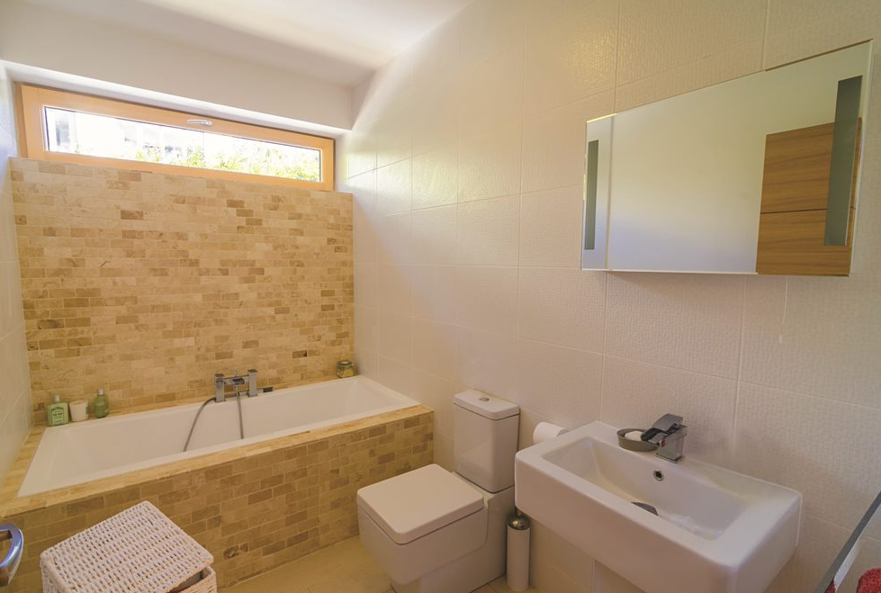
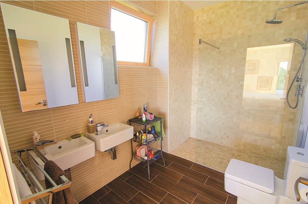
The main bathroom gave her the same impression. “I realised we wouldn’t be able to fit a standalone bath, which I originally wanted, so I compromised and went for a built-in one which I now realise works much better for us, so I’m really happy with it. The bathroom feels spacious and I wouldn’t change a thing about it.”
A major decision they had to make during the construction phase was whether to render the house or simply paint it. “Rendering was going to be more costly and when we went to visit houses with this finish, we felt the colour had faded badly and there wasn’t an awful lot that could be done about it,” explains Julie. “Since we wanted a white crisp finish we chose to paint it, even though we were told it would need to be redone every few years but it’s still looking good after two. Being near the sea we expected to get it done yearly but it has stood the test of time so far.”
Interior design
Inside the colour scheme is also predominantly white, keeping with the contemporary look, but that too requires upkeep, especially with children. “To keep it very white indoors the house will need to be painted every few years but that’s part of the maintenance required in a home,” says Julie.
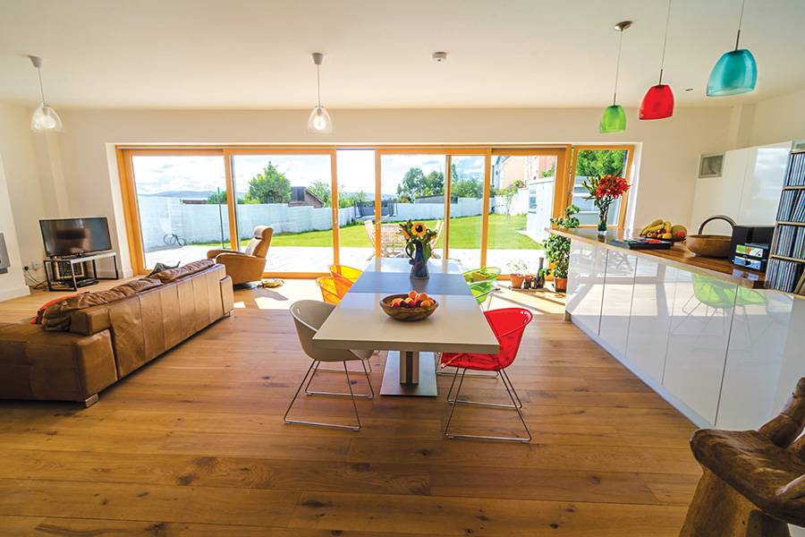
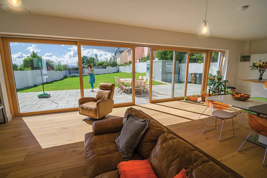
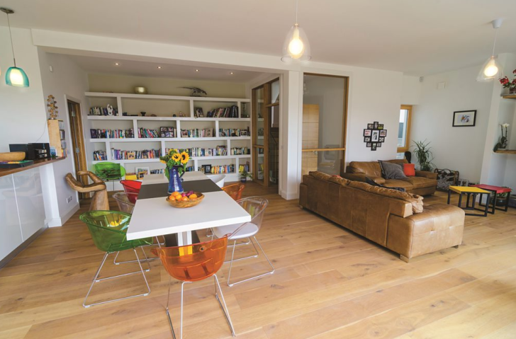
For the general look they chose to go for a Scandinavian style, particularly Danish. “With two young boys we do accumulate clutter but we get away with it as there’s plenty of space to hide it. We have a lot of wardrobes and there’s quite a bit of ‘on display storage’ as well, in the form of bookshelves and the like.” Flat pack furniture was bought and they got help assembling it, while the sofa in the open plan living room was bought online from Edinburgh.
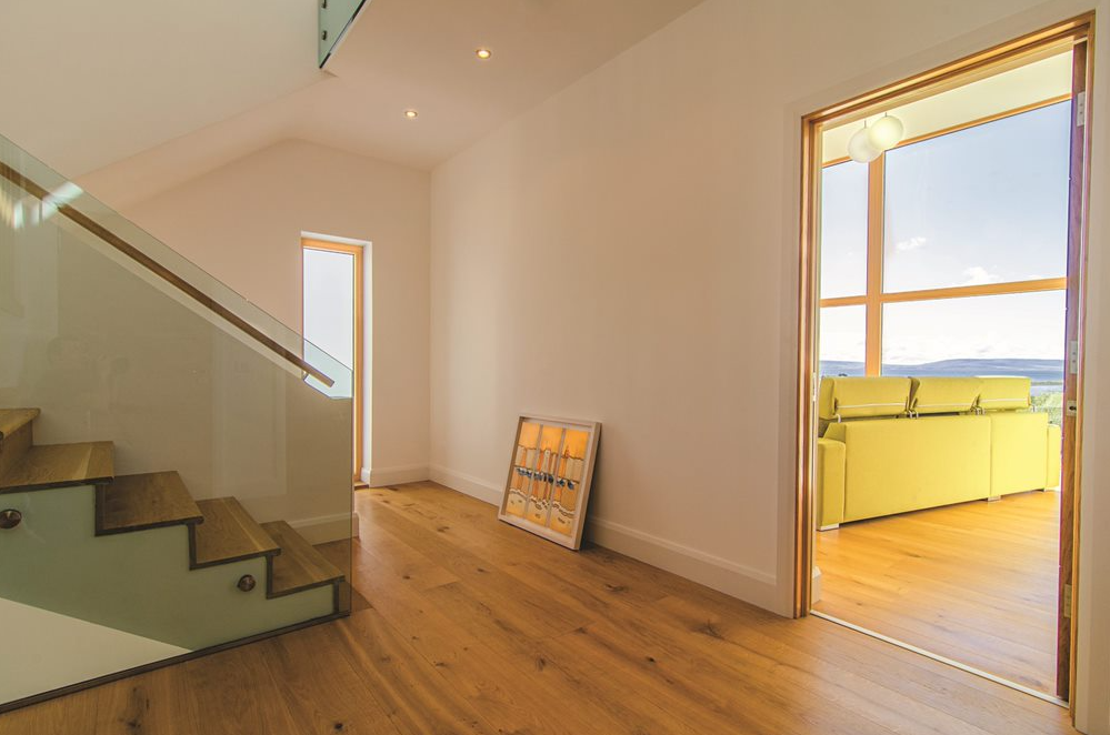
Julie says it pays to shop around in this day and age. “There are huge differences in cost so make sure to do your research,” she advises. The colour scheme is indeed restrained, with engineered oak floors contrasted with splashes of colour, such as the green sofa in the drawing room and the Danish pendant lights in the kitchen.
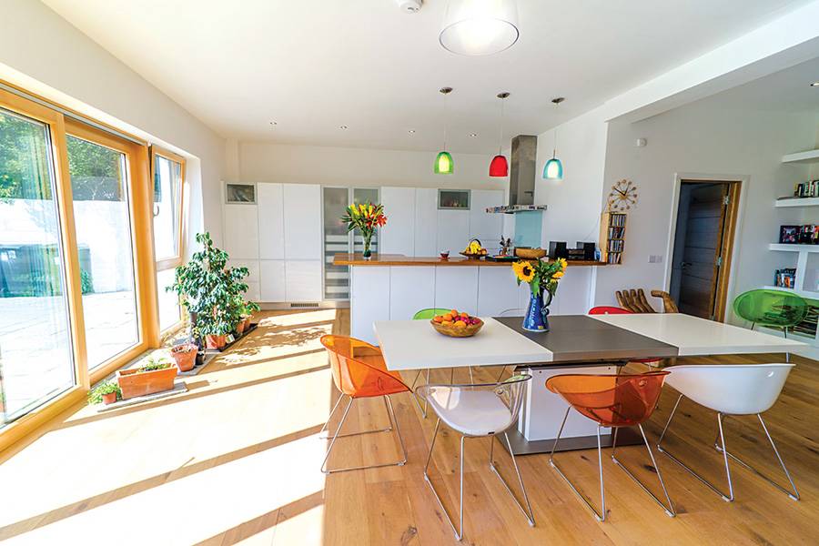
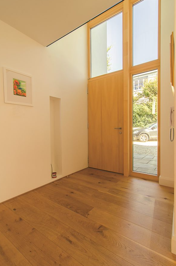
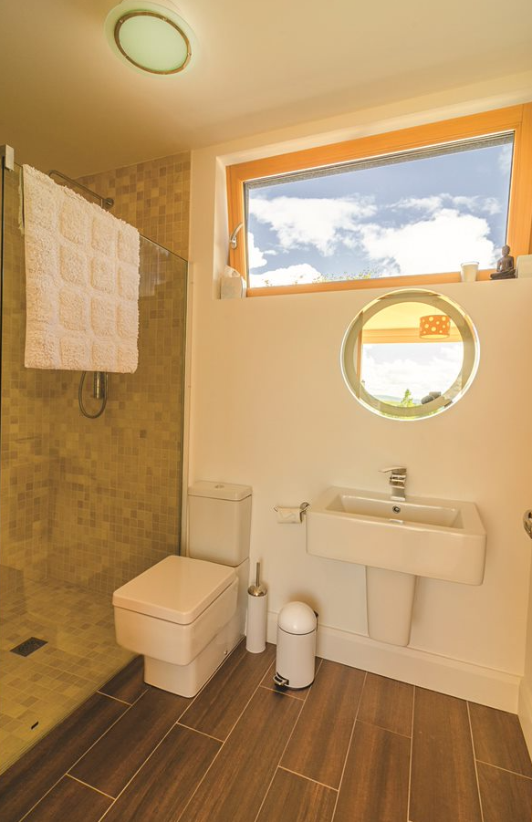
“We used the same wide floorboards throughout the house but in the kitchen they were sanded down and treated to give a pale white colour.” Recessed lighting throughout the house adds to the minimalist feel. In the bathrooms they chose to go for designs that age well. “The wood effect tiles on the floor and the cream colours look clean and crisp,” says Julie. “We played it fairly safe but that simple style doesn’t tire either.”
Open plan living in split level two storey house
Organising a big open plan space like that can be challenging but Julie found it straightforward. “Thanks to the architects everything fell into place, it all just fitted together, the TV and stove, the sofa and the kitchen layout.”
“We really like cooking so needed a good sized kitchen but also required storage. We were originally going to go for an island but decided against it. It’s nicer to have the space enclosed and it gives us the opportunity to put plenty of storage underneath the unit, on both sides. We also put stuff in the utility next door.” The countertop is made of Zebrano wood.
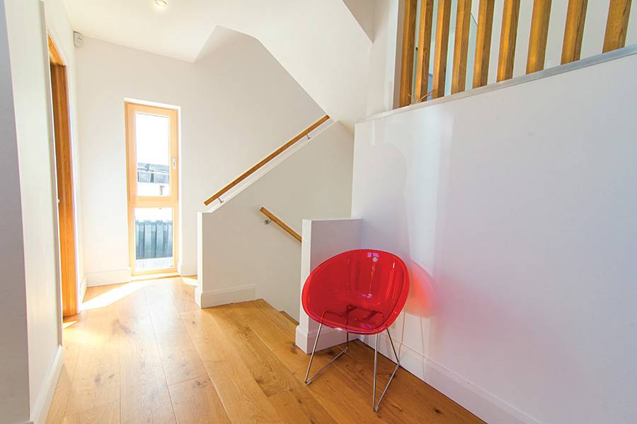
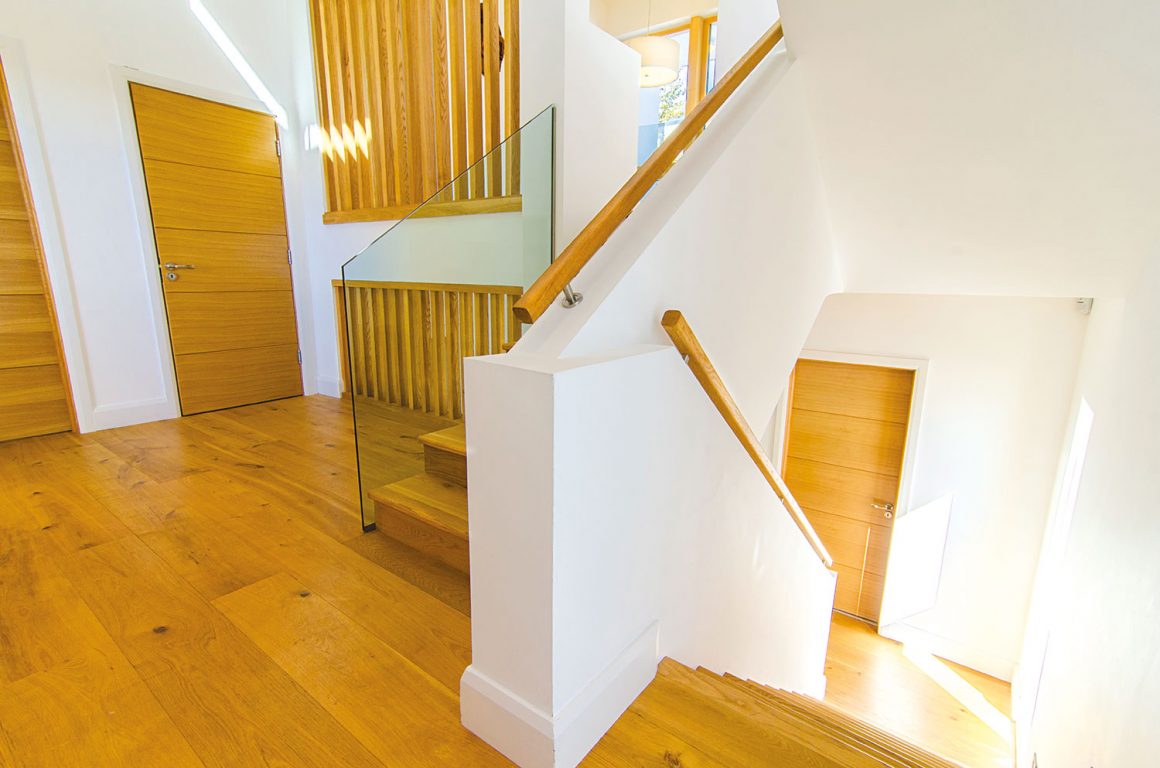
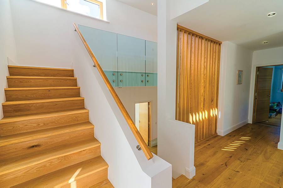
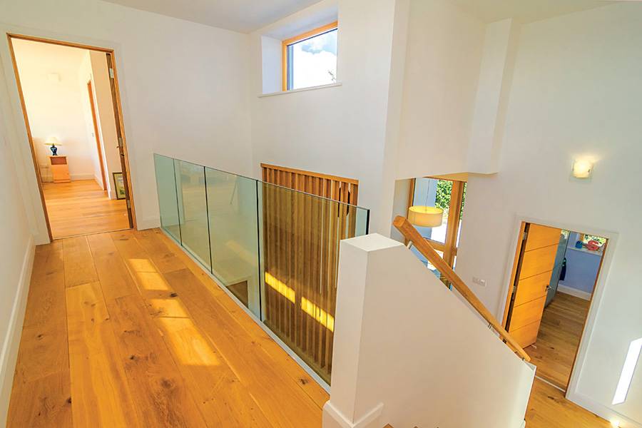
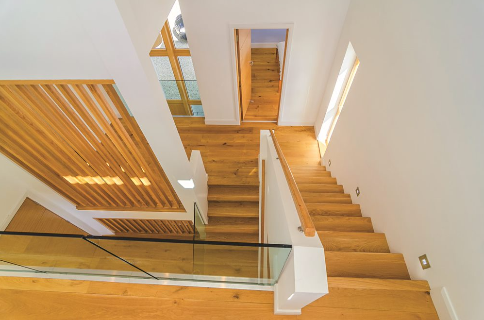
With a house this size the staircase plays a pivotal role. Thanks to the glass balustrades and wooden slats, light not only flows freely but the split level design adds interest. The stairs are made of precast concrete and clad in wood to match the Scandinavian style.

Another consideration was broadband. “Wi-fi is hard to get in the house, maybe because of the concrete slabs which don’t allow the signal to travel from one end of the house to the other. So it’s a good thing we decided to run cables to the office and in the main living areas.”
Practicalities
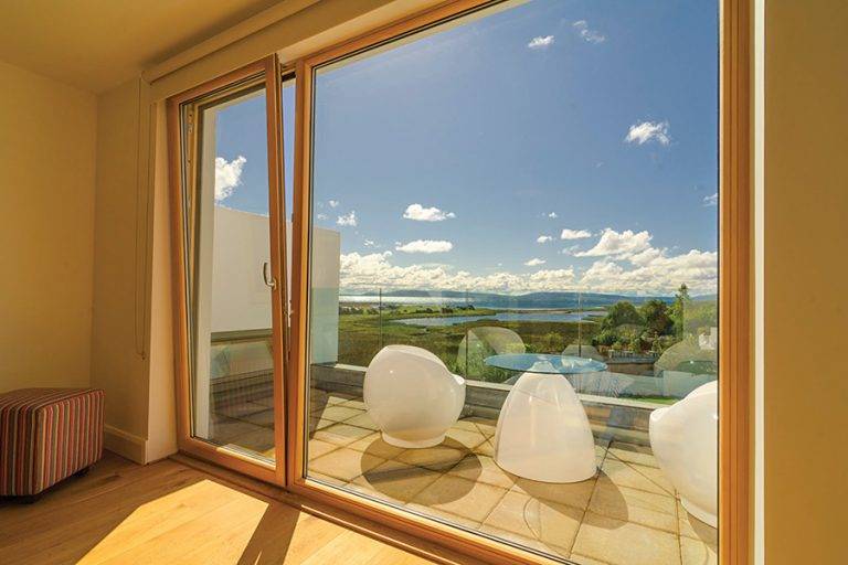
The top floor bedroom has a balcony, which allows guests to enjoy the views. “A lot of people ask us why we didn’t choose that room as our master bedroom but it was never our intention to use it,” says Julie. “The children counted the steps and there’s 40 of them to climb up there – a bit of a hike every night!”
They moved in March of 2012 and two years on Julie says the house is really easy to live in, even though with five levels there are a lot of windows to wash. “We have a window cleaner come around twice a year,” she says. “The ones downstairs we regularly clean ourselves to get rid of all of the muddy football prints!” Julie says the architect was concerned about the waste bins. “The slope at the side of the house is too narrow to bring up the bins. But we had to give the house the space it required so I don’t mind.
Apart from that I have to say there’s nothing I would change; the location, the feel of the house, everything is perfect and suited to all of us.” Nifty design details like the sliding door from the playroom to the bathroom add to the comfort and modern feel; for Robert and Julie, there certainly is no place like home.
Specification
Build up: walls: 215mm inner leaf blockwork covered by 12mm plaster, 150mm cavity with 100mm PIR board insulation, 100mm outer leaf blockwork, three coats of paint on sand cement render; roof: 12.5mm plasterboard with skim finish on suspended ceiling system, 150mm precast hollowcore concrete slab, 75mm screed at 1:50 fall, vapour colour layer and air barrier, 120mm PIR insulation board, 30g fleece separating layer, mechanically fixed PVC membrane; floor: radon barrier, concrete slab, 25mm edge insulation, 125mm rigid urethane insulation, 60mm sand-cement screed with underfloor heating, high density polyfoam underlay, 20mm engineered oak planks (180mm wide).
U-values: Roof 0.22 W/sqmK, walls 0.27 W/sqmK, floor 0.13 W/sqmK
Windows: double glazed, argon filled, low e, timber aluminium clad
Suppliers
Architect & Project manager
O’Neill O’Malley, Galway, tel. 091 771033, www.onom.ie
Builder
O’Brien O’Malley Construction, Co Galway, mobile (Tom O’Brien) 087 2390437
Furniture online
www.SofaSoGoodOnline.com (leather sofas/chair) and www.Made.com.
Furniture stores
BoConcept www.boconcept.com/en-ie and IKEA www.ikea.ie. Old pieces of furniture have also been reclaimed.


2 Comments