Tiles, unlike paint colours or even carpets are not something you will want to change on a whim. So careful consideration is required in the selection process.
The vast choice of floor and wall tiles on the market today is both a blessing and a curse. No longer simply considered as just a way to protect walls and floors, the huge selection of tiles available is wonderful and exciting but it’s also very intimidating when it comes to narrowing down our choices. As tiles are a longer term proposition it is important to choose colours, patterns and designs you like, that suit your lifestyle and your home or particular space. Here are some tips to help you along the way.
1. Size matters
As with all aspects of interior design, you need to first and foremost ensure that form follows function. Some people argue that small spaces look better with larger tiles or vice versa. I am however a firm believer in choosing the largest tile possible in any space.
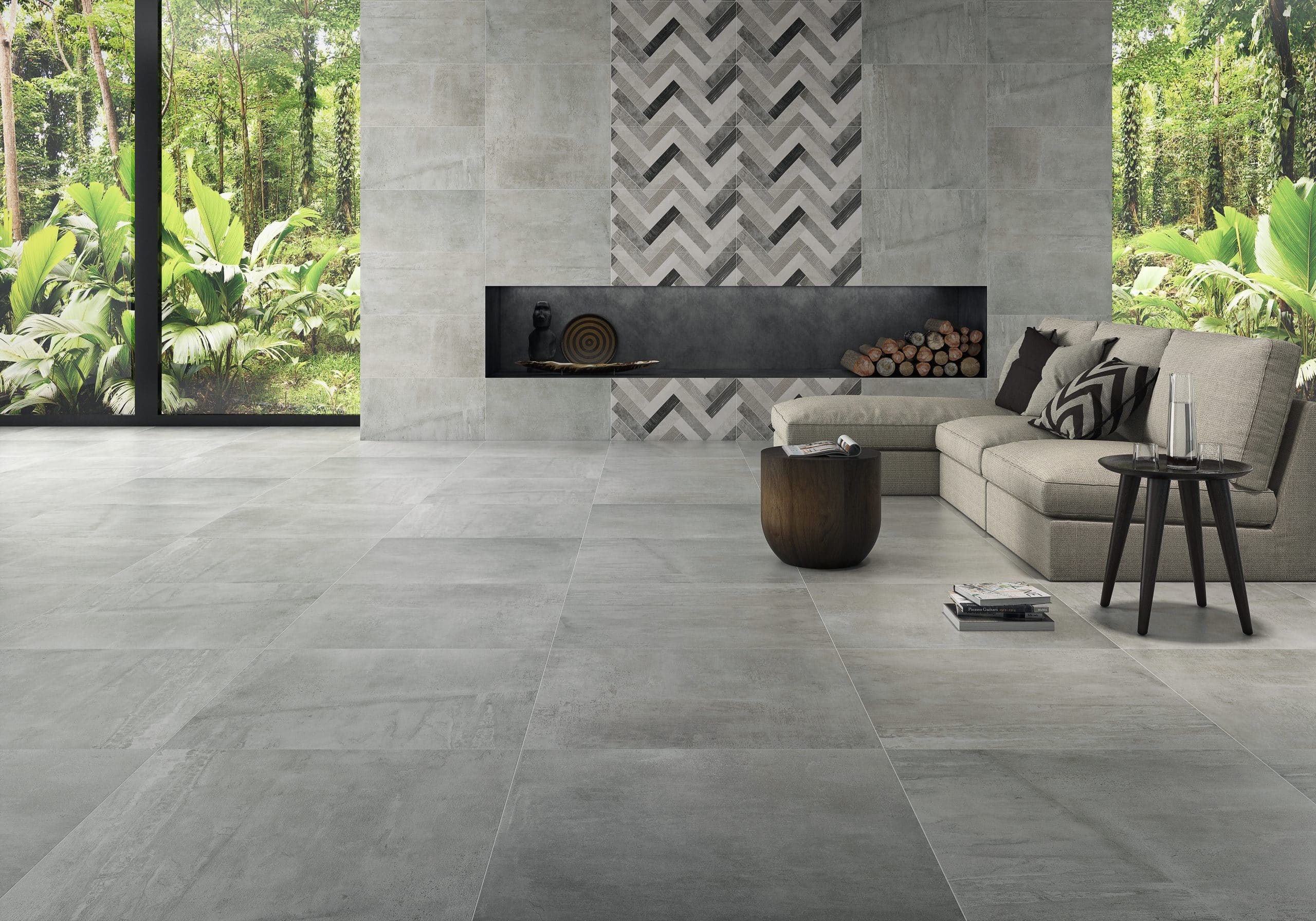
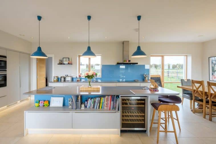
I find larger tiles give a feeling of expansiveness in a room as they reduce the clutter associated to multiple grout lines. That said selecting a grout colour that’s very similar to the tile’s will minimise this effect. Less grout incidentally results in an easier cleaning regime, especially in bathrooms and busier floor areas, such as kitchens, where continuous foot traffic tends to have more impact.
In terms of patterns, while mixing tile sizes in the same room may lead to a cluttered feel it can also add warmth and homeliness. Wood flooring effect tiles in rectangular plank style formats laid lengthwise will trick your eye into thinking there is a lot of room; blocky grid woodblock patterns will on the other hand consolidate the space.
2. How to make small beautiful
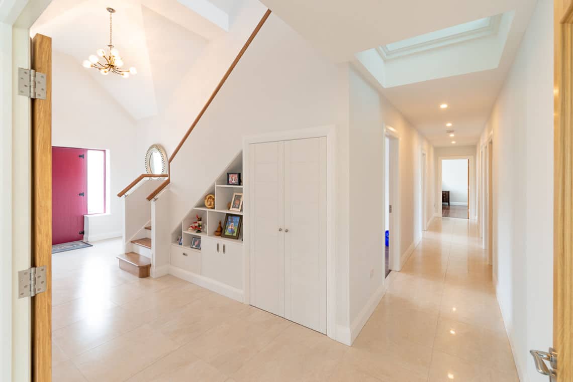
Even though I do think large tiles work in most instances, care must be taken when selecting tiles for narrow areas, like a hall for example. A long continuous grout line, or a single tile, can accentuate a narrow space and make it feel cramped. You will need at least three full tiles across the width to prevent the area looking like a landing strip. A good alternative is to lay the tile at a 45 degree angle or to choose a patterned or checkboard design.
Another great way to bring interest into small spaces is with smaller decorative tiles. Most halls are dark and have limited natural light. Adding a patterned floor tile against a light wall colour will make this space immediately look bigger and airy. This works exceptionally well in small bathrooms and cloakrooms too where a predominantly neutral palette allow a bold floor to take centre stage. A mosaic or geometrically shaped floor tile can boost personality and provide contrast.
3. Tiling in Bedrooms
In bedrooms, tiling is also becoming increasingly used, especially as improved digital printing technology is enabling manufacturers to make wood effect tiles more and more realistic.

I have to be honest, I’m not a fan of tiling bedroom floors. We don’t exactly have a Mediterranean climate in this country and the thought of putting my little pinkies onto a cold tiled floor first thing on a winter’s morning fills me with dread. However if used with underfloor heating systems (which many new houses have) they can be a great alternative as they are scratch and stain resistant, and very easy to clean. With wood, this makes them a product of choice to allergy sufferers.
4. When to shift to neutral
Conversely, if you are thinking of having some statement colour on your walls and possibly ceiling, you should definitely stick with a neutral palette for your tiles.
This will also be the case if you are laying tiles in a room you might update relatively often. For example in a living space, choosing a neutral colour is usually your best bet as it will allow the walls and soft furnishings to set the tone. Also when the time comes to changing your upholstery or window treatments you won’t be restricted in your choices.
And remember to consider the finish, whether glossy or matt. A high gloss tile in a lighter shade will reflect light and make your room seem bigger. Black glossy tiles look wonderful but are more likely to show dust and dirt than a lighter tile. At the moment matt tiles in a cement or grey stone colour are right on trend.
In bathroom areas where both walls and floors are tiled, again less is more which means that decorating the floor and walls with patterns or bold colours will overwhelm the space. Go with a neutral palette and bring in pops of colour with towels and accessories.
5. Inside Outside Living
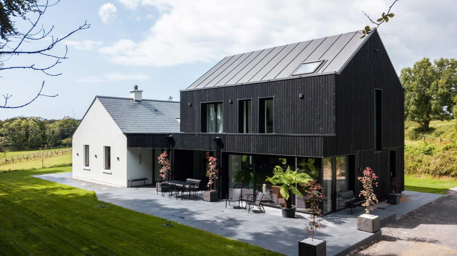
If your budget can stretch to have a usable area outside your living space, choosing a tile suitable for both indoors and out can bring a seamless transition from one space to the other. Again neutral colours will be easiest to decorate around.
Porcelain tiles are suitable for outdoor use as they are non-porous, will not soak up water nor crack in frost. Several tile manufacturers also make porcelain tiles 20mm thick with a slip resistant finish designed for use on patios, garden paths and even driveways. The non-porous characteristics of porcelain tiles will inhibit moss and algae, they are also highly durable and easy to clean.

6. Installation
Lastly, one of the most important aspects in any tiling design is the installation. Regardless of the cost of your tiles, if they are not fitted properly they will be a disaster. Always ask for advice from the retailer, builder and fitter. Talk to the references your tiler gives you, and make sure you are happy with the quality of their work.

