Hallways, corridors and access points may not be the most glamorous part of designing a home but they’re crucial in achieving the ‘flow’.
Synonymous with flow, circulation is the architectural term given to the way that people move and interact with a building, be it horizontally via entrances, hallways and verandas or vertically, via stairs and lifts; in whichever form, good planning and the observation of universal design principles will meet your functional needs.
As anyone living in a home will attest to, the quality of a space and our experience living in it has little to do with size and everything to do with how it is structured. The home must work as a whole to meet the requirements of its occupants, rooms and spaces must connect and relate to each other to accommodate everyday activities.
Entrances
Externally, many designers identify entrances by structural means: canopies, porches and oversized doors can be used (in any number of materials), in combination with colour, lighting and landscaping. But a subtle front door can often belie what lies beyond and reveal interiors that make impressive first impressions, here the use of contrast will create a sense of interest and surprise.
However, it must always be remembered that ease of movement (both entering and exiting a dwelling) is paramount as anyone who has negotiated a narrow front door with suitcase in hand, or exhausted themselves pushing a door open that is too heavy, can testify. Many small spaces can appear airy and spacious without the need for an extravagant design statement such as a double height ceiling with chandelier, simply by being well organised or because sympathetic decorative choices have been made to dispel the feeling of any of the rooms being small or cramped. Mirrors and neutral colours can help to achieve this effect.
[adrotate banner="58"]Hallways
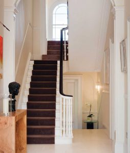
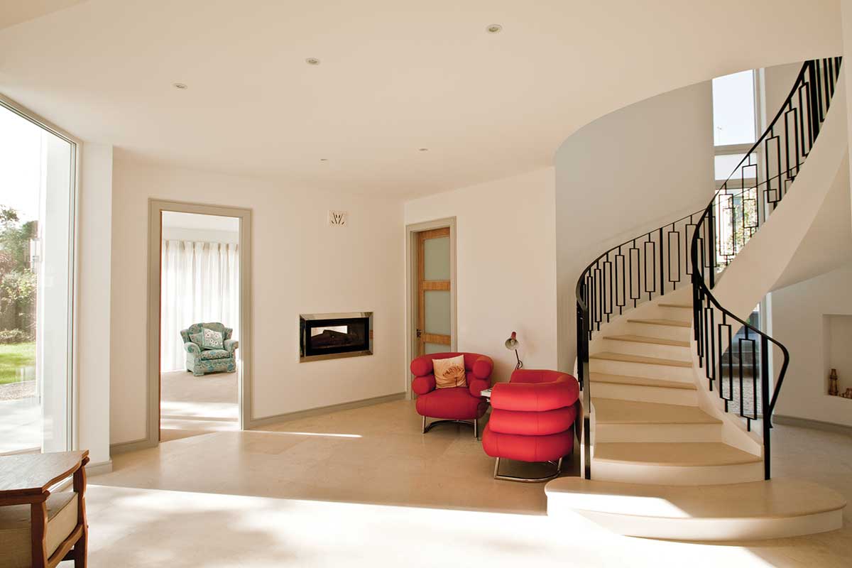
For hallways and stairs, an important element is unity; using the same colours and textures will add not only continuity but will also reinforce a sense of cohesion and direction to these areas. Being more of a thoroughfare than an actual room, it is important that the entrance hall is free of clutter and doesn’t become a collection point for school bags, sports kit, stray shoes and other oddments of clothing and equipment.
To avoid such eventualities, well planned and accessible storage solutions should be incorporated at every opportunity to ensure a smooth-running household. All areas should be examined for their storage potential: stairs that double up as drawers, cubby holes, wcs, small offices or even play dens make ingenious use of this space. Ideally storage accommodation can be provided by way of a cloak/bootroom.
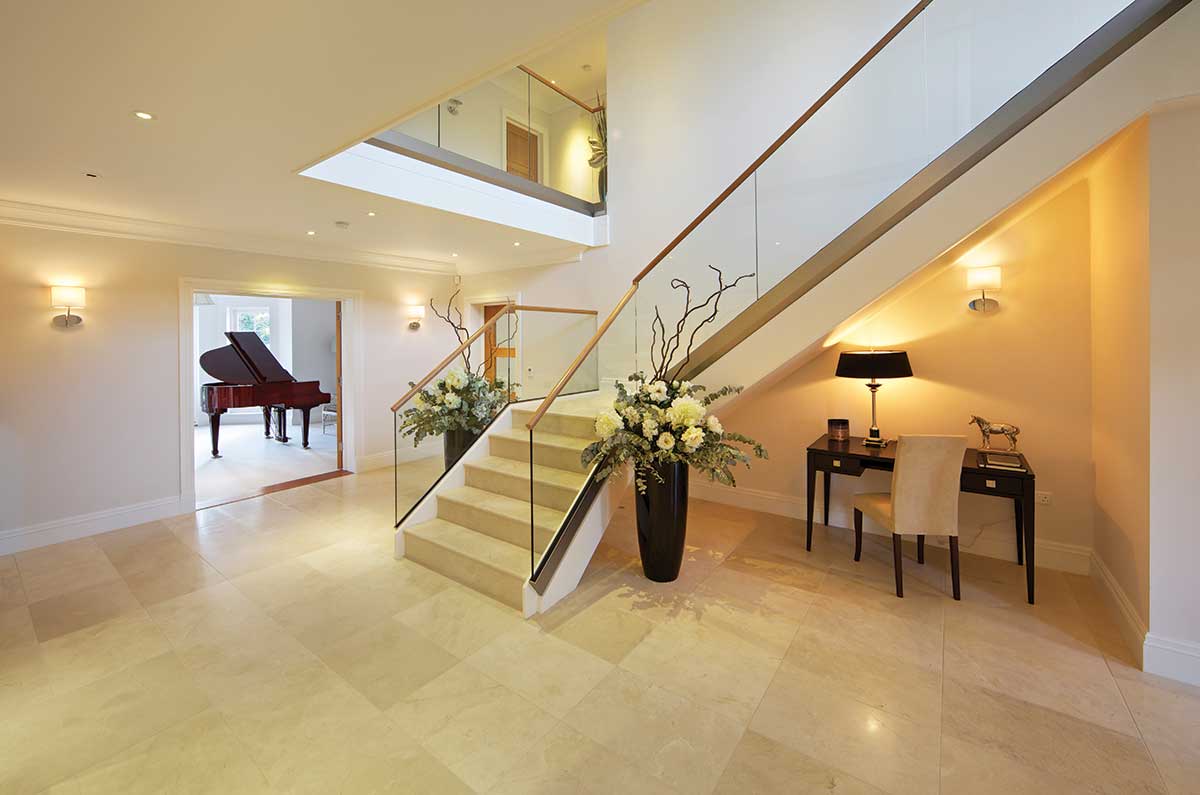
Additionally, console tables not only provide a great opportunity for decorative flair with flowers and vide poche but for storage too: look for a narrow but wide design that has drawers and shelves or even a pull out desk so it can used as a temporary office space. Hallways and landings areas are often underutilised: incorporating alcoves or nooks for sitting and reading or simply a table and chair will add a sense of dimension but may also provide opportunities for storage, by way of a window seat for example.
Lighting
Lighting is an essential factor in defining spaces and setting the mood but circulation areas must be lit primarily for safe passage. Great drama can be provided in some entry ways and hallways through the use of chandeliers, pendant fixtures and sconces.
In some homes long hallways serve as gallery spaces and these are well served by accent lighting as well as ambient lighting. In other cases hallways and other circulation spaces will benefit from a simpler approach of lamps and track lighting. Because circulation spaces are designed to facilitate movement, the location of switches and controls provided must support this movement. This will require providing switching at the top and bottom of a run of stairs and at each end of a hallway for example.
Finishes
As areas of high traffic, entrances, stairways, hallways and landings are prone to more daily wear and tear than other rooms in a house. While a visually rich, substantial looking floor will reward visitors and make an impactful first impression it must also be practical. Slate, stone, and porcelain meet this criteria, but note that a high gloss finishes can be hard to keep clean.
With wood, use a durable hardwood board (with appropriate finish) as soft woods may dent and scratch; don’t use carpeting as it gets dirty with traffic and avoid vinyl unless it is a high quality luxury variety. Homeowners may wish to set off the area in a different material than adjacent rooms and hallways. But choosing one common material for several rooms produces a feeling of continuous flow and makes smaller rooms appear larger.
In addition, high-traffic areas will also benefit from rugs, runners and, entrance mats which can also enhance your home’s décor as accent pieces, and can be replaced as necessary. Make sure these are securely fixed or gripped to the floor with matting, otherwise they may become a slip or trip hazard.
When it comes to paint colour, you can either go for bold statement hues or choose a welcoming and soothing palette. Neutrals will obviously ensure that your hallway feels light and airy and grey will provide a timeless shade. Heavy traffic areas, entrances, stairways and hallways will require the use of a washable paint so that signs of wear and tear, scuff marks, fingerprints etc. can be erased without compromising or altering the colour of your walls.
Top Tips
- Make sure you have a level entry. Step-free entrances facilitate not only people with buggies but people with mobility aids and the visually impaired.
- Think long term. Minimise the need for expensive changes or retrofits to meet the needs of particular
groups at a later stage, e.g. include a wheelchair friendly access / doors and downstairs bathroom. Also consider that larger toilet areas facilitate parents
accompanying small children as well as people using walking or mobility aids. - Arrange your furniture so that it doesn’t impede circulation within, or to and from rooms.
- Maximise light and ventilation, particularly with the help of rooflights.
Rules of Thumb
- Minimum clearance. When approach is not head on and the corridor is only 900mm wide, the minimum clear opening width of a door should be 900mm.
- Accessibility. Provide 1.5m diameter for wheelchair users to turn. Design the stairs so that a stair lift can be accommodated in future, and identify a space for a lift if the need for one were to arise.
- Obstruction free. Ensure that doorways and opening sections of windows do not create hazards for users of passageways and circulation routes. External routes to clotheslines, bin and fuel storage areas should be free from steps and adequately illuminated.
- Slips Trips and Falls. Hallways that are likely to get wet should have non-slip finishes. Light fittings and fire alarms to be located so that there is safe and convenient access for changing bulbs and for testing. Particular care should be taken not to locate fittings in the vicinity of stairs and over voids to avoid risk of falls.
- Fixtures and Fittings. Switches, sockets, ventilation and service controls should be at a height usable by all, i.e. between 450mm and
1200mm from the floor.
Extracts from ROI Department of Housing Quality Housing for Sustainable Communities


