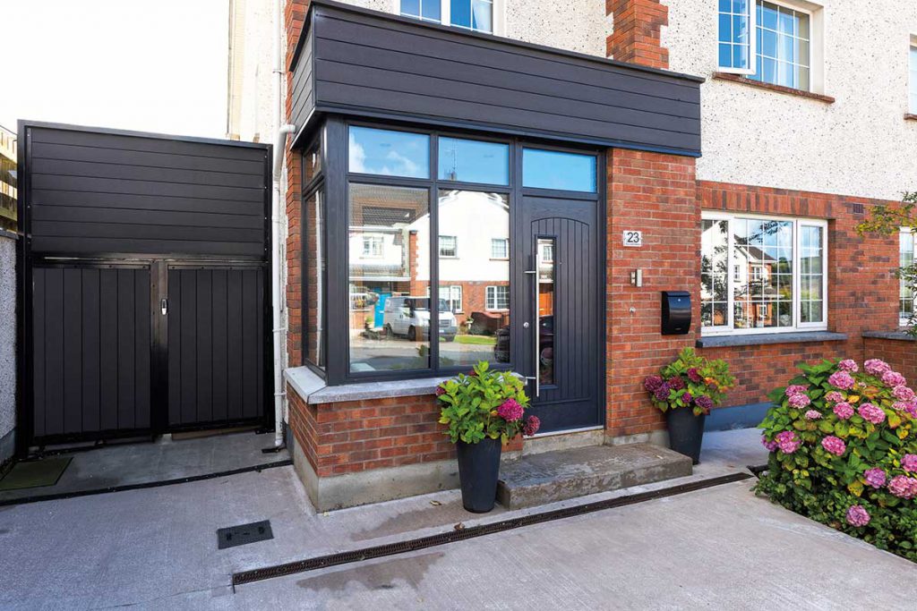
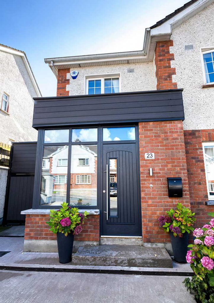
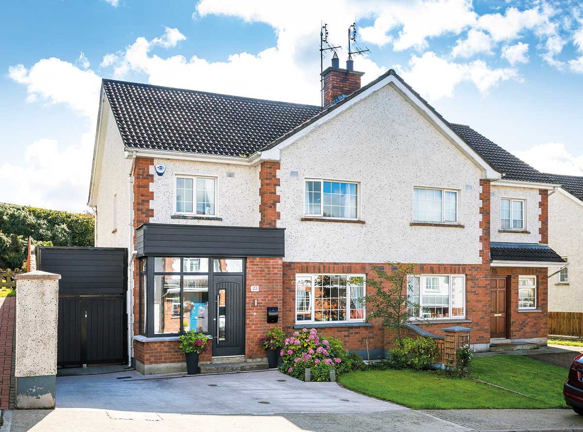
Clíodhna and Enda Rooney had a choice between moving or extending; they decided to stay put and inject the wow factor into their semi detached home.
In this article we cover:
- How to renovate and extend a semi-detached house
- Extension that provides privacy and brings light in
- Dividing up the kitchen and open plan areas with different levels and partitions
- Heating upgrades and insulation grant
- Lighting design
- Kitchen design
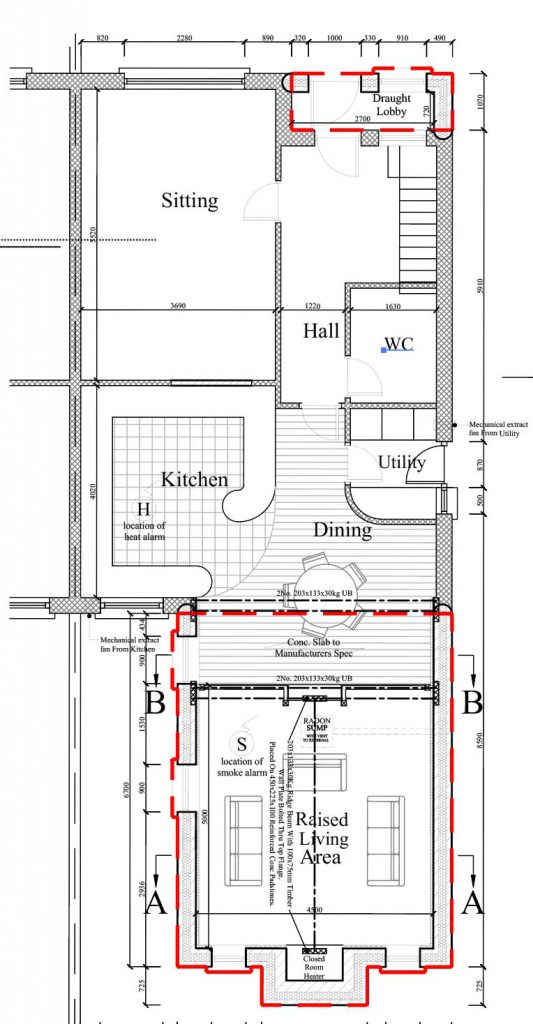
- Floor plans
- Specification and supplier list
- Professional photographs
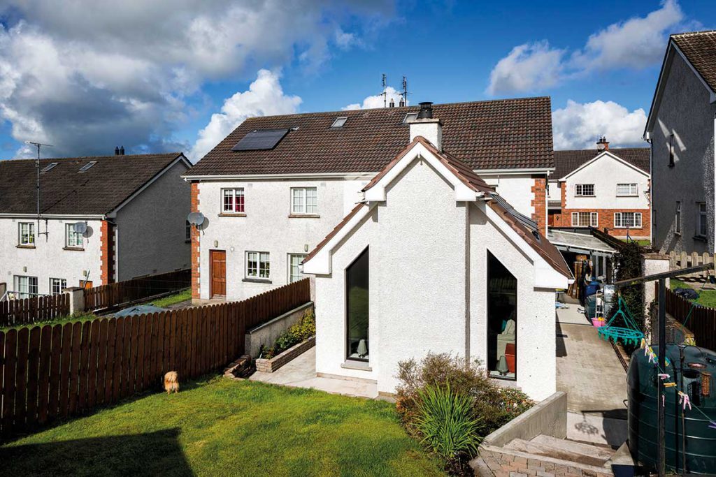
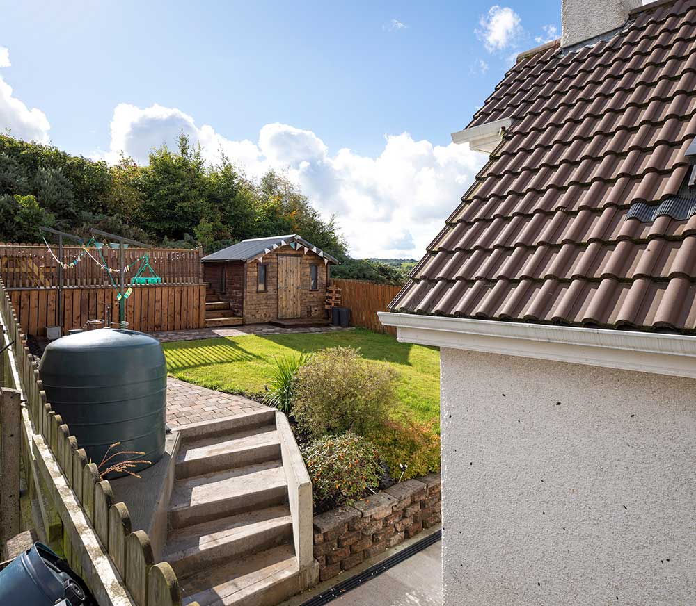
“Even though we love where we live, our concern about renovating was that it might be difficult to make it more comfortable considering the constraints of being nestled between two other houses – the footprint is relatively narrow and the garden is confined and overlooked,” recounts Clíodhna.
“Martin, who designed the extension, is a friend of ours and he encouraged us to stay put as he could see the setup had potential,” continues Clíodhna.
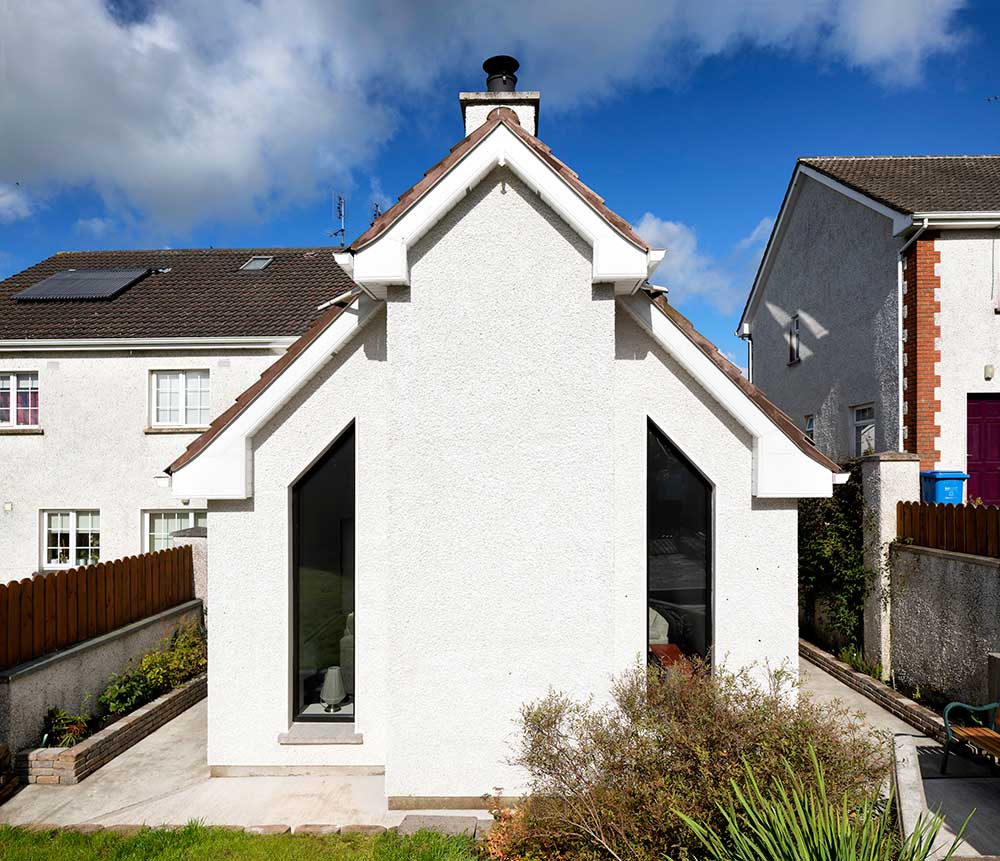
“He designed the space from the outside in to make sure that the room itself was the feature and not what you could look at outside. In many extensions Martin said he would create large glass panels in the external walls to bring the garden area into the house, but here the focus was on creating a feeling of warmth and light without compromising on privacy.”
[adrotate banner="57"]“We’d put pen to paper ourselves, sketched every configuration we could think of, but couldn’t figure out how to keep the space private and flood it with light. Martin came back with a few options that really impressed us. Straight away that highlighted to me why you need to hire a design professional and trust their advice.”
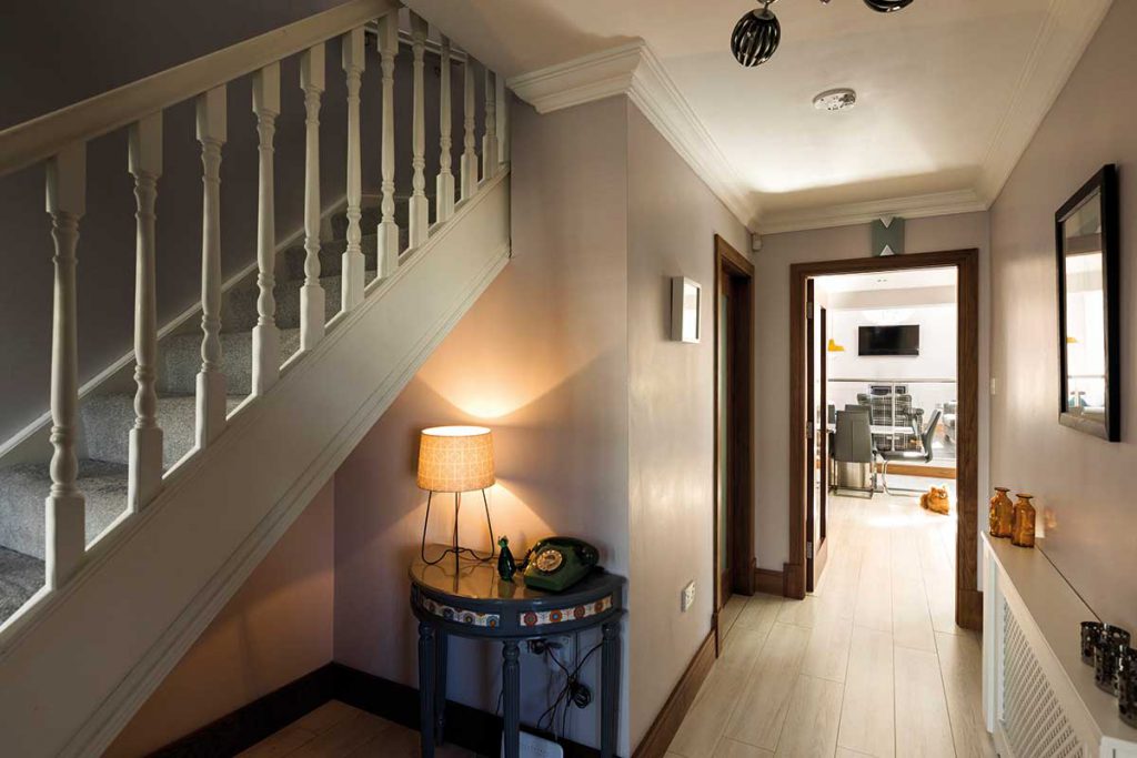
As with many families, the motivation to renovate was the need for more light and a more workable kitchen. “It’s not that we’re chefs but you couldn’t comfortably have more than one person at a time in the kitchen, we used to bump into each other,” says Enda.
Making the house work for them as a busy household was also important. “We wanted a porch to put down our stuff at the door and prevent a draught, but we also knew that a second living space was going to make everyone’s life much easier, especially for our 16-year old daughter Laoise.”
As the extension is less than 40sqm they did not require planning permission. In terms of thermal comfort, the couple had already invested in an energy upgrade a few years previous. “Enda doesn’t really feel the cold so when he lived there on his own, heating wasn’t an issue,” says Clíodhna.
“But when I moved in I thought it was nippy, even with the heat on, so we went for the government grant to get the attic pumped with insulation and did the walls too, and that made a huge difference to the comfort levels in the house.”
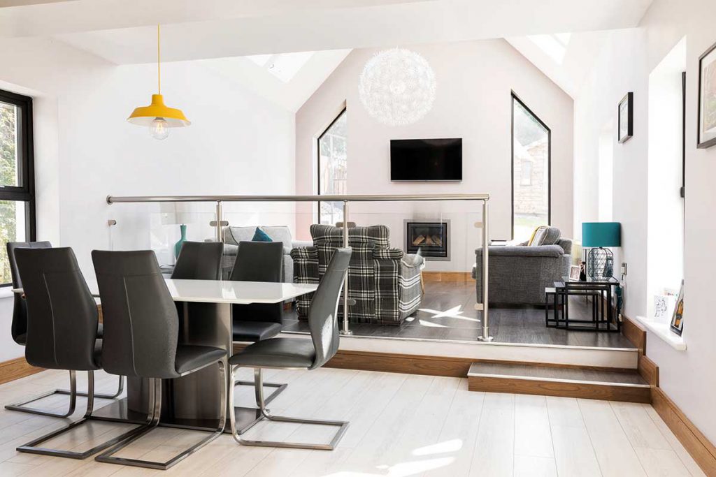
‘Because the space was small, we needed a way to provide a definite divide without it being too stark.’
New living space
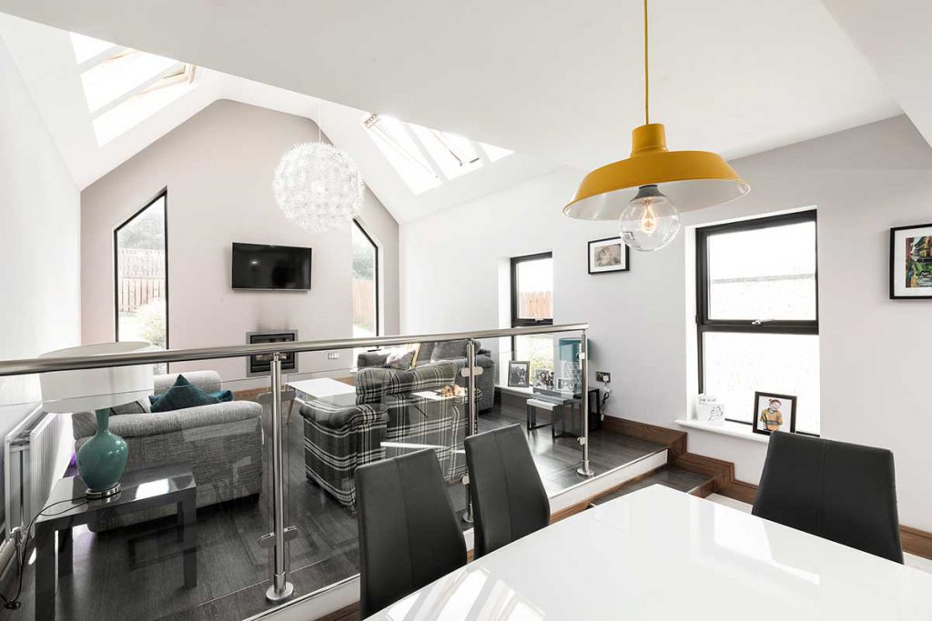
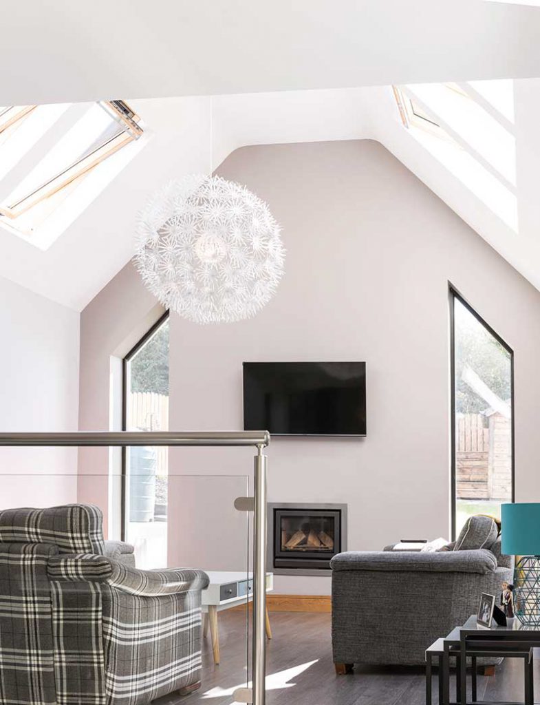
“We were sure of one thing: we didn’t want a box attached to the back of the house,” recounts Enda. “The solution Martin came up with was to build high walls on both sides and vertical glazing on either side of the stove – we still have no blinds up and don’t feel a need for them.”
“During the winter months we only need a minimal amount of heating and the spacious living room is easily heated by the wood burning stove.”
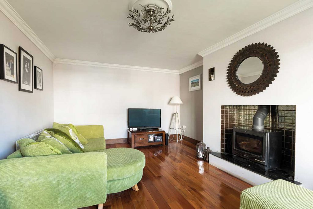
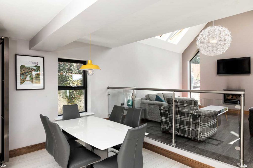
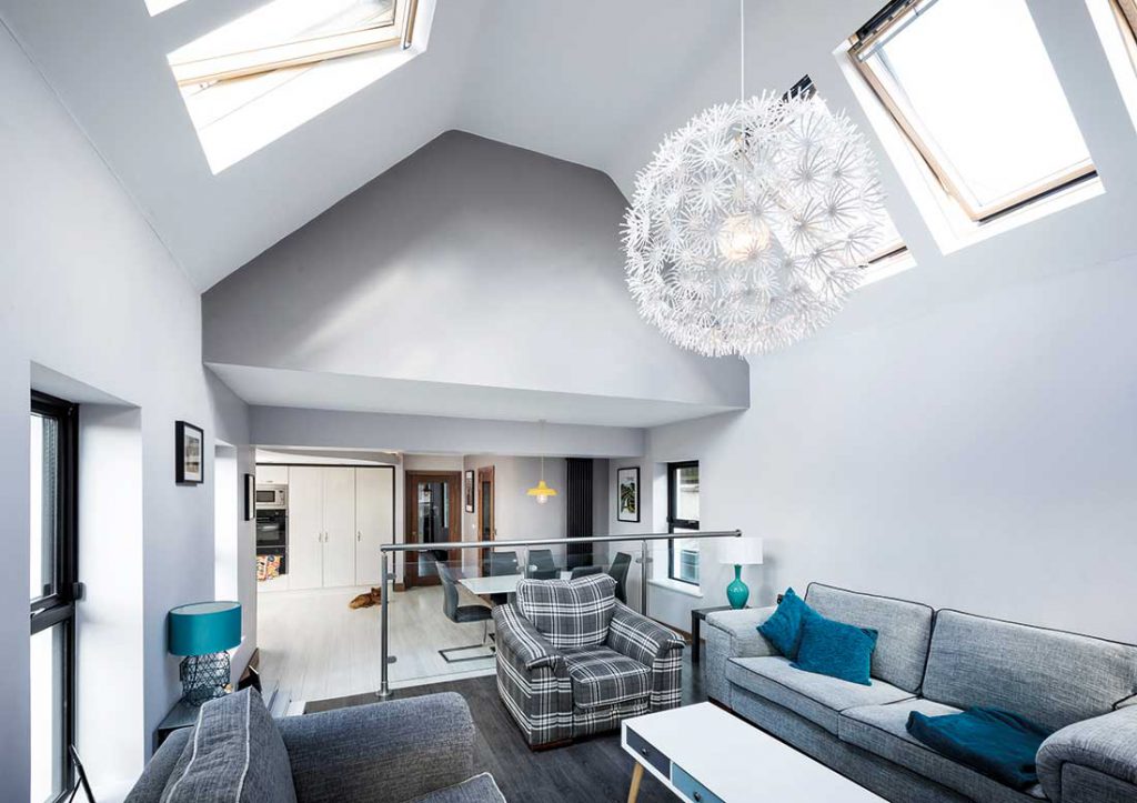
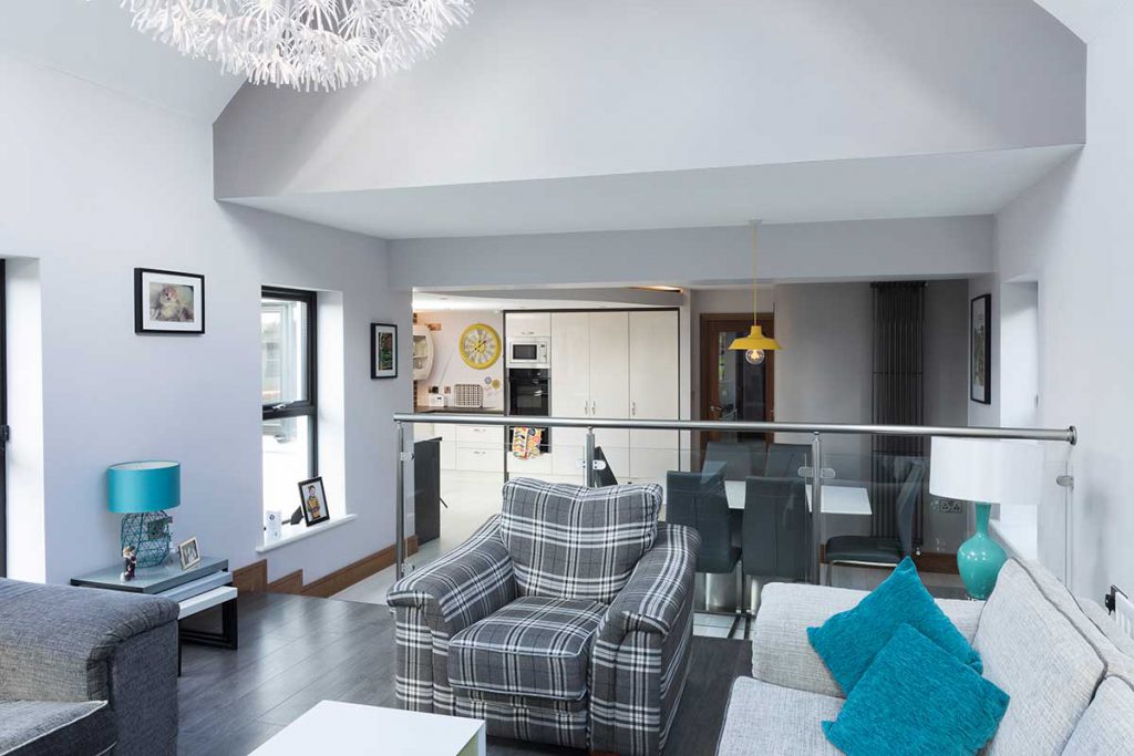
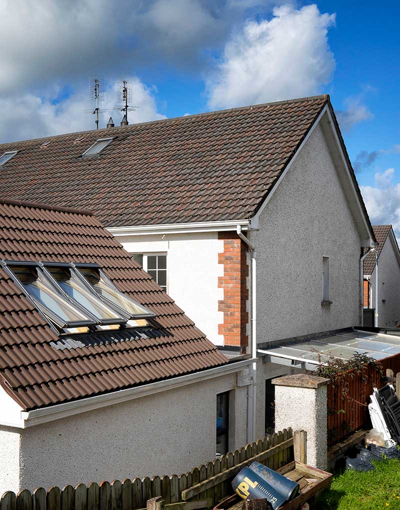
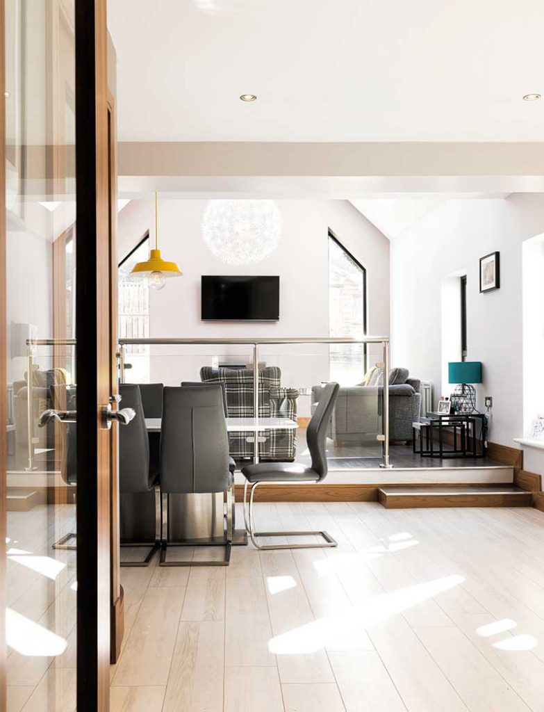
“Inside, we wanted a difference in levels between the kitchen and new living area. Because the space was small, we needed a way to provide a definite divide without it being too stark. So we raised the living area where the patio used to be.” The extension is flooded with light from above with the help of a set of six rooflights, three on either side. “Our builder told us it would be cheaper to install two large rooflights but Martin insisted it would look better to have them in sections,” adds Clíodhna.
The use of standard rooflights proved to be a cost-effective way of creating a cathedral like effect in the raised living area; once you’re in it you don’t realise the fact that there are no side windows on the long elevations. “It keeps the focus in the room and the flow from the existing house out into the new extension is so natural, you can’t tell where one begins and the other ends.”
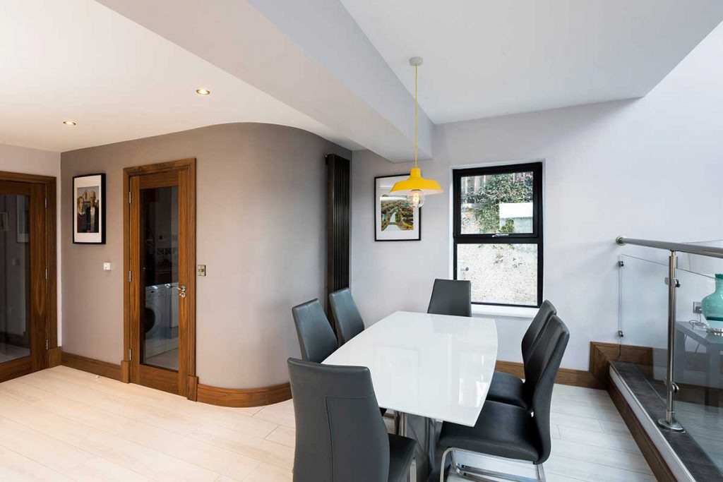
“We went with Martin’s vision and we’re delighted we did because at the time, we couldn’t tell. It was a bit like watching Dermot Bannon on TV, why fight with him if you trusted him to design it in the first place? The builder also suggested adding a window at the kitchen table, which wasn’t in the original plans, and we decided to go with his suggestion in that instance. It definitely does let in more light in that area. We realised it was the right call once we were on site.”
In terms of the configuration, they also debated quite a bit about the size of the utility room. “It would be nice for it to be bigger but I didn’t want too much to be taken out of the dining area,” explains Clíodhna. “So what we ended up with was a shorter but wider space than what we had before.”
The kitchen is purposefully tucked away from the other daily activities. “I love how well separated everything is, and I especially like being able to close off the glazed hall door,” she adds. “I also love the glass panelling with chrome hand rail between the living/dining areas, it creates a division without blocking light and you can see right through.”
Adding the floor space however did require that they invest in a new boiler. “Because of the extension, we needed to add two radiators in the living room and another, floor to ceiling, in the kitchen area,” explains Clídohna. “There was an increase in the energy bills as a result but nothing dramatic.”
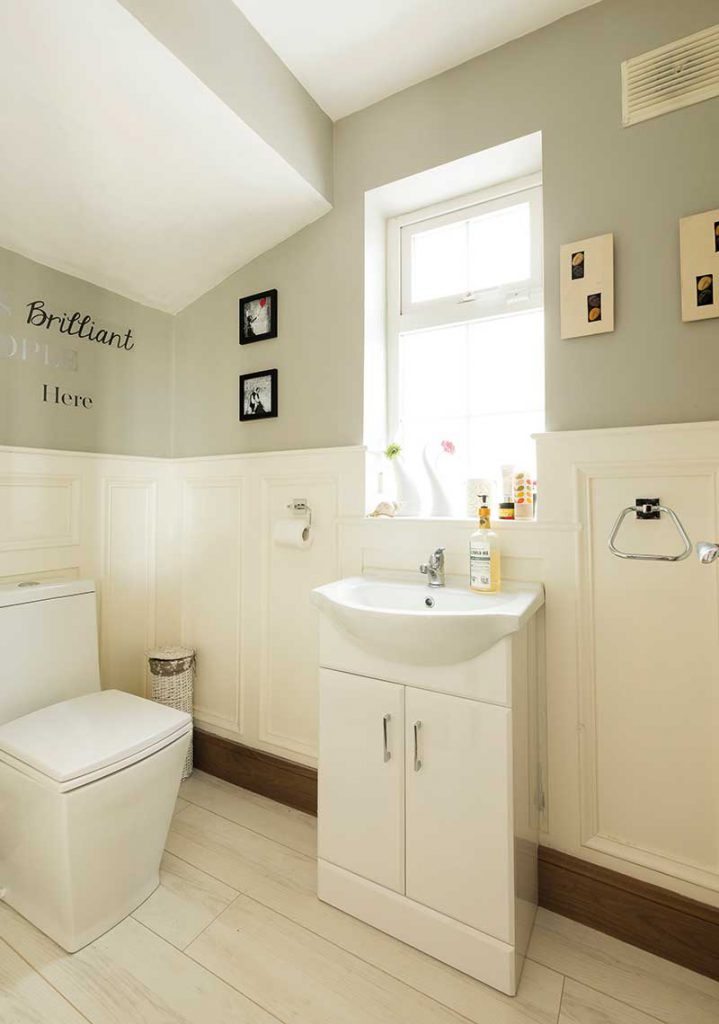
There is however now a noticeable difference in temperature between the new living room and the teenage-den sitting room in winter. “Even though we insulated at the front it’s not to as high a specification as the new part of the house, and the windows are double glazed as opposed to triple,” comments Clíodhna.
‘With the large windows and highly insulated walls and roof, no heating is needed for at least six months of the year…’
Choices, choices
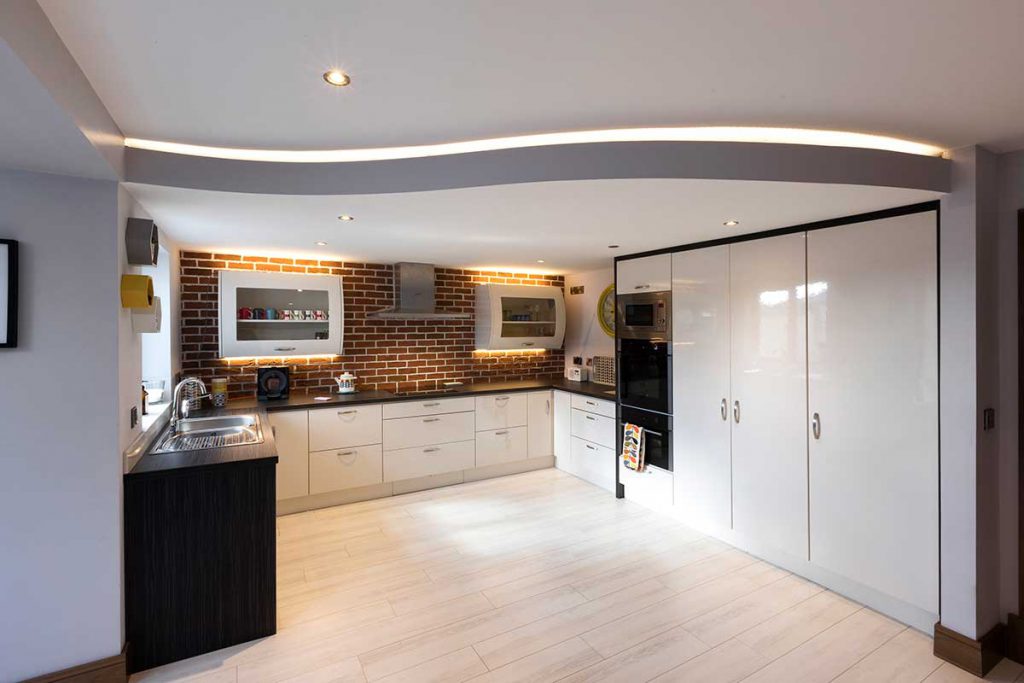
Clíodhna and Enda had their builder picked out very early on, and also knew their electrician, plumber and kitchen supplier. “We were lucky that we had connections in the trade, it made choosing who we would be working with a lot easier,” she confides. “It also helped that we had a clear idea of what we wanted, for example I was adamant that I didn’t want an island or breakfast bar, I felt we just hadn’t enough space. It was important for me to be able to open the dishwasher when someone else would be at the cooker.”
Artificial lighting was also pivotal to the design. “To add to the wow factor Martin helped design a stunning feature at the kitchen, we lowered the ceiling for definition and added LED mood lighting to highlight the curve.” “It’s independent from the roof, we built a frame that’s running between the two walls. I saw it in a pub and really liked it,” explains Clíodhna. “Martin said that if we dropped the ceiling we should have the tiles go up to it, so we went with that and it does bring it all together.”
“Apart from the two pendant lights we went with lamps to provide warmth and if we need them, we also have lights under the kitchen presses.” The floor finish is laminate, white in colour from the front door and charcoal in the new sitting room. The extension was completed three years ago and they’re still struggling to think of what they would change. “I can’t believe how much we got out of that extra bit of space, it’s completely transformed our enjoyment of the house.” With many more years to come!
Q&A
Would you do it again? Yes I would, I really enjoyed the design process.
What advice would you give? Don’t just build a box, get someone with expertise in design as they’ll know what’s the best thing to build in that space with the money that you have. We’d drawn so many sketches, we had so many ideas in our heads, and Martin turned it all around to produce something much better.
What surprised you? I didn’t expect to be able to live without a kitchen for 12 weeks but it wasn’t as bad as I expected. Although, much to my surprise, I did get sick of eating Chinese!
Wall: cavity wall (100mm blocks on internal and outer leaf) filled with 150mm PIR insulation boards and cavity closer together with 50mm insulation with 12.5mm plaster board to inner leaf. U-value 0.14W/sqmK
Roof: cut timber roof rafter sizes 50×150, collar size 50×150, hanger size 50×150, 150mm PIR between rafters with 82.5mm PIR insulated plasterboard to underside of sloped ceilings, 400mm of attic quilt insulation between and above ceiling joists. U-value 0.18W/sqmK
Floor: 100mm sand cement screed on 125mm PIR insulation horizontally with 25mm PIR on vertical edge, on 100mm concrete on compacted hardcore. U-value 0.13W/sqmK
Windows: triple glazed, uPVC, U-value of units 0.77W/sqmK and G-value 0.38
Kitchen Tips
Consider how you cook. I love the kitchen waste disposal unit at the sink (even though the dog hates how noisy it is). It’s just brilliant for all the scraps.
Get rid of the kettle. The hot water tap is brilliant, I wouldn’t do without it.
Give yourself enough room to manoeuvre. We made sure we could open fridges, dishwashers and so on without affecting the movement of others in the kitchen.
Suppliers
Insulation grant: Better Energy Homes Scheme from the Sustainable Energy Authority of Ireland, seai.ie
Design and supervision: J. Martin McLaughlin B.Eng (Hons) CEng MIEI of October House Design Ltd, Ballyshannon, Co Donegal, octoberhouse.org
Building contractor: Niall Mulligan Construction, Castleblayney
Plumbing: John Mc Geough Plumbing, Castleblayney, Co Monaghan
Electrician: Declan Mc Guire Electrical, Castleblayney, Co Monaghan
Floors: Irwin Tiles & Hardwood Flooring, Castleblayney, Co Monaghan
Insulation: Kingspan Insulation, kingspaninsulation.ie
Kitchen: Colt Design, Castleblayney, Co Monaghan
Electrical Appliances: Watters Electrical, Culloville, Co Armagh
Photography: Paul Lindsay at Christopher Hill Photography, Belfast, Co Antrim

