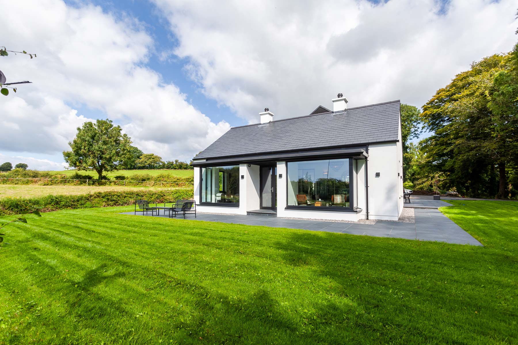
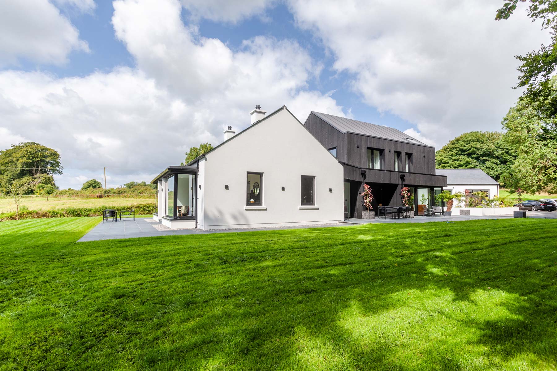
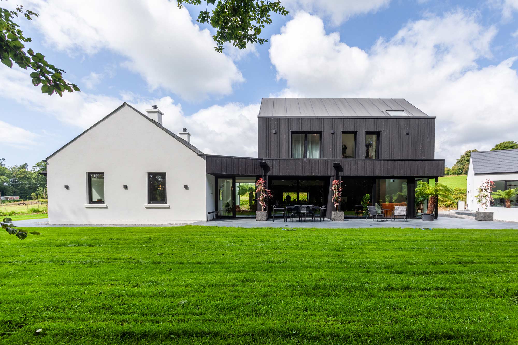
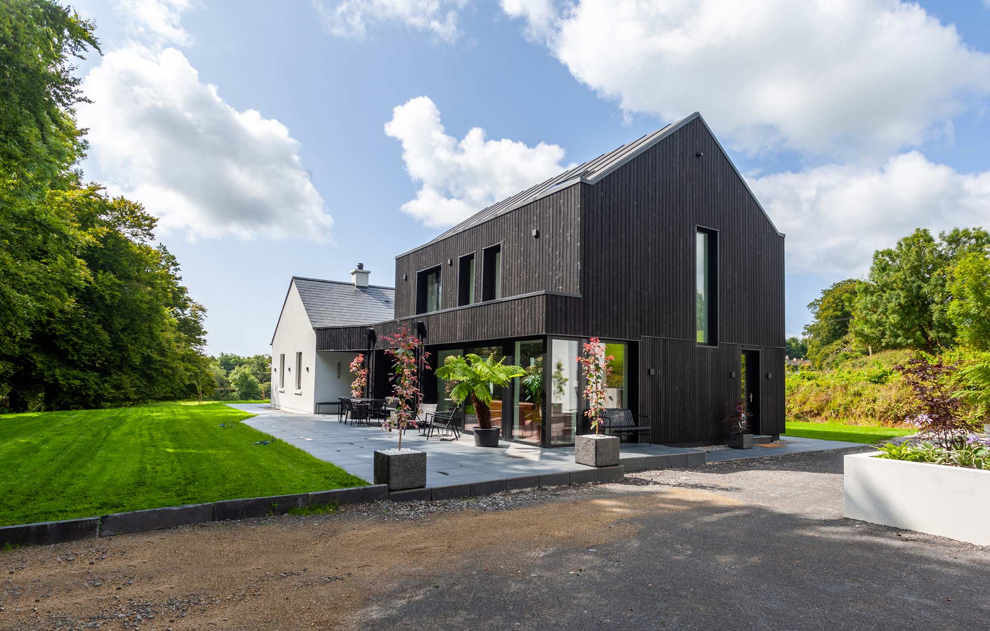
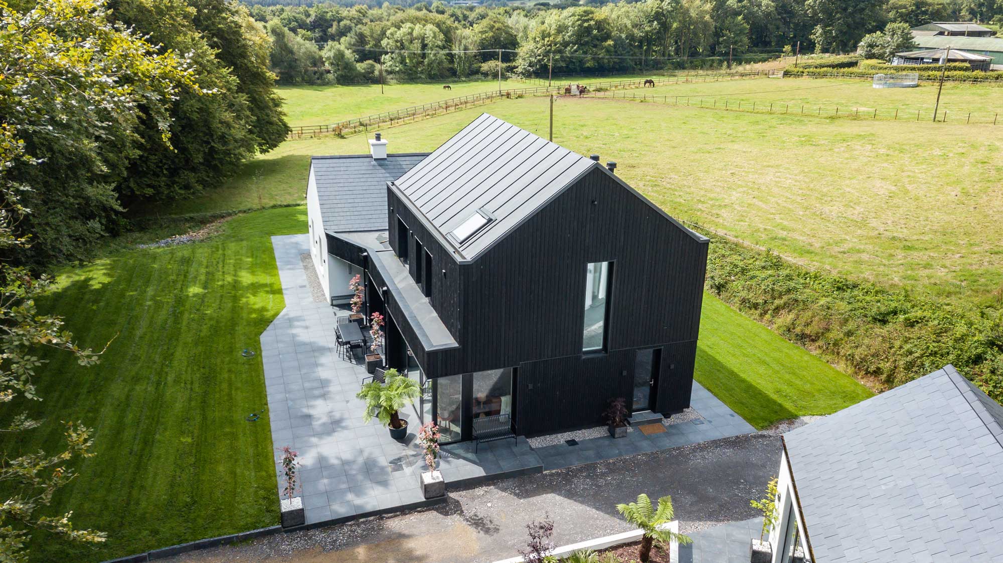
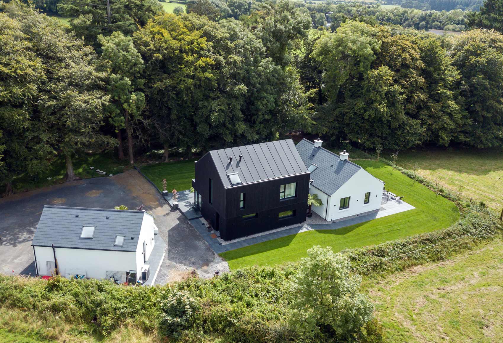
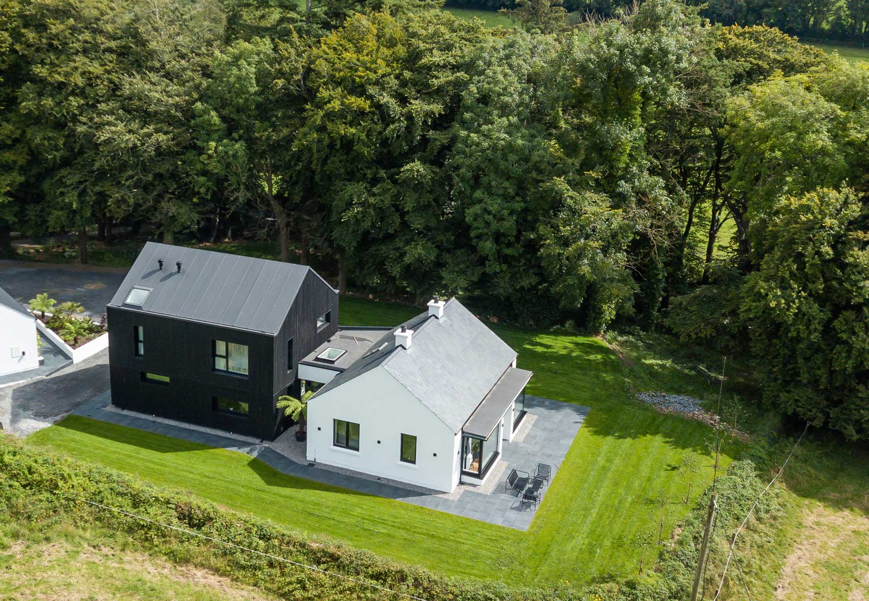
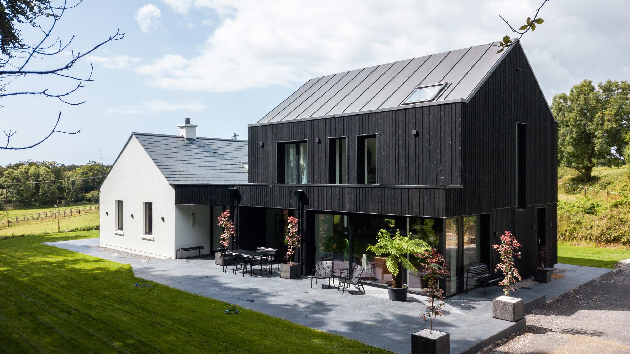
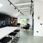
Finalist for RTÉ Home of the Year 2024, this clever redesign breathed new life into a mud built cottage in Co Waterford.
In this article we cover:
- Build costs, timeline and spec
- Material price increases and how much it added to the build
- State of the cottage and first steps
- Planning permission process including conditions
- Repairs to existing cottage
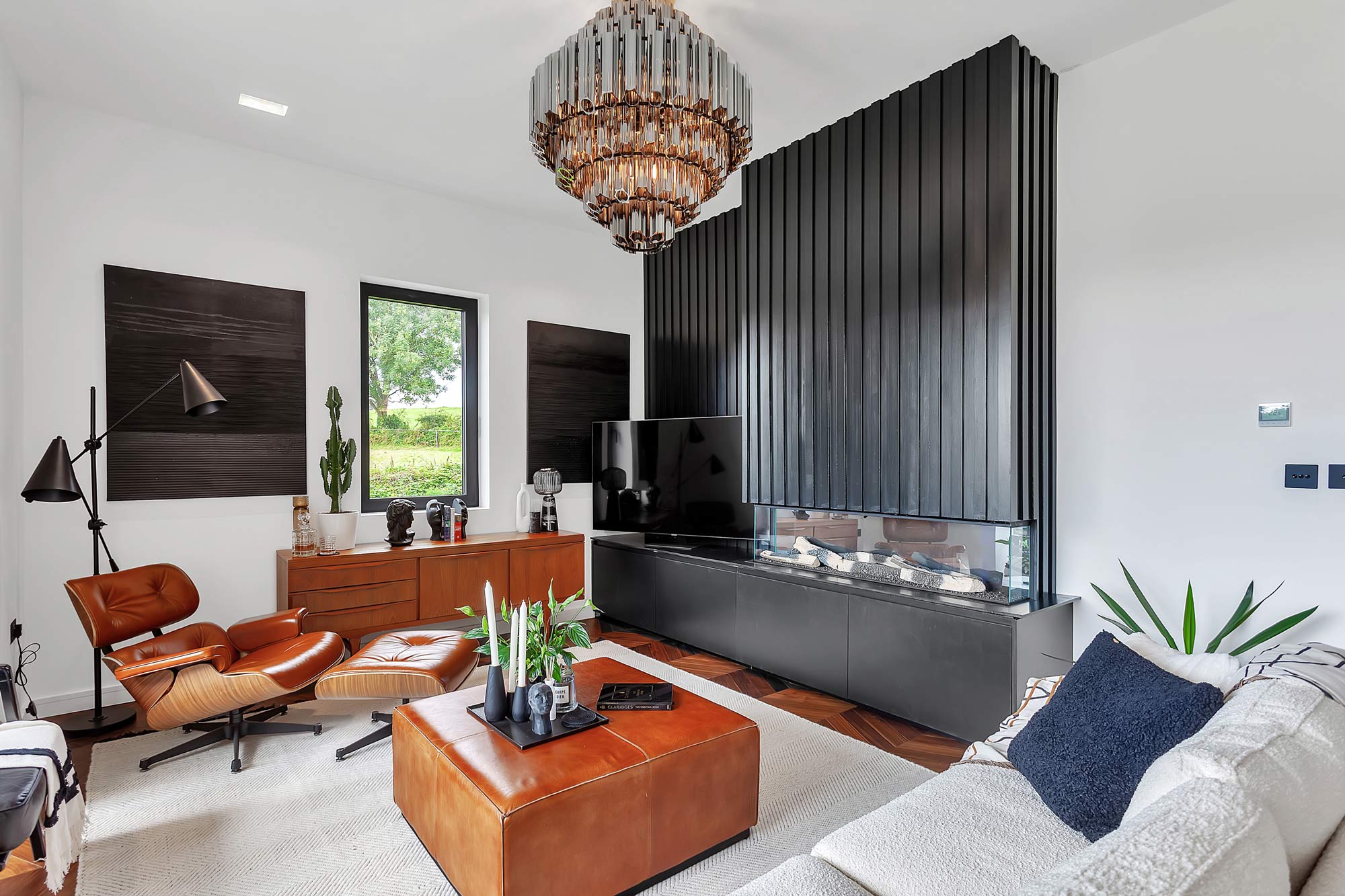
- Mid century monochrome design details
- Pros and cons of uPVC roofing
- Floor finishes – what they did and what would do differently
- Kitchen design
- Lighting design
- Colour choices, window choices
- Top tips for those undertaking a renovation and extension project
- Project evolution from start to finish
- Floorplans and supplier list
- Professional photographs
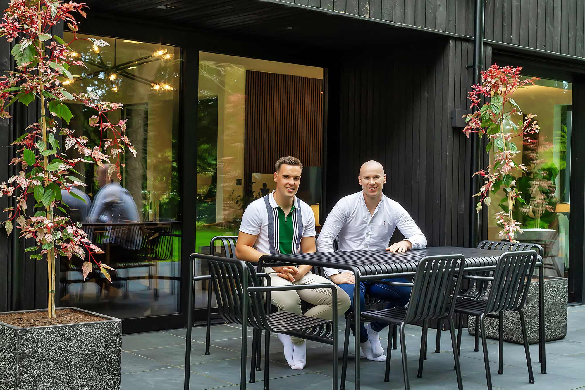
The decision to buy this property was deeply rooted in personal history, says Craig. “It sits on the outskirts of the village where my parents and I grew up; on the road where my grandparents used to live.”
“We used to pass by it on walks with my grandmother down to see the horses at the end of the lane or whenwe went collecting conkers from the chestnut tree nearby. She would oftenjokingly warn us that it was the ‘witch’s house’, no doubt to keep us young onesin line. At that time, only the roof was visible as it was surrounded by a 20ft coniferous hedge and a forested area, so it was easy to believe the spooky tale she told.”
House size before: 120sqm
House size after: 250sqm
Bedrooms: 3
Plot size: 1.6 acres
Site cost: €165k
Build cost: €450k
BER: A1
Heating system: heat pump
Ventilation: centralised mechanical with heat recovery
Build method: blockwork
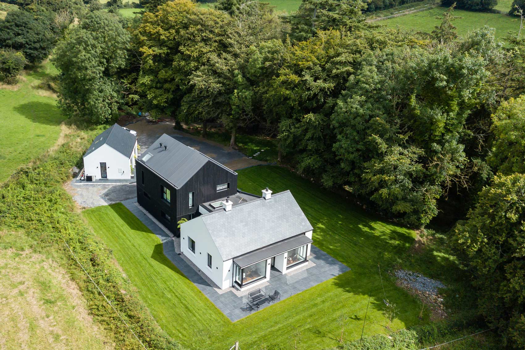
The warning didn’t put off the grownup Craig however, who ended up buying the cottage, renovating and adding a modern two storey extension.
“One of the first jobs we did, after purchasing it, was to cut down those hedges,” he says. “They were so high and close to the house meaning it was in shade throughout the day and this had created a damp, mossy environment. It was a major revelation to see the far reaching views we had once those hedges were removed.”
“The forested area, which in the springtime is filled with bluebells, snowdrops and daffodils, has been a part of the landscape for decades. By cutting down the conifers we let in the light and the beauty of the surrounding landscape.”
Flying start
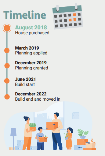
Craig and Dee started off by looking for an architect. “We spent quite some time following local architects in our area prior to engaging with Agnes and Bart’s architectural practice,” says Craig.
“We admired their previous work and contemporary aesthetic on similar projects in our area. They were a dream to work with and really nailed our brief to maximise the potential of our property and budget. They made the entire process simple and we really enjoyed fine tuning the details with them.”
With the help of their architects, plans were submitted for alterations to the existing cottage and the addition of a new extension. “The planning office requested a change to the height of the old building so we amended that and reissued it.”
The existing building was originally a mud and clay worker’s cottage with lime mortar and stone. “It had a cavernous floor,” explains Craig, “effectively a mud foundation so we had to overcome that. While we reinstated the lime mortar, we also took the opportunity to incorporate underfloor heating and upgrade the whole structure.”
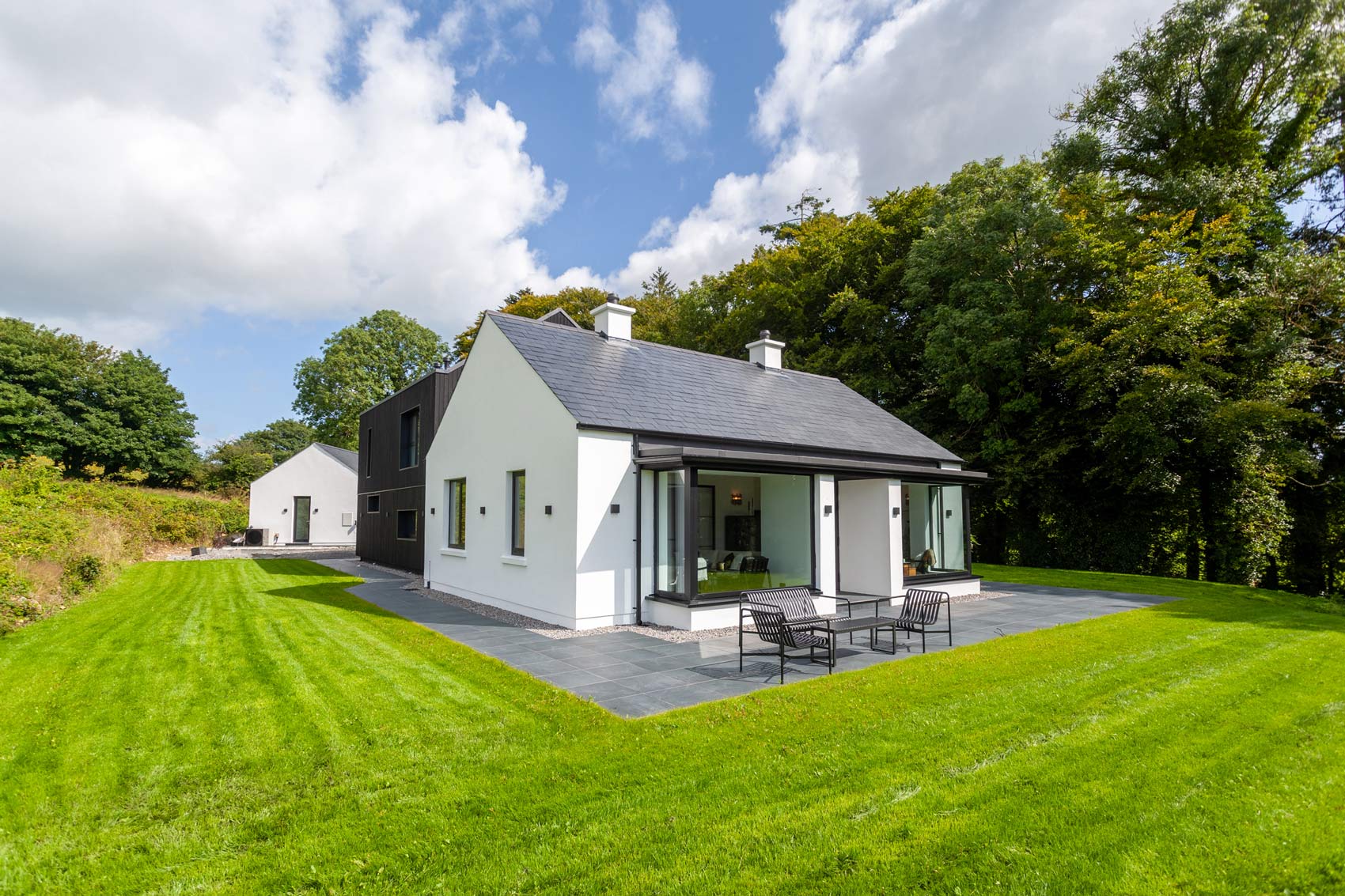
“We wanted to keep the impact of the old cottage’s large bay windows which are 8ft high by 10ft wide but we opted to upgrade them to a more modern style.”
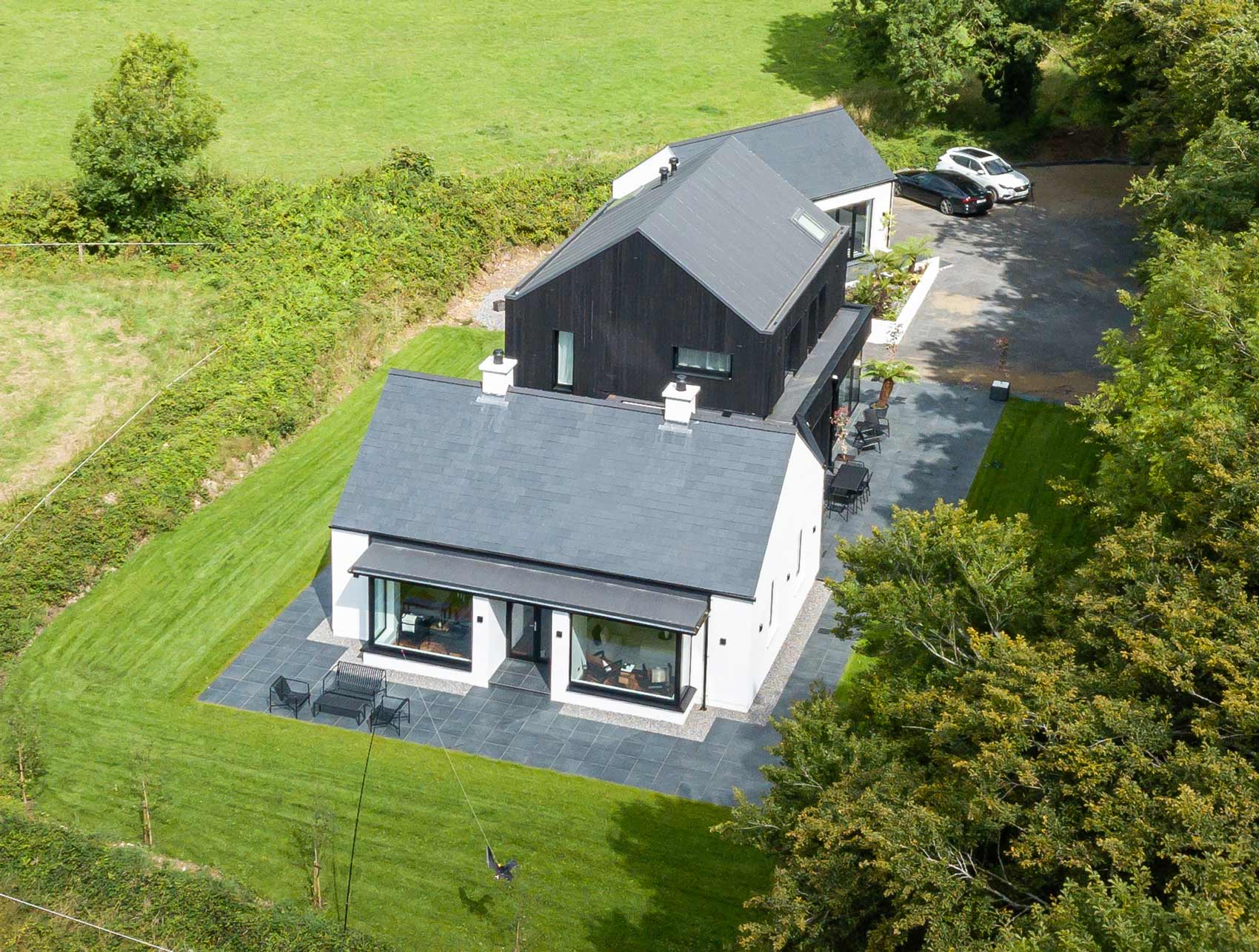
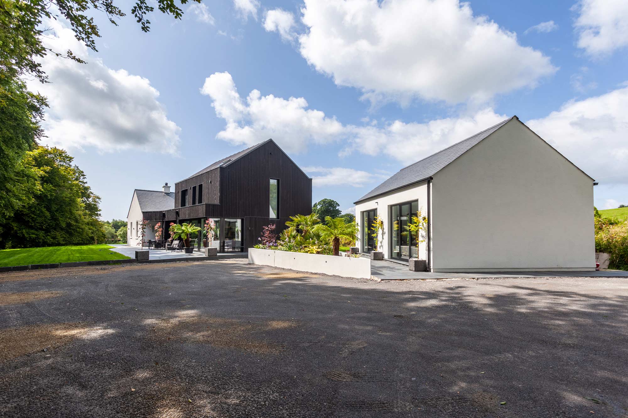
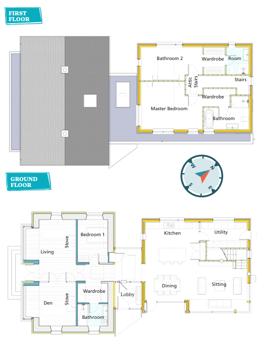
“To marry the old building with the two storey extension we raised the roof of the cottage to bring the profile in line with the new building and to make it look intentional. We linked the buildings with a glass box corridor.”
“That was kind of a planning trick. It didn’t qualify as a living area, but it gave us a little extra bit of space. When you’re in that space, you can see what’s old and what’s new and that is what we like. And even from the outside looking in, it’s pretty monochromatic. You know that the black part is new, it’s obtrusive and it’s different to the old part. Although they match in terms of profiles and sizes and so on, we wanted to show what was there before and what’s been added.”
“We reinstated a natural slate to the original cottage roof but used a uPVC membrane, with a standing seam for the extension. It has the look of pressed metal but it’s a softer product for noise resistance. Aesthetically, it’s just a little lighter in colour, more anthracite than black.”
“Our master bedroom and the primary guest bedroom sit beneath the roof of the extension to which we have also incorporated large rooflights. We were conscious that heavy rain could prove to be a noise issue. During a casual conversation with our builder, he suggested that if we opted for a pressed metal roof, the noise of the rain hitting the skylights would be the least of our concerns. That got me thinking and looking into alternative solutions which is when I came across the uPVC roofing system and its noise-reducing benefits.”
“However, it’s very labour intensive, as opposed to the metal standing seam which is simply rolled out and pressed. There’s a lot of prep work with uPVC – heating, tarring and joining, similar to a traditional asphalt roof. So, in terms of labour costs, it was much higher but the product cost was more economical than the pressed metal particularly then because the cost of metal had gone through the roof. Material wise, it’s more cost effective, but I’d just flag that anyone exploring that option look at labour costs as well and weigh them up to see which is more feasible.”
Most utilities were already in place at the cottage and required merely upgrades rather than a completely new installation.
Modern nostalgia
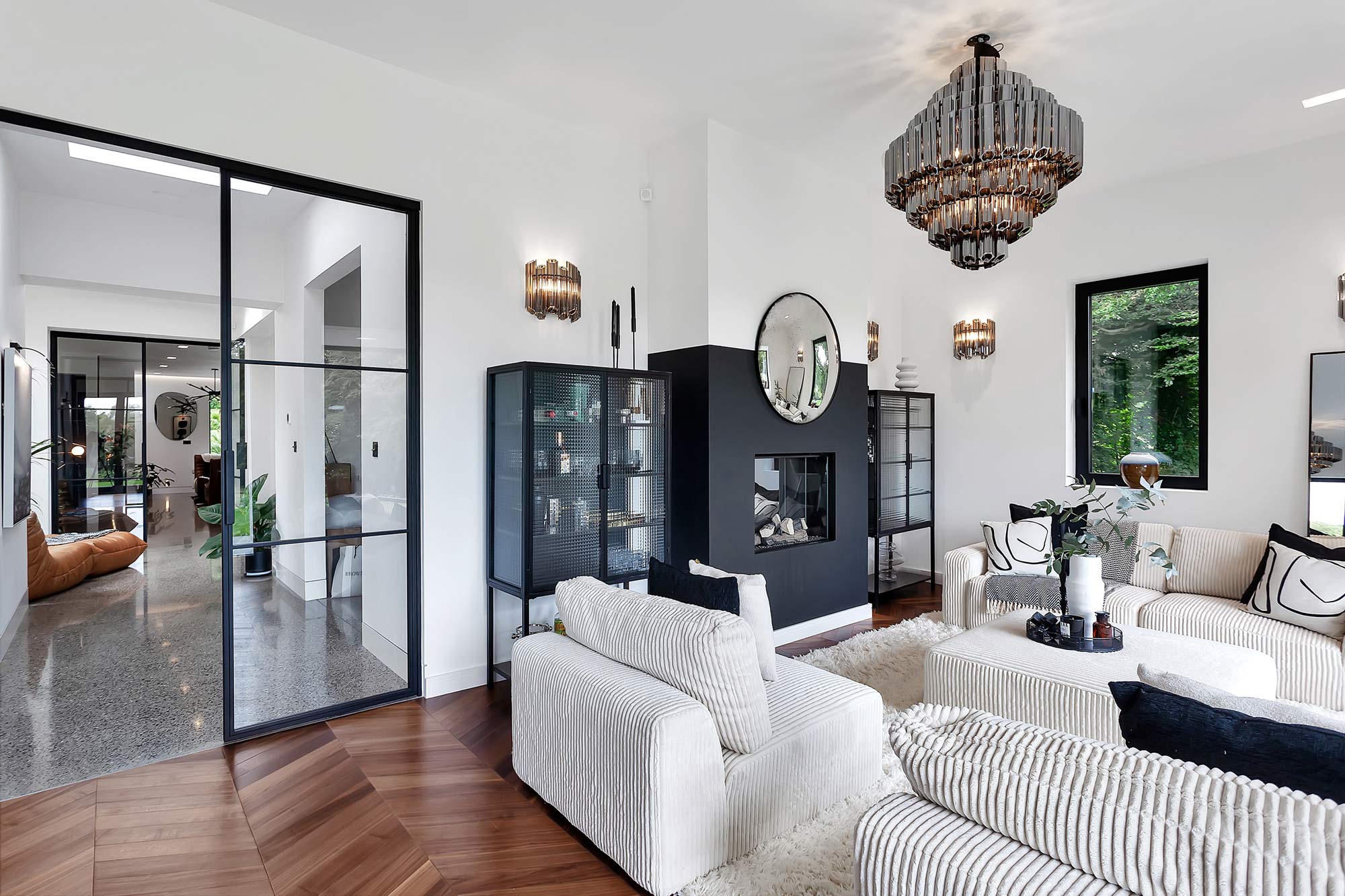
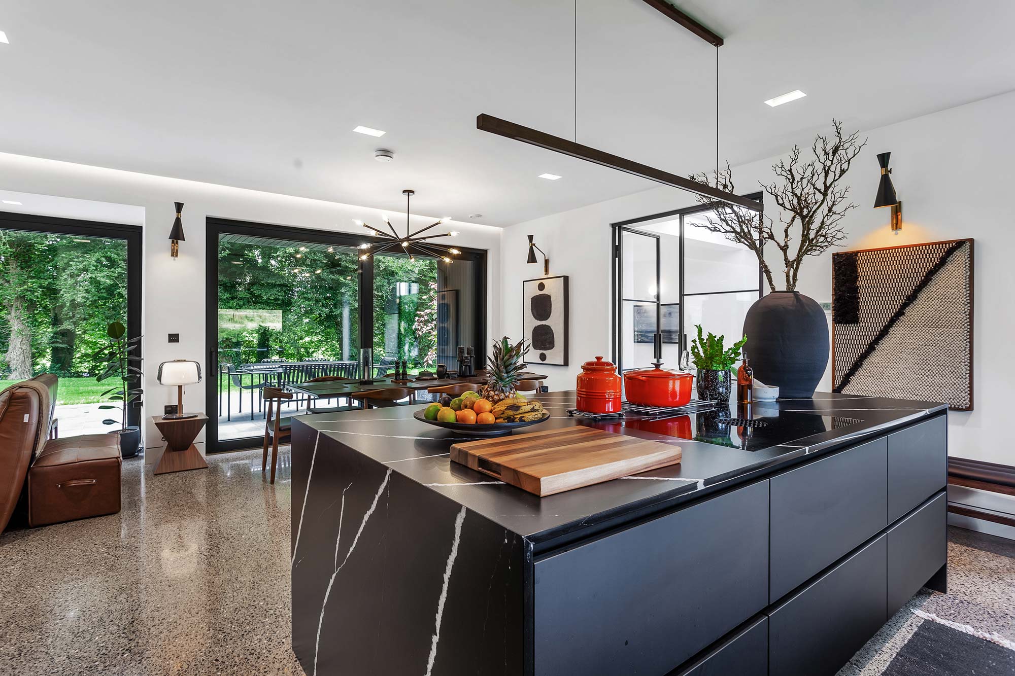
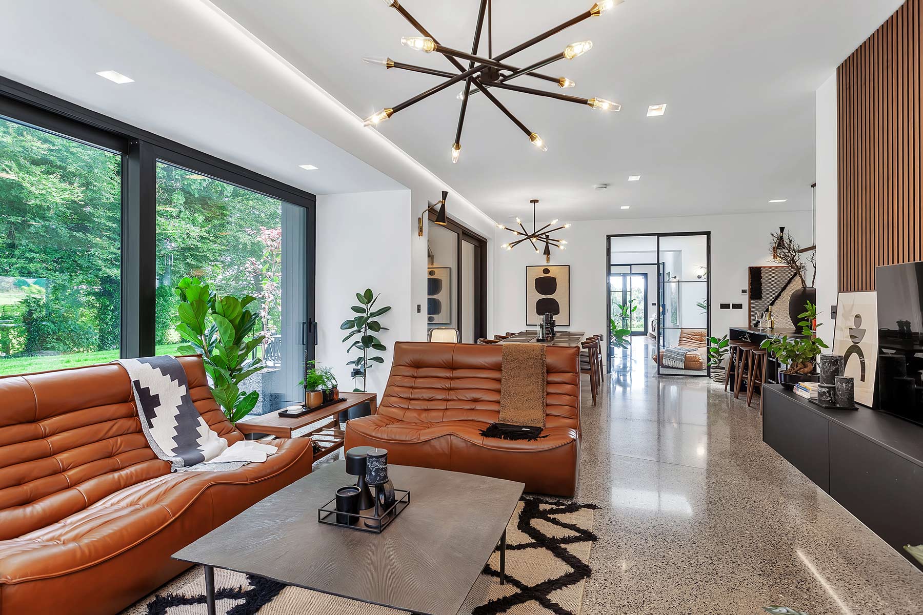
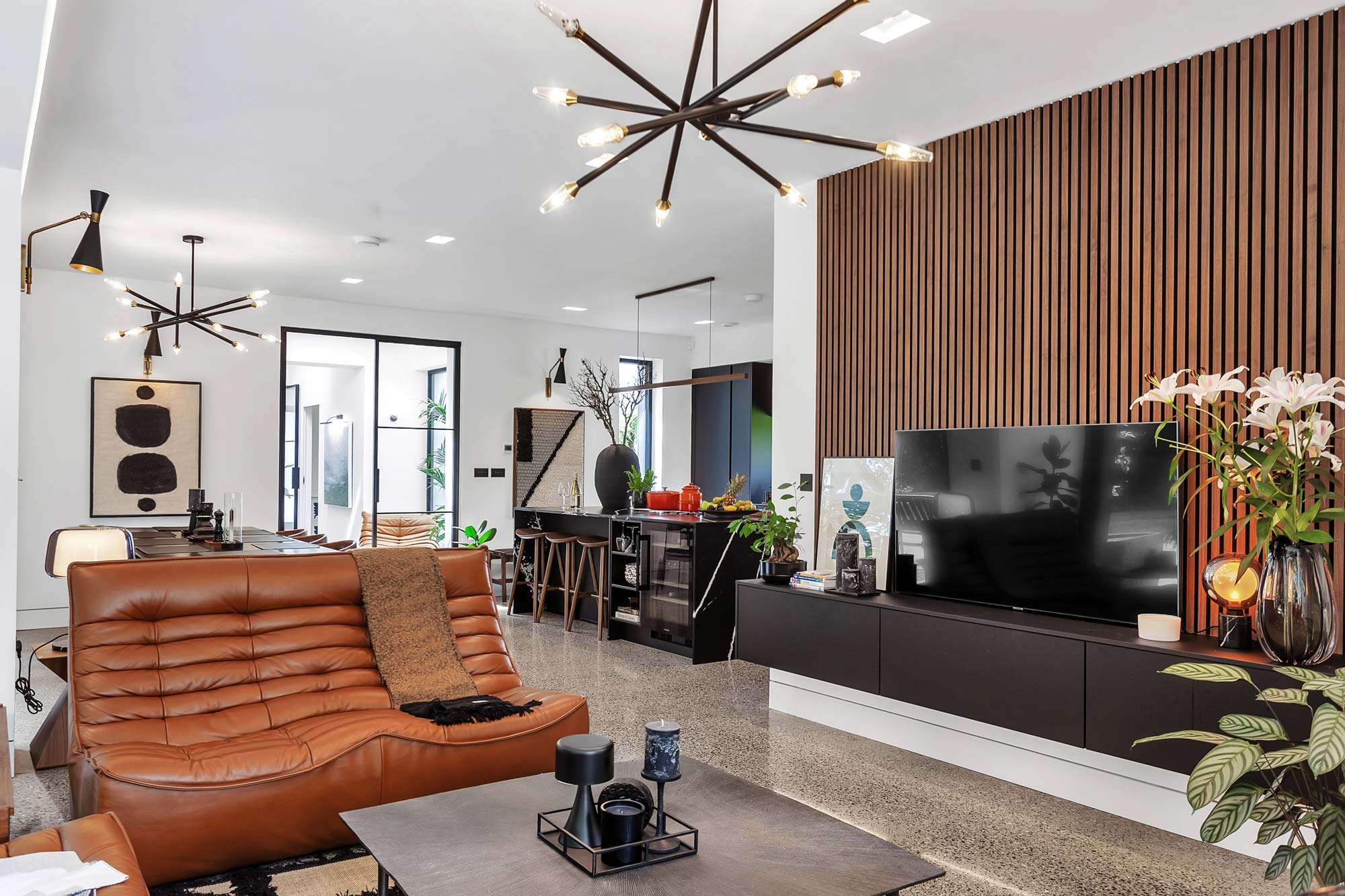
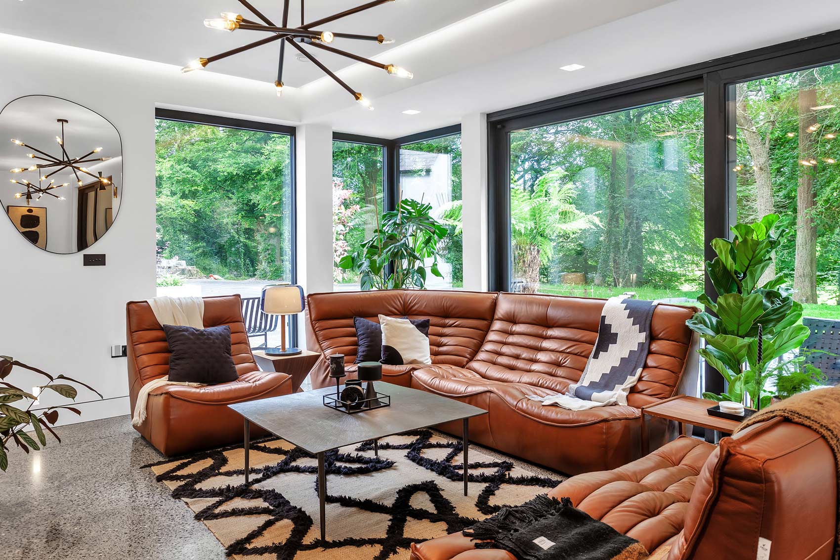
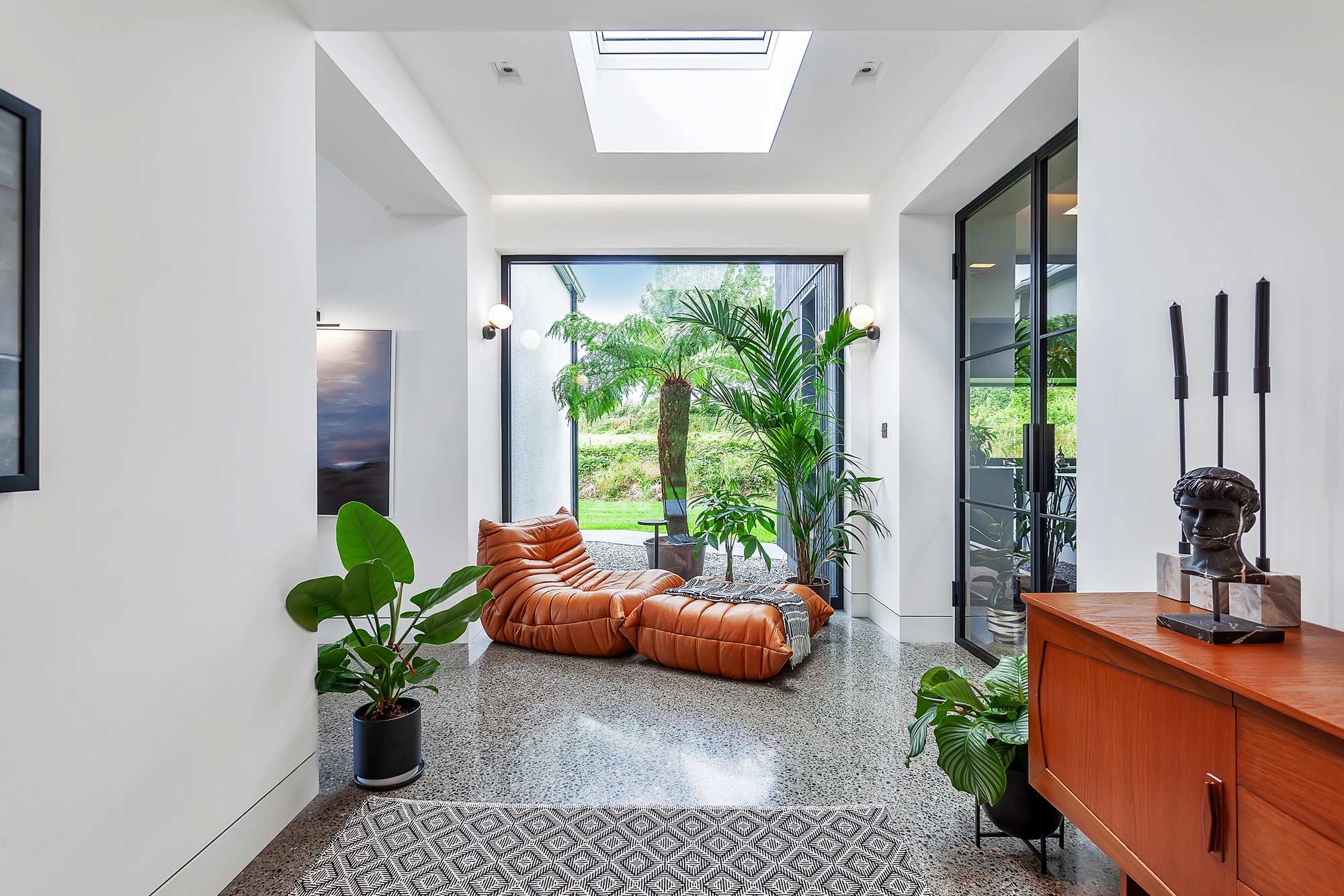
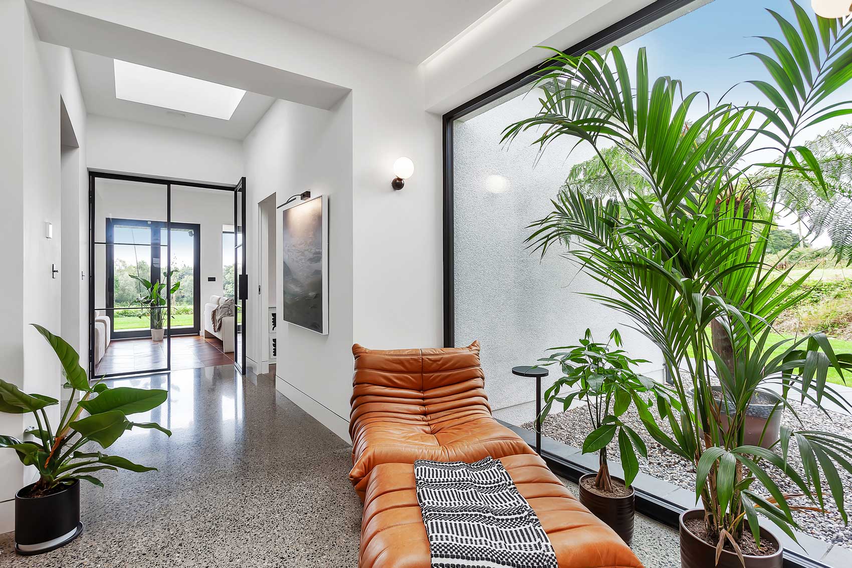
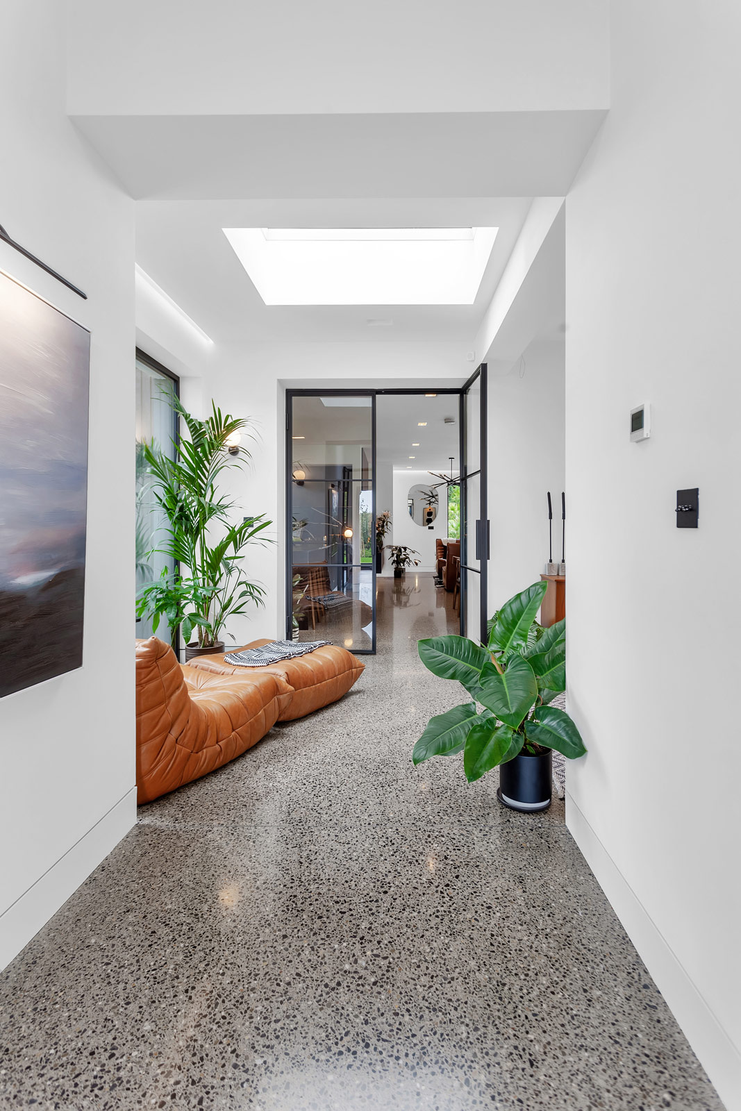
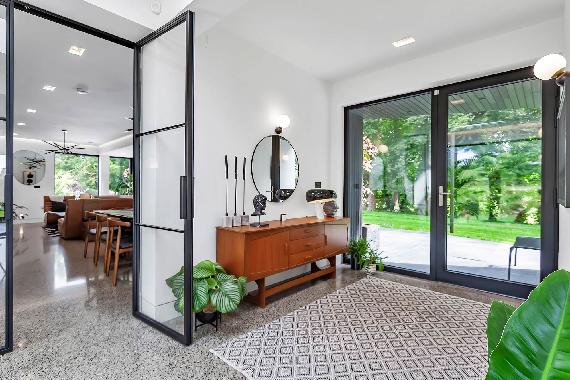
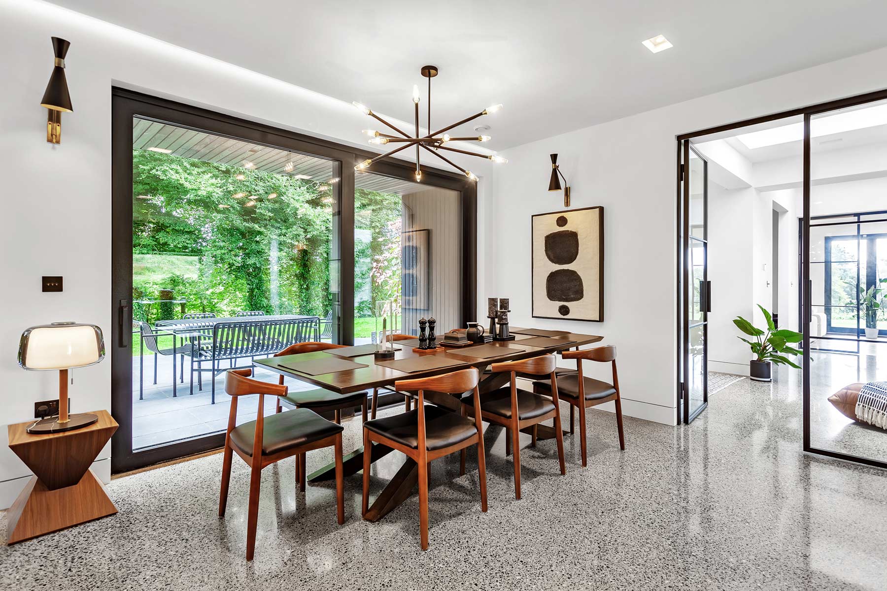
“Inside, we installed wooden flooring in the original structure and opted for a polished concrete finish in the extension. We aimed to distinctly separate the old from the new within the spaces – that was our primary objective, to have that definition between what was older and what was new.”
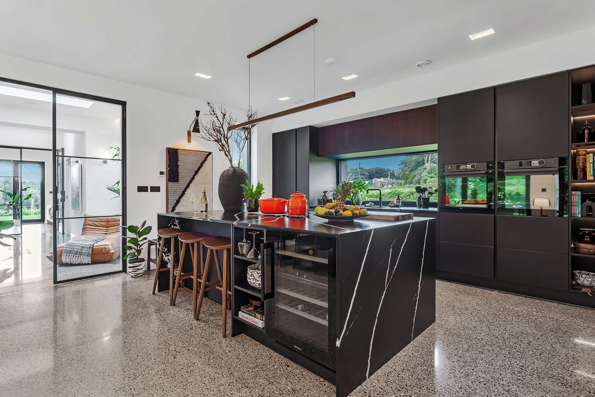
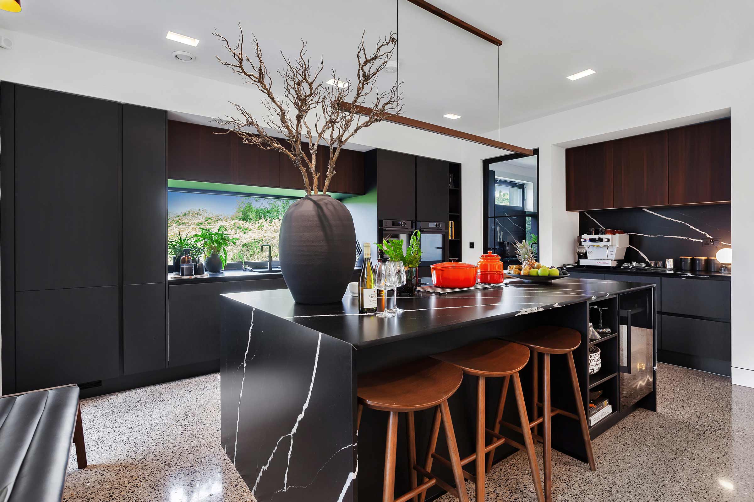
“For the kitchen, we wanted the whole open plan living space to link together and create a social hub. When someone is cooking at the kitchen island they’re able to have a conversation with someone seated at the dining table. We have a cosy little lounge space where you can also chat with whoever’s doing the cooking. The goal was to integrate the kitchen with the rest of the living spaces.”
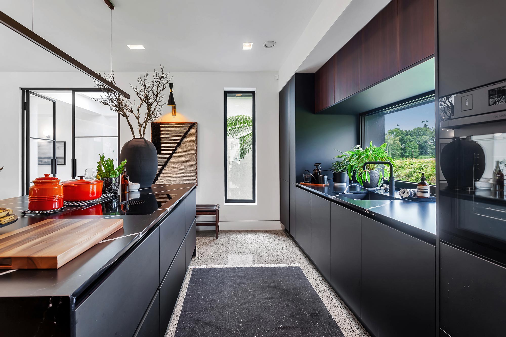
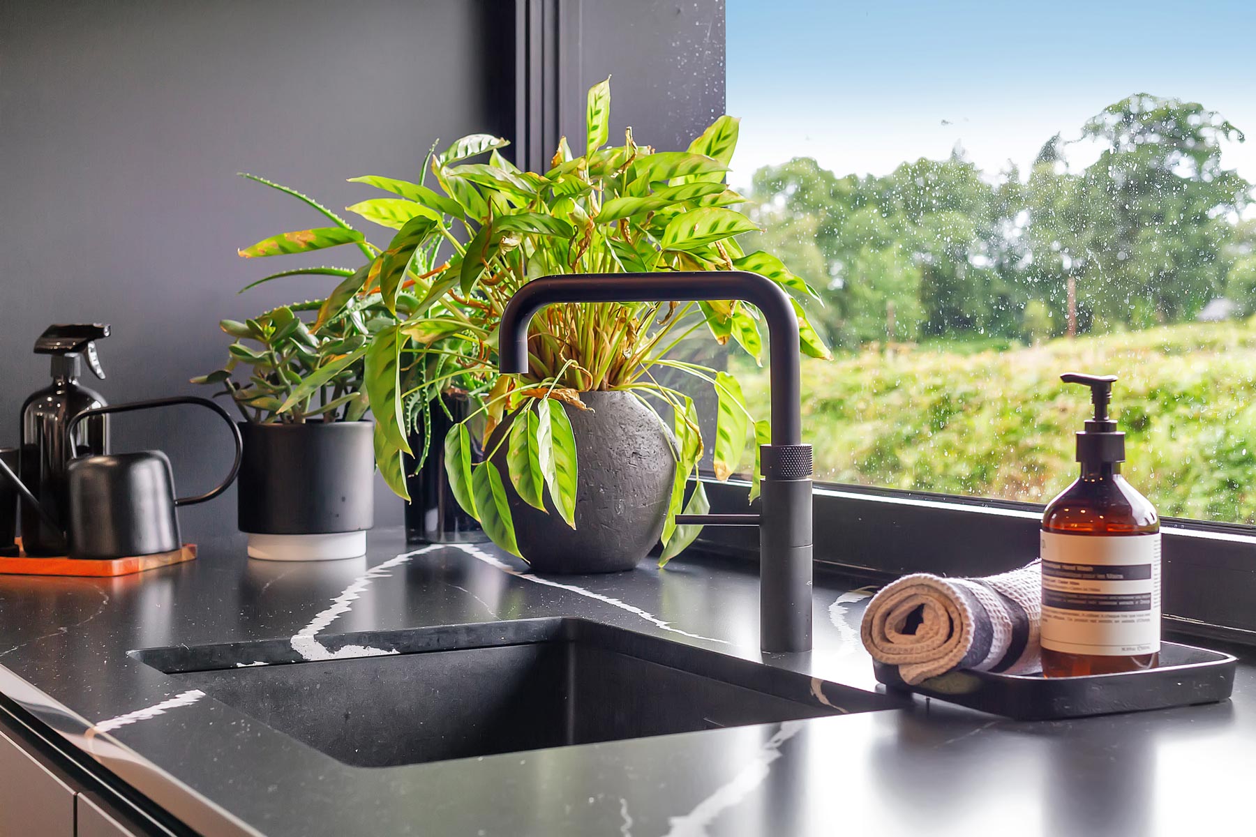
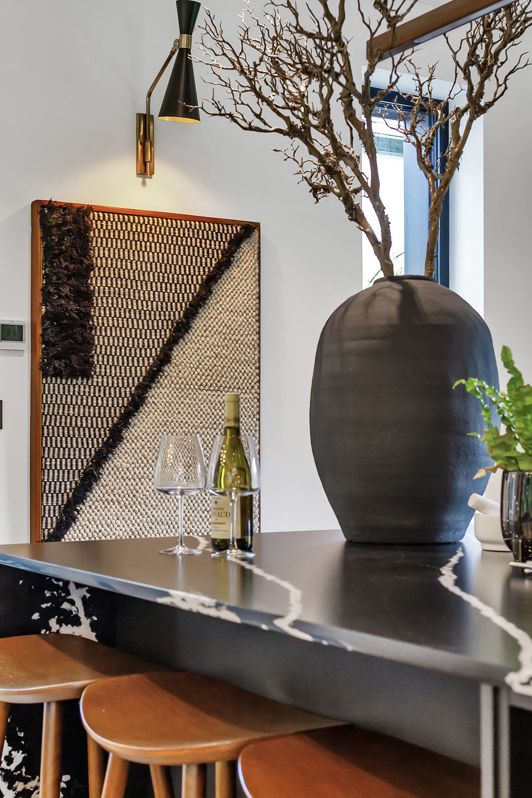
“We opted for a sleek black theme for the kitchen, complemented by a matte quartz stone on the island surface which absorbs the light rather than reflects it. We were conscious of the polished concrete and didn’t want to overdo the reflective surfaces so it was not overpowering or cold. It’s a warm space.”
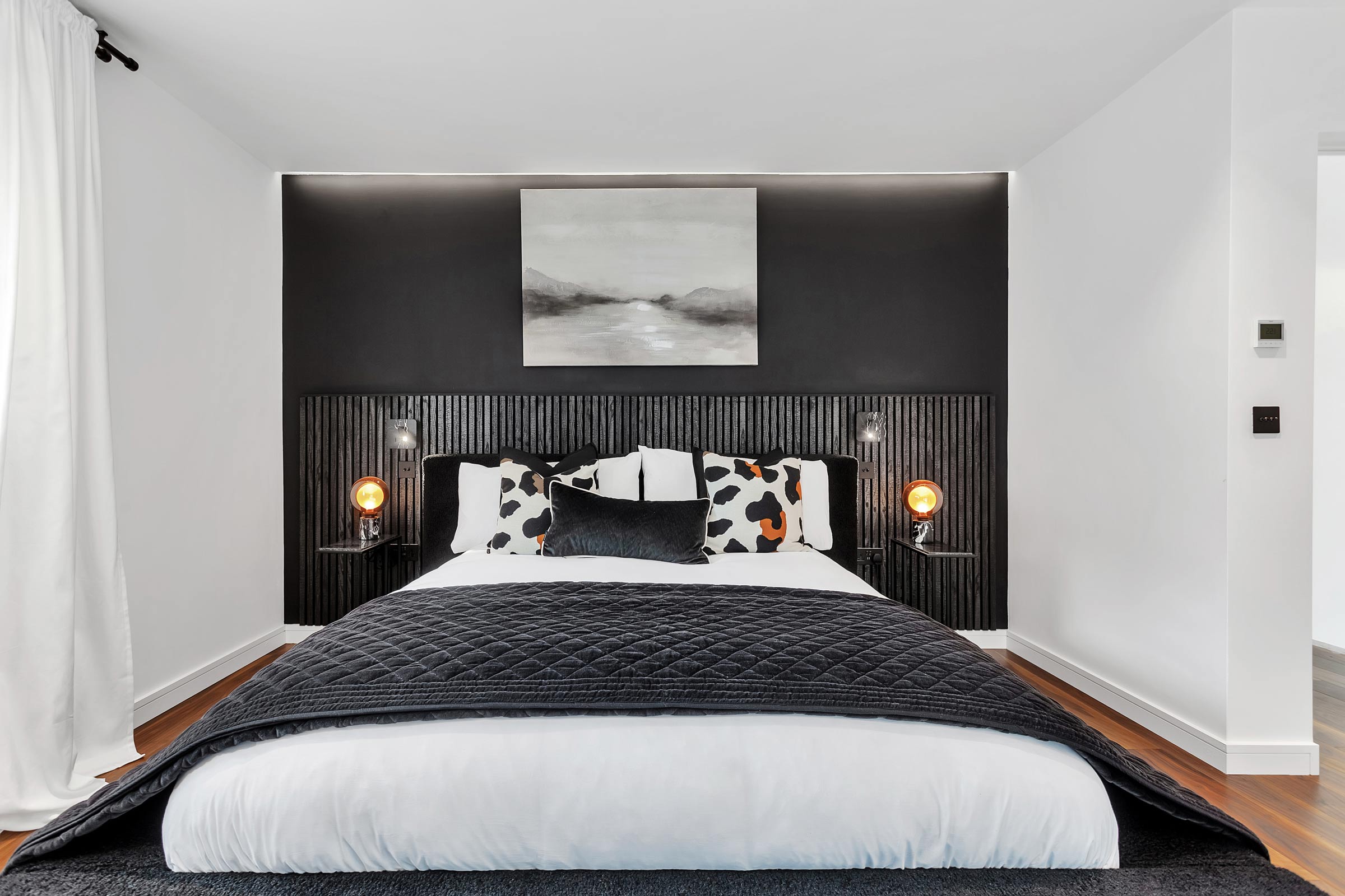
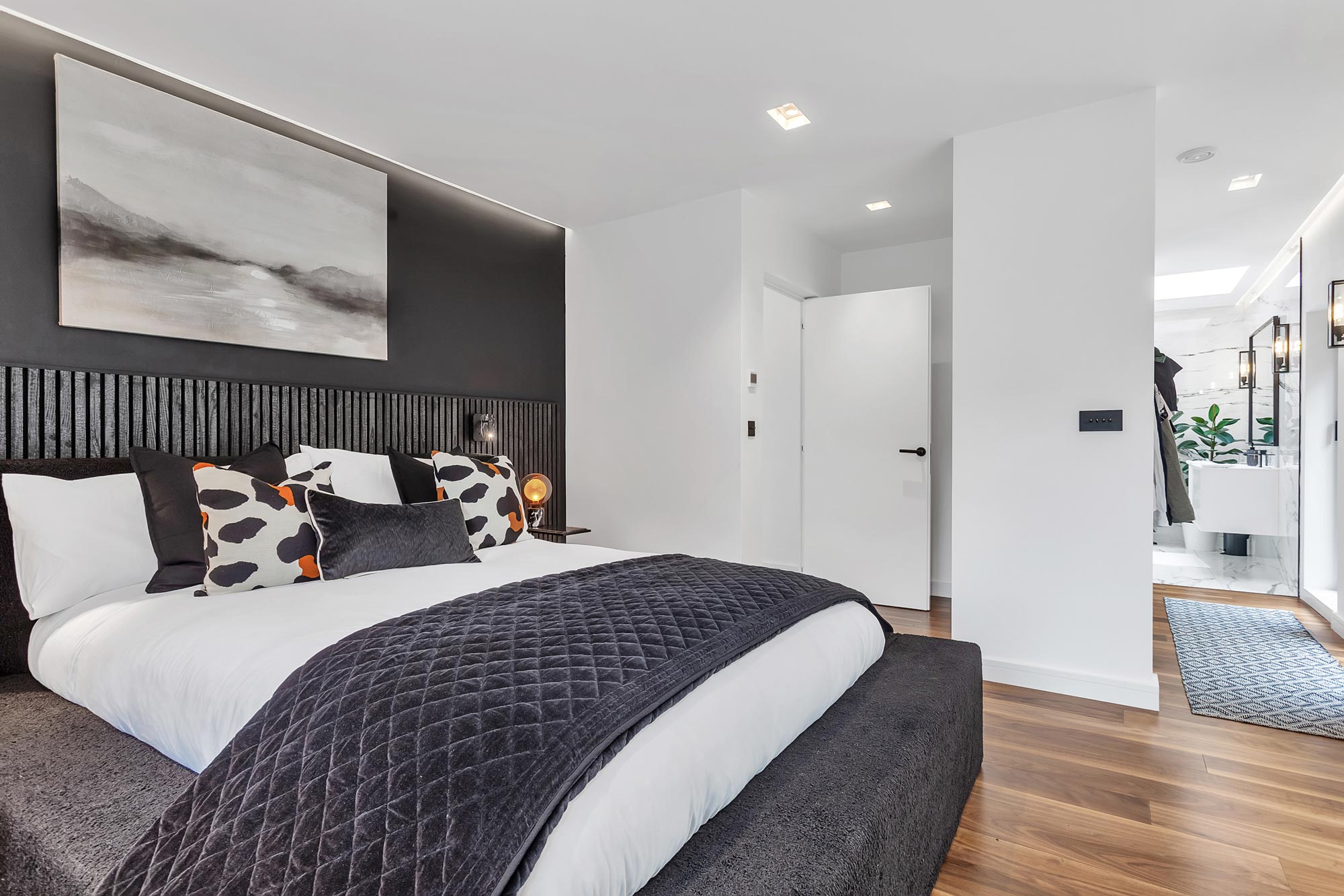
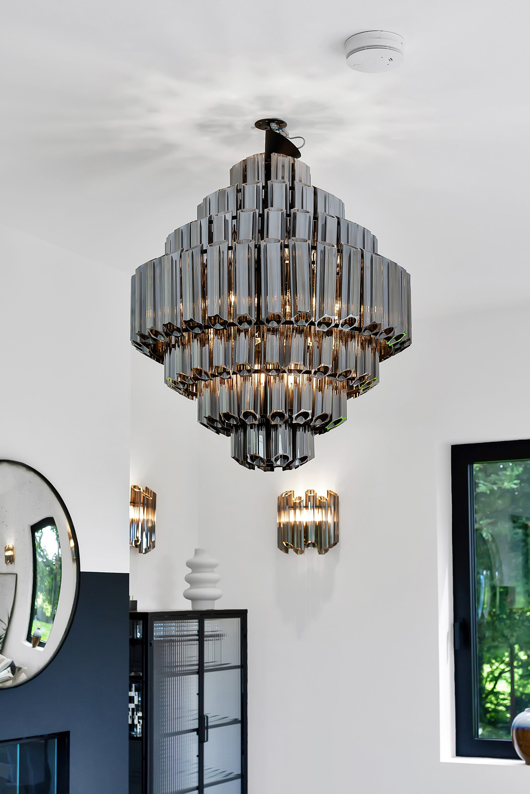
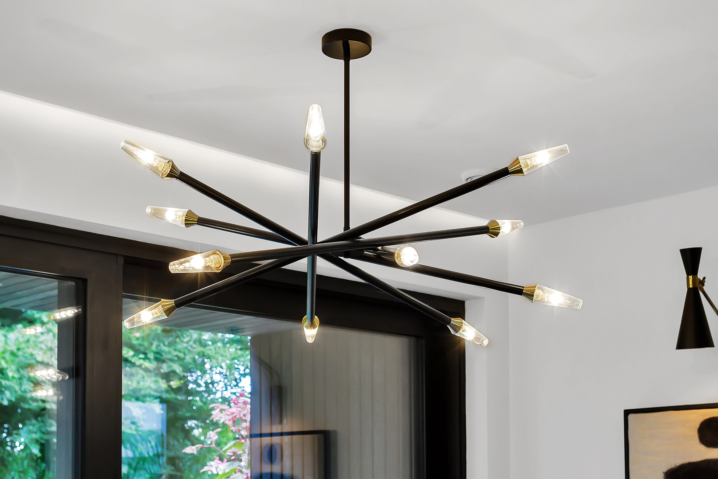
“Lighting was a significant consideration for us. We took a three pronged approach, catering to various needs. For everyday tasks, we have bright lights for cleaning and cooking. However, for more relaxed moments, we predominantly use warm toned downlights, creating a cosy and inviting ambience reminiscent of candlelight. Additionally, we incorporated entertainment lighting, such as LED strips under cabinets, providing a subtle effect without flooding the place with light. We went for recessed lights in the ceiling, walls and stairs and low level lighting. They’ve all been plastered in and so they blend in with the walls. Your eye isn’t distracted by the light and fittings hanging down. It creates a glow without the origin of the light being immediately obvious.”
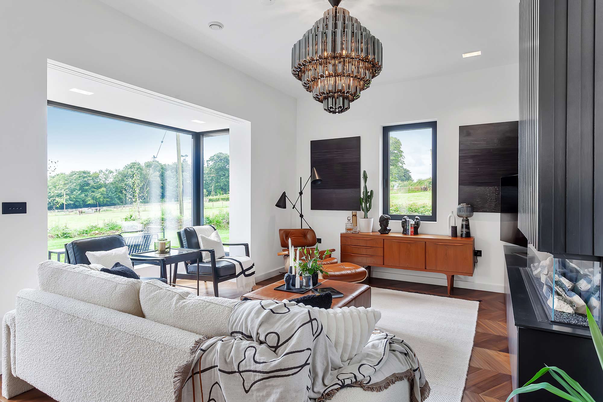
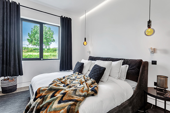
“We painted the walls in light colours and to warm up the building we went with a lot of leather and tan shades to tie in with our midcentury furniture items. The choice of furniture, accompanied by the retro leathers and tan accents, brings a modern yet timeless feel to the space.”
“Bringing in natural light was a priority. In the downstairs area and the kitchen, we installed numerous windows, and every door is fully glazed. In the cottage, we replaced the original Georgian timber panelled door with glass French doors. The light shines right through to the opposite side of the cottage part where we installed full height windows. So as the light changes during the morning, afternoon and early evening it wraps around the building and gives you different perceptions.”
Cost challenges
“The timing wasn’t in our favour, especially with the onset of Covid. Labour shortages and increased material costs were significant hurdles. One of our major challenges was navigating through those changing material prices, especially during a time when the market was favouring housing developments, not individual builds.”
“Blocks went from 80c to €2 overnight. However, we strategically approached key elements like plasterboard and flooring, allowing us to mitigate some challenges. For instance, we warehoused certain items to ensure availability. Yet, the cost escalation in areas like heat pumps, plumbing related materials and doors presented unforeseen obstacles, slowing down the pace of the project.”
“Labour shortages became a pressing issue, with many tradespeople gravitating towards more lucrative housing projects. This presented difficulties in terms of both pricing and timelines, as we found ourselves at the lower end of the priority list.”
“Effectively, this was a simple extension project. A lot of services were already on site so it should have been a quick, 12 month build but it turned into an 18 to 19 month process.”
“The initial build costs for our project were estimated at €380k but we ended at €450k thanks to the hike in materials, particularly the windows. We changed the spec of the windows, rather than going with aluclad we went for a full aluminium system because the price difference was justifiable.”
How is it all working out for them? “The house has become a sanctuary for us, especially during the busyness of daily life,” says Craig. “It serves as a retreat where we can unwind, even if it’s just for an hour in the evening.”
“Initially, there was a flurry of decisions, from choosing where to hang pictures to completing the finishing touches. Over the summer, we focused on the exterior, turning our attention to the garden and landscaping.”
“Now, with everything in place, it feels like a completed project—a space to truly enjoy without the constant worry of pending tasks. Now, as we sit in our finished space, we can truly appreciate the decisions we made and the effort that went into creating our home.”
Find out more from Craig on Instagram
Q&A with Craig
What is your favourite design feature?
The windows stand out as a favourite feature for me. The scenic surroundings, coupled with the changing seasons, make the views from the windows a constant source of delight.
What would you change or do differently?
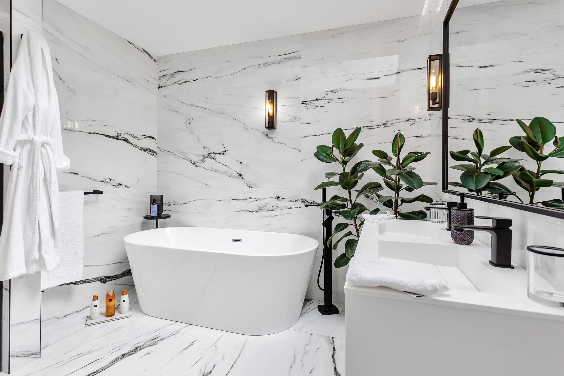
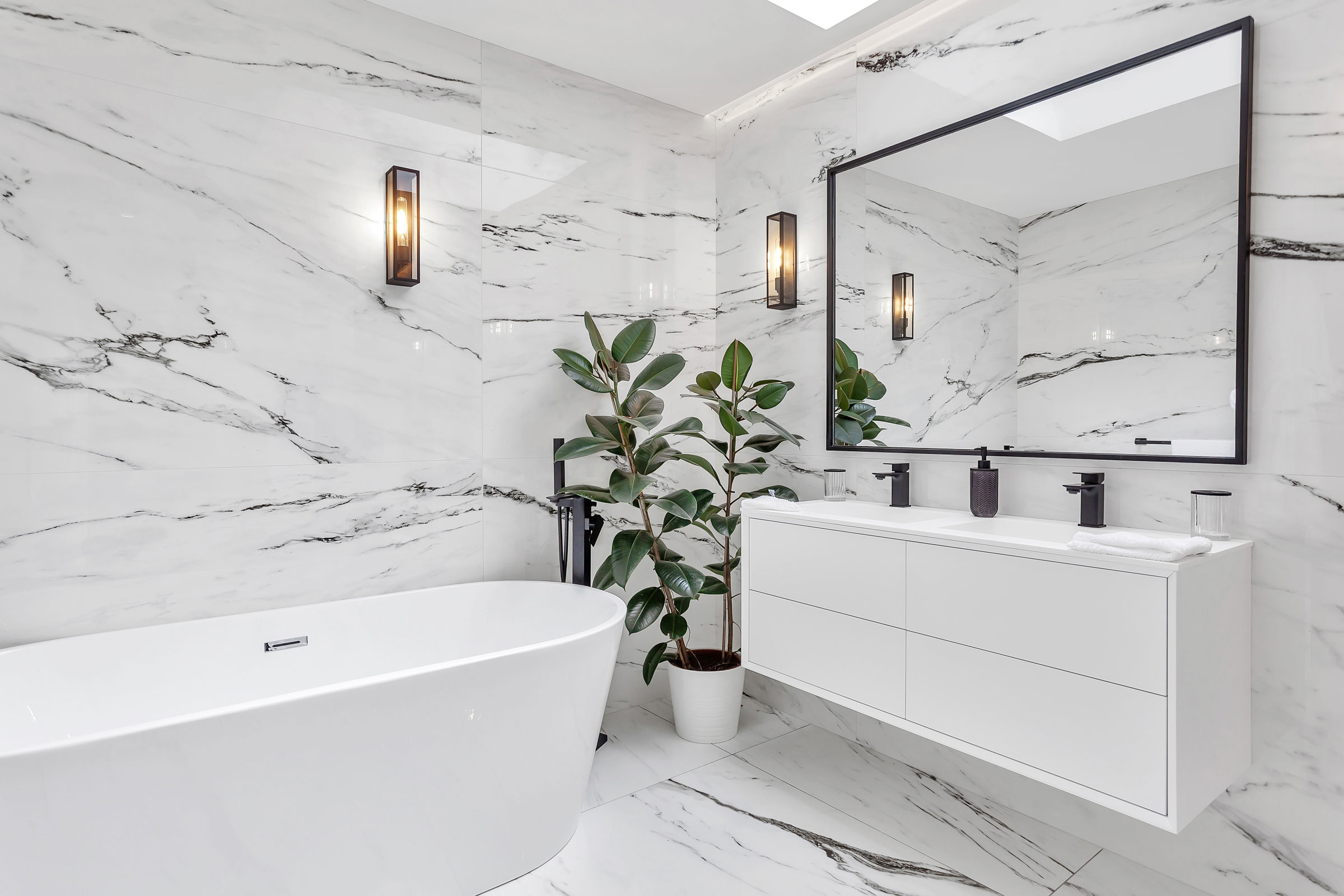
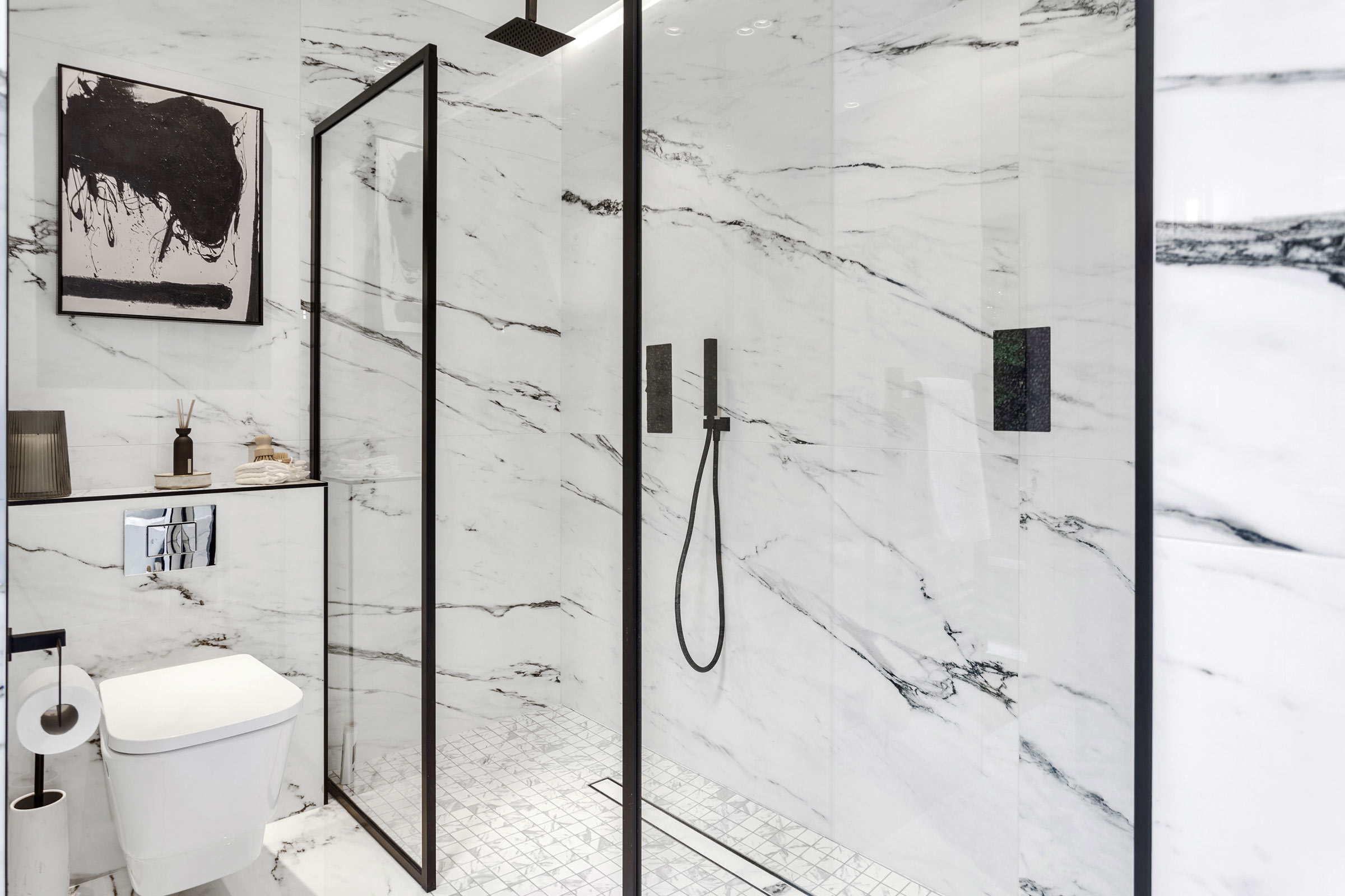
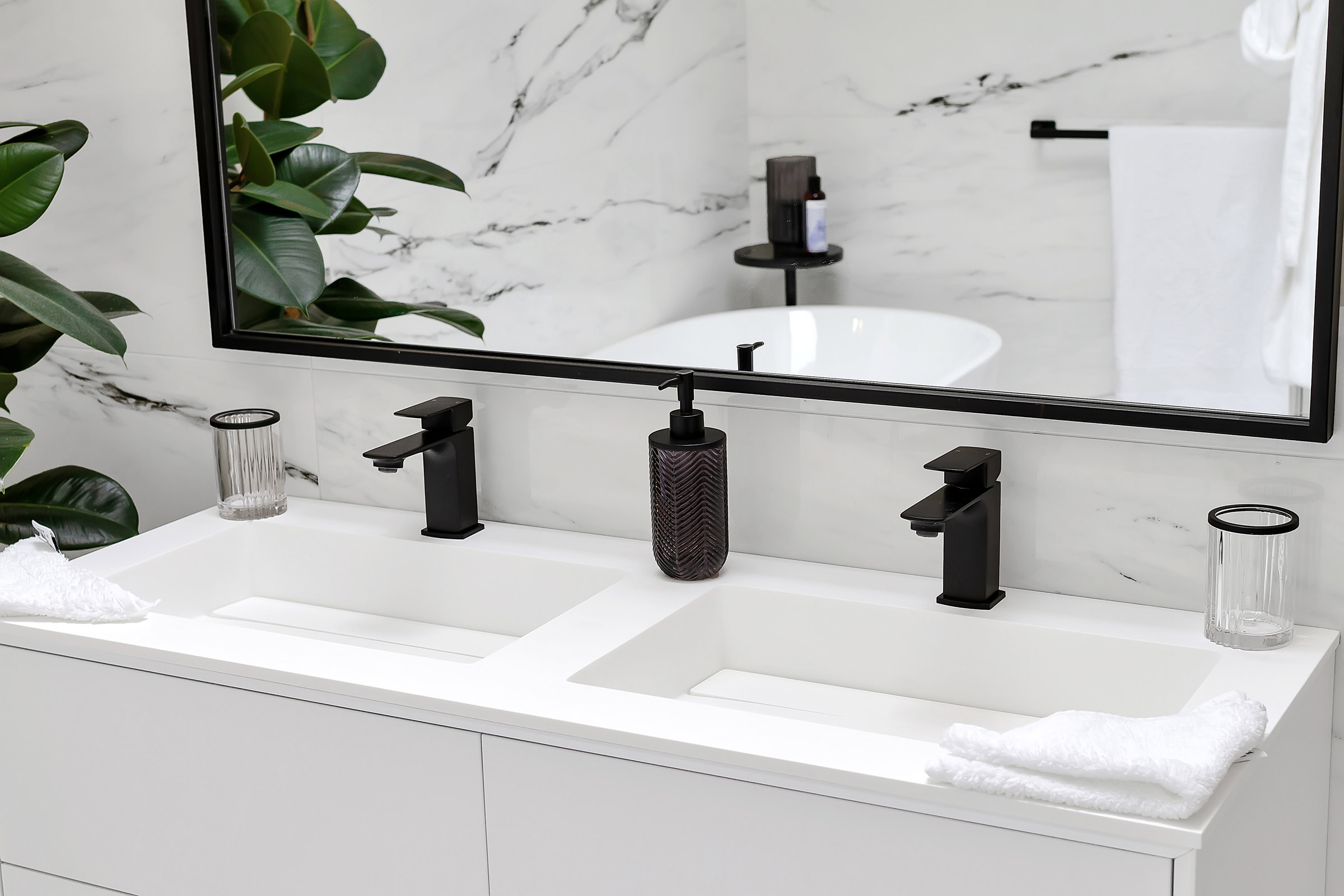
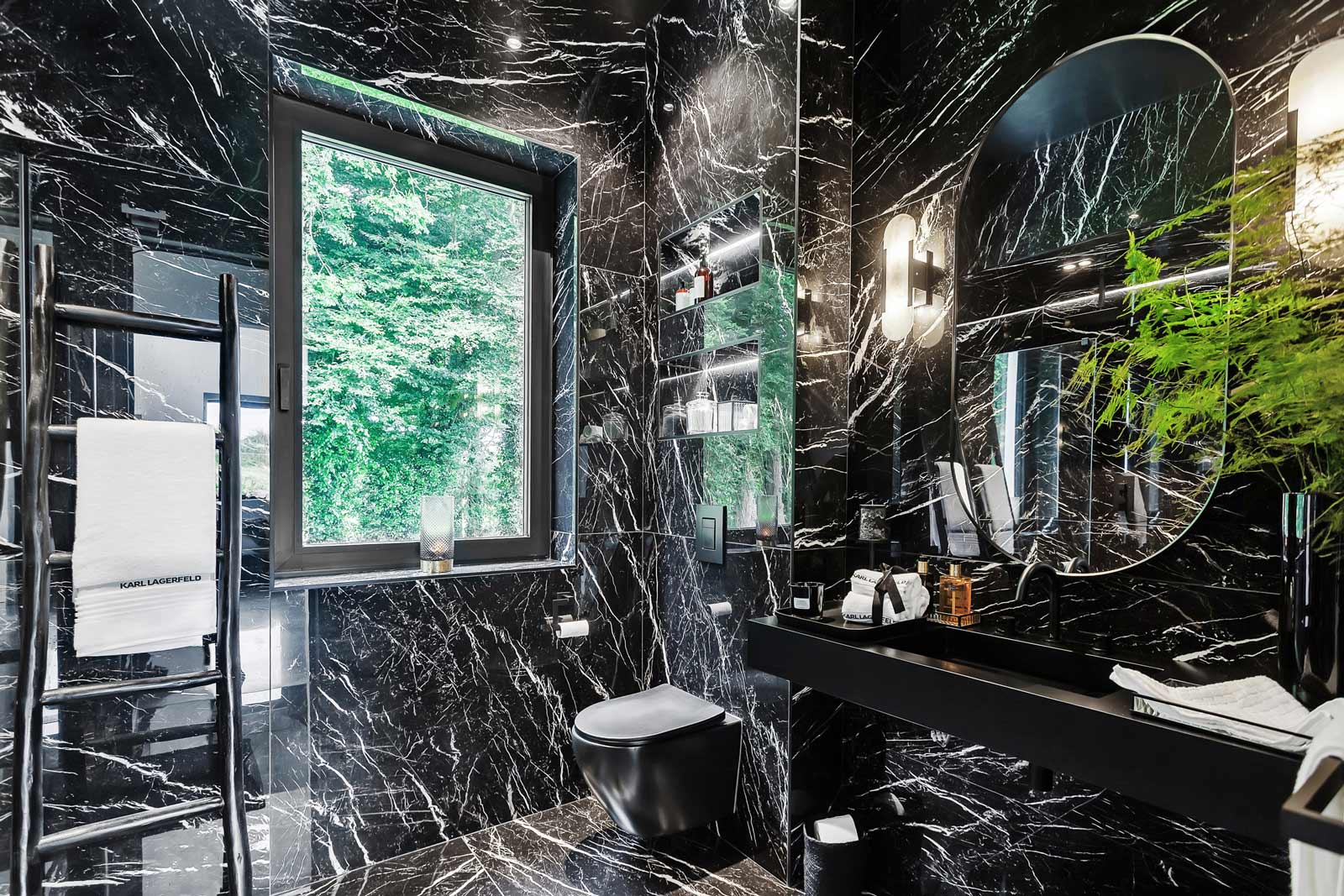
One aspect I would reconsider is the approach to decision making, especially concerning significant elements like bathrooms. We made simultaneous decisions for all bathrooms within a short period, aiming for efficiency. It’s easy to get caught up in the rush to finalise everything, but some decisions, like bathroom design, have a long lasting impact and deserve careful consideration.
What surprised you?
What caught me off guard was the intricacies of coordinating tradespeople. Scheduling and timelines can be challenging, and getting ahead of it is crucial. Planning and working in tandem with the trades, whether it’s for plastering, painting or other tasks, helps in managing both time and finances effectively. Unforeseen bills, especially from plumbers and electricians, can disrupt the flow.
Would you do it again?
Despite the challenges and occasional stress, I would do it again. While the budget might get stretched, the rewards of a completed project are immensely satisfying. Even the late night painting sessions were enjoyable experiences.
Tips
Take your time.
I would advise others to take their time, perhaps renovate one space at a time, and live in the environment before making permanent decisions.
Be clear about payment.
It’s essential to maintain open communication with your tradespeople and plan for significant payments to ensure a smoother process. The drawdown process, especially with banks, requires a paperwork trail. Having a dialogue with tradespeople about payment schedules and obtaining invoices in advance helps create trust and prevents unnecessary stress. Whether under time pressure or not, spreading out payments and maintaining financial control contributes to a smoother experience
Spec
Walls: 15mm plaster and skim, 100mm inner concrete block leaf (thermal block to ACD), 150mm PIR insulation, 100mm outer leaf concrete block, 20mm sand/cement plaster with weather barrier, 35mm vertical battens, 35mm horizontal battens, 22mm charred timber cladding.
Floor: floor finishes include tiles/ engineered timber/architectural concrete, floor screed with perimeter insulation upstand with underfloor heating, separation layer, 150mm PIR insulation, concrete slab, damp proof membrane/radon barrier, sand blinding and hardcore.
Roof: uPVC zinc effect standing seam, structured separating membrane, 12mm Marine grade plywood, 50mm Battens to create air gap ventilation cavity, breather membrane, 150mm truss C16 timber, 150mm PIR insulation between rafters, airtightness, vapour control barrier layer, 50mm PIR insulation, 25mm cross battens to form service cavity, plasterboard and skim.
Suppliers
Architect
ROJO Studio Architects, rojo-studio.com
Engineer
John Santry
Contractor
Charlie Foley Construction
Roof covering
Trocal
Aluminium windows
Drutex supplied by Home Improvements Ireland
Kitchen
Evoke Kitchens
Polished concrete
Concas
Insulation
Walls: Xthratherm CavityTherm;
Floor: Xtratherm Hyfloor 150PT
Photography
Damien Kelly Photography, damienkellyphotography.com

