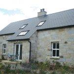
When Mary and John Stewart of Co Cork decided to extend their family home, they knew exactly what they wanted. A north facing, yet light filled, extension…
[agg_tabs theme=”dark”]
[agg_tab title=”BUILD SPEC”]
Build type: masonry with traditional cavity wall
Insulation: 60mm partial fill cavity insulation and 62.5mm insulated plasterboard inside; timber roof with high density quilt insulation between joists and insulated plasterboard underneath
U-values: walls 0.19W/m2K, floor 0.20W/m2K, roof 0.15W/m2K and windows 1.8W/m2k
Windows: thermally broken, double glazed, low-e, argon filled
[/agg_tab]
[/agg_tabs]
[adrotate banner="57"]“We’ve been here eight years, and the extension was completed in August 2009, so we’ve been living in it for over two years now,” says Mary. “We’d talked about adding more room for a while but our main aim was to get more light. We talked about it, then let it go for a few months, then came back to it again. Once our ideas were clear, we contacted a few architects, but none of them could really deliver what we wanted. Choosing one of them would have been a disaster in the sense that their designs wouldn’t have made much of a difference to the house.”
From experience, Mary advises prospective extenders to call the architect’s previous clients to get their viewpoint, and see the end result for yourself. “We finally found the architect that was right for us and he directed us from the start, helping us establish how the space could be used. He proposed building the extension to the side of the house, which was a great idea because the side garden was a useless space, which we’ve now regained. It also provided more room, allowing us to add a shoe and bag room, a bathroom and a laundry room.” Since they were building right up to the boundary wall, the neighbours had to be convinced that there would not be any overshadowing of his property from the extension, but this only lead to a slight delay.
As is the case in many extension projects, the motivation to build was to get more light, however as seen above, the challenge was significant. The extension faces north, while the front of house faces south. “That was one of things we discussed with the architect, whether or not putting in a lot of glass would make the extension cold. But it’s done the opposite! Maybe it’s because I can see the sky and benefit from the natural light. Even when rain is lashing, you get that feeling. In the summertime the glazing especially pays off because the sun is so high in the sky. But even in winter, the daylight comes right in, which makes you feel warmer.”
They achieved this by introducing several roof lights to capture direct sunlight throughout the day, the main one located at the very back of the extension, allowing an abundance of light to wash down across the stone wall. This also created a much more open feeling in the kitchen space by giving the impression that the roof is floating over it, because it is not attached to the wall. At first the architect was worried that the existing house might cast a shadow onto these roof lights, but shadow study animations ascertained that it wouldn’t. They then introduced a large west facing glass wall opening out to the patio space to capture the afternoon and evening sun.
They introduced a large west facing glass wall opening out to the patio space to capture the afternoon and evening sun.
The Stewarts kept their existing heating system, and just put in bigger radiators. “I turn on the wall radiators when I go out, and when I get home I turn it off after having collected the kids. The big difference now is that I’m much more aware of closing doors! That really does help keep the heat in.” While their heating bills are higher, Mary is delighted with the choice they made, based on their priorities.
Which is why she advises others to have clear ideas of what they want before they approach an architect. “Even if it’s just a collection of magazine clippings, it’ll help. What’s really important is to be able to communicate with the architect, and the only way to do that is if you know exactly what you like and what you don’t.” Being indecisive certainly isn’t one of Mary’s attributes, which considerably helped during the build, and made the working relationship between client, architect and builder run all the more smoothly.
Mary indeed emphasises the need to get the right team on board: “You need to sit down with a very good architect, one that has a vision. For example, the inclusion of a window to the side of the house makes a big difference, as do the long living room windows. It adds to the airy feeling in a big space, yet it can be heated the way we want to.”
“Our architect always kept us up to date, and dealt with everything. In my view, he was married to the job! He was on site intermittently, but was always there at the right time to discuss what to do with the builder. For instance, one light in the hall was higher than another, and it was redone. There were no shortcuts taken.”
“Their relationship worked very well, I could see that. The builder was also great, we got in three tenders, and chose the middle price. We met all of them and he was the one I was most comfortable with, thinking ‘I can work with this guy’, so we chose him.” And he really did deliver, not only because there were no delays on the three-month building schedule but because he understood what the clients wanted. “He was very meticulous, and made some useful suggestions. For example, the old kitchen was replaced by a storage area, and he suggested a false door with shelves, which work very well and look nice. He did a great job with all of the finishes.”
In fact, one of the most important elements of the build was to get the old/new divide to be as seamless as possible, which the builder perfectly achieved. “From the very beginning we knew we wanted the new dining room floor to match the old living room’s. This was important to us, for old and new to blend, that way we didn’t have to take up the old floor to make them match! And they did, which isn’t easy considering that different batches of the same wood can yield different hues.” As for the kitchen Mary insisted on neutral colours. “I think the architect had different ideas but we knew what we wanted. We looked at a lot of kitchens, and chose a cream and wenge wood theme.”
The interior stone wall was a suggestion that the architect proposed and the Stewarts adopted. “He convinced us it was a good idea, but when it was going up, we hummed… it looked very raw as it was one of the first things to be built. But now it’s the most admired thing in the house! When you come in from the hall it really draws you into the extension. It’s beautiful.” The stone is Donegal quartz, 150mm to 200mm thick, built as a finish on top of the cavity wall and plasterboard. It was left untreated, and there’s been no problem with humidity or grease from the cooker (there is a powerful extractor!).
The project was actually built in two stages; the first part, built four years before the modern section, consisted of a 14ftx14ft extension onto the original structure, of the same style as the house, with the same pitched roof. “It’s really a standard extra room linking the old part to the new, and we use it as our dining room, something we didn’t have in the original house.” The second part has a lean-to roof, filling in the space between the house and the boundary wall. “To connect the extension we made a small window into a door, which now opens up into the kitchen.”
“It was also visually important for us to have an outside area to sit in, so we lost some of the garden. But what we gained is amazing.” As for the costs, Mary says they did go overbudget, despite a fixed price contract. “We kept adding on extras. I think that anyone who writes a figure down at the beginning probably wouldn’t get the same figure at the end. One example relates to changing the doors and skirting boards, from the standard pine to a white finish. There’s always a hidden cost!”
As the project neared completion, Mary and John moved out for a few weeks while the builder was doing the finishes. “When we came back, I walked around the extension, round and round, and I loved it! Whether it’s being in the kitchen, sitting room, dining, I love all of it. Two years on I still love it, I still get the same feeling as I did on the first day.” The Stewarts got exactly what they asked for, and then some.
Original house size: 233m2
Extension size: 73m2
Site size: 557m2
Project cost: €180,000


3 Comments