Showing signs of age after just 25 years, this self-built home nestling in a Co Clare housing estate was the last place Niall and Sinead O’Connell expected to find their future holiday home. But the views and location were too good to pass up in an area where houses are hard to find…
In this article Niall and Sinead cover:
- How they found their holiday home to renovate
- Extending the existing house within permitted development
- Designing the house for holiday use
- Open plan design with details of contemporary interiors, from lighting to furnishings
- Sourcing local materials and project managing from abroad including schedule of visits
- Working with the builder and architect involvement during the construction phase
- How they managed the need to redo some of the work
- How they sourced materials in a remote location
- Bathroom design with details of tiles and clae foot bath
- Need for electrical upgrade and upgrading ESB Networks connection, and boiler upgrade
- Full supplier’s list
When London expats Niall and Sinead decided they wanted to buy a holiday home in Ireland, they started looking around Cork, where Sinead has family. “We didn’t find an area we particularly fell in love with in Cork and Kerry was too far for us to go to, so we set our sights elsewhere,” recounts Sinead.
“My first job was in the Shannon Industrial Estate and during that time I lived in Limerick for 18 months, spending all my weekends in Clare. I have very fond memories of that period so when we expanded our search we trotted up to the west coast. When we got there both Niall and I realised this was where we wanted to look. This was definitely the place – bingo!”
Clare holiday home destination
The most scenic spots are along the coast but finding a holiday home in the area with unhindered views wasn’t easy. By definition an Area of Outstanding Beauty is unspoilt; due to planning restrictions the natural landscape has very few houses dotted on it apart from the odd vernacular cottage or farm steading.
[adrotate banner="57"]But thankfully for Niall and Sinead, in this instance they found a housing estate that had been built for holidaymakers.
“We were ideally looking for a stand-alone cottage with sea views but there was little or no stock of that kind available,” says Niall. “Even though initially we would not have considered buying on an estate, we had searched for over a year but couldn’t find anything to match all of our criteria.”
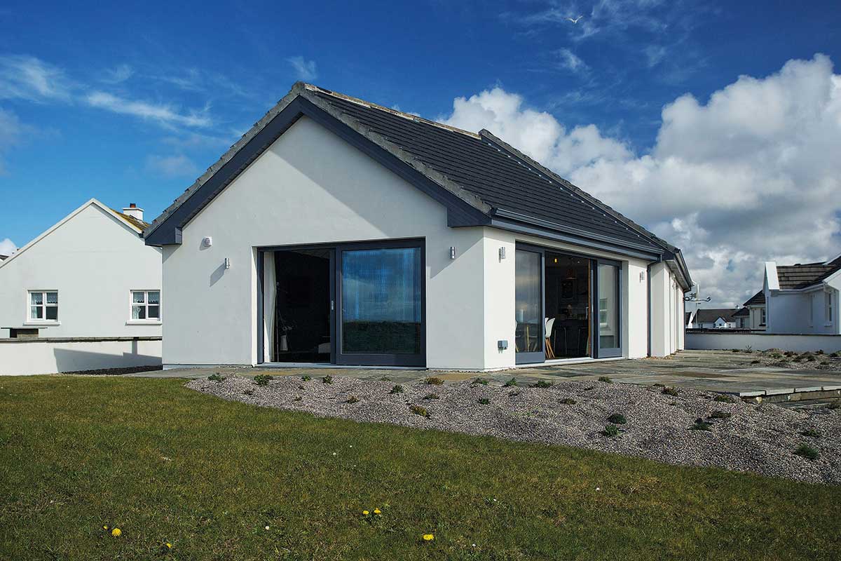
“What clinched it for us was the view, which is truly amazing. Our architect also assured us that we could extend its size within standard permitted development rights [under 40sqm exemption rule], having gotten written confirmation from the council. On that basis we were happy to proceed,” he adds.
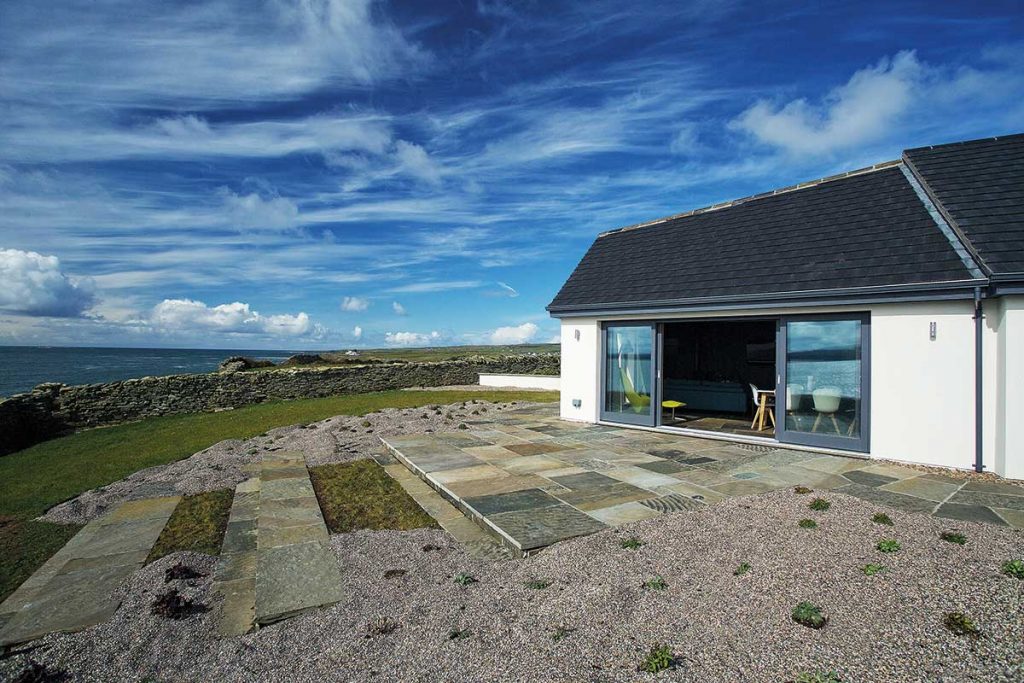
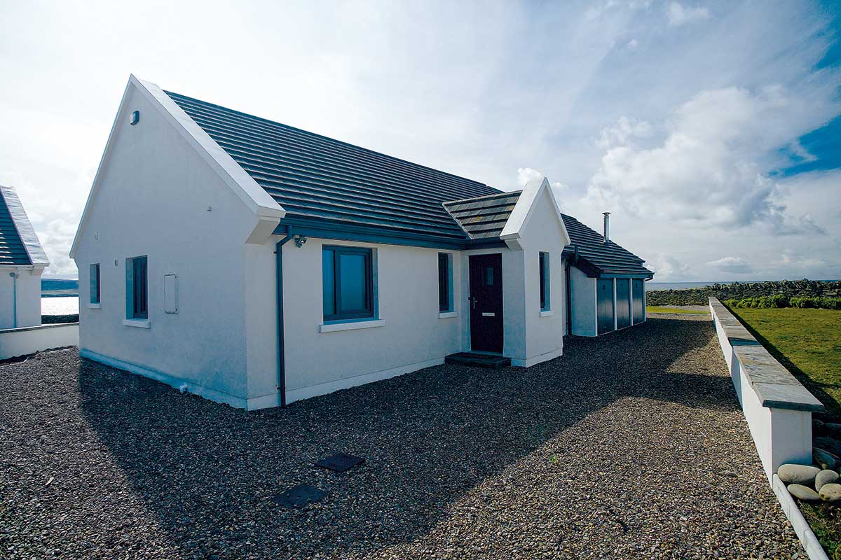
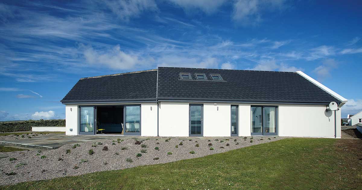
The house was weathered on the outside and inside it needed a facelift too. “It was built in the late 1980s and strain from the elements was visible,” says Sinead. “So we went with external insulation which gave it good protection and a new render, and inside we wanted to make the most of the views with an extension.”
Their architect came up with most of the ideas for the shape and internal configuration. In terms of the brief they wanted the seaside cottage feel first, with reflections of yellow gorse as seen in the spring and other elemental colours from the landscape so blues, greens, yellow and white mix in every room.
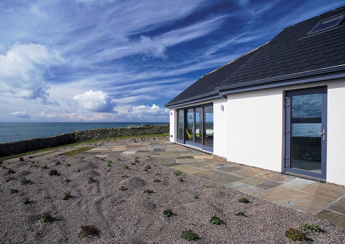
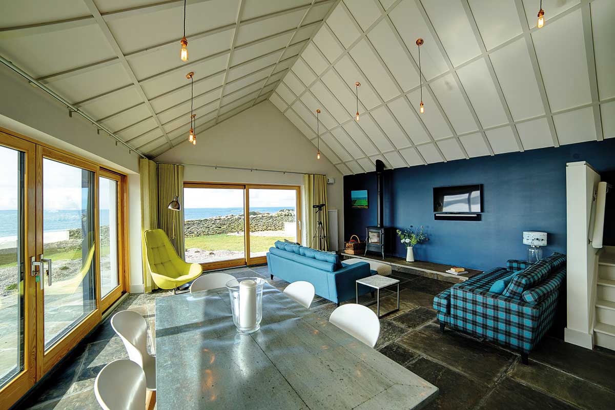
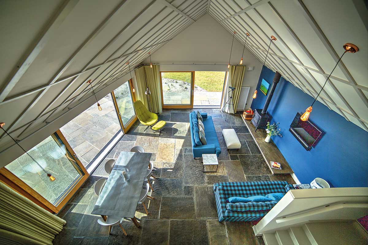
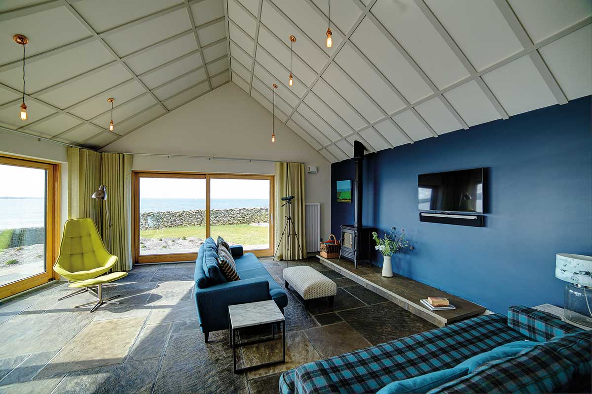
“What I absolutely didn’t want was any of the twee associated to coastal properties, replete with seagull and starfish motifs.,” quips Sinead. “The landscape is quite wild and elemental and I wanted that to be reflected in the interior. Our aim was to complement the view, which is the dominating feature of the house. The living area with its expanse of floor to ceiling glass reinforces this.”
Sinead would describe the décor as a mix of Nantucket washed-up beach house and Isle of Sky crofter’s cottage. “We have whitewashed floorboards and exposed flagstones, cosy tartan patterns and a deep blue feature wall.”
Submersed
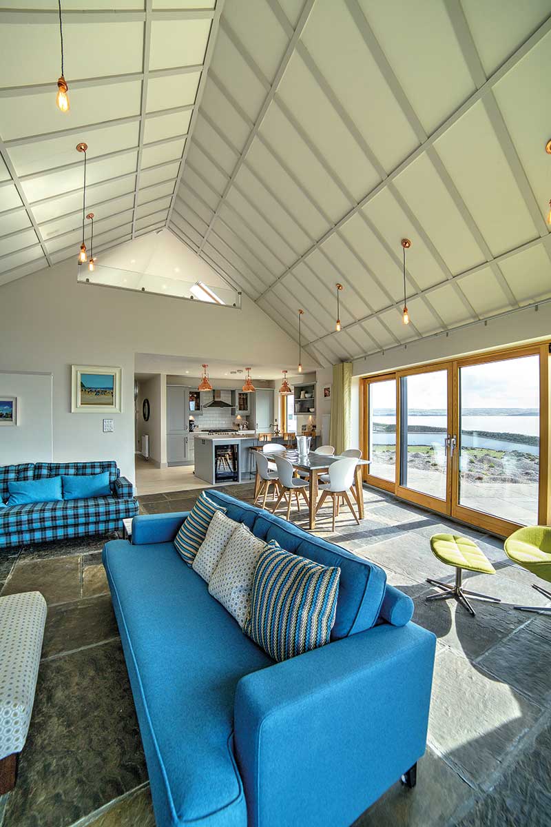
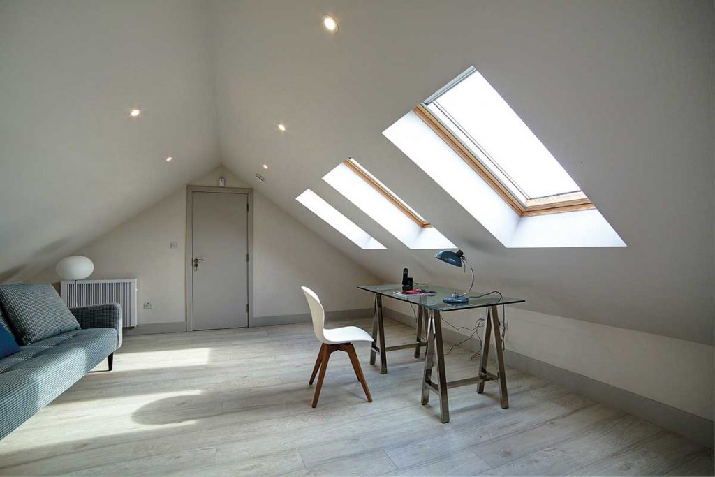
“Thanks to the extension having been designed as a slightly angled shape, it doesn’t feel like a box but instead pulls you into the landscape, which is exactly what we wanted,” adds Sinead. “The vaulted ceiling works really well to accentuate the tilt, we’re delighted with the result.”
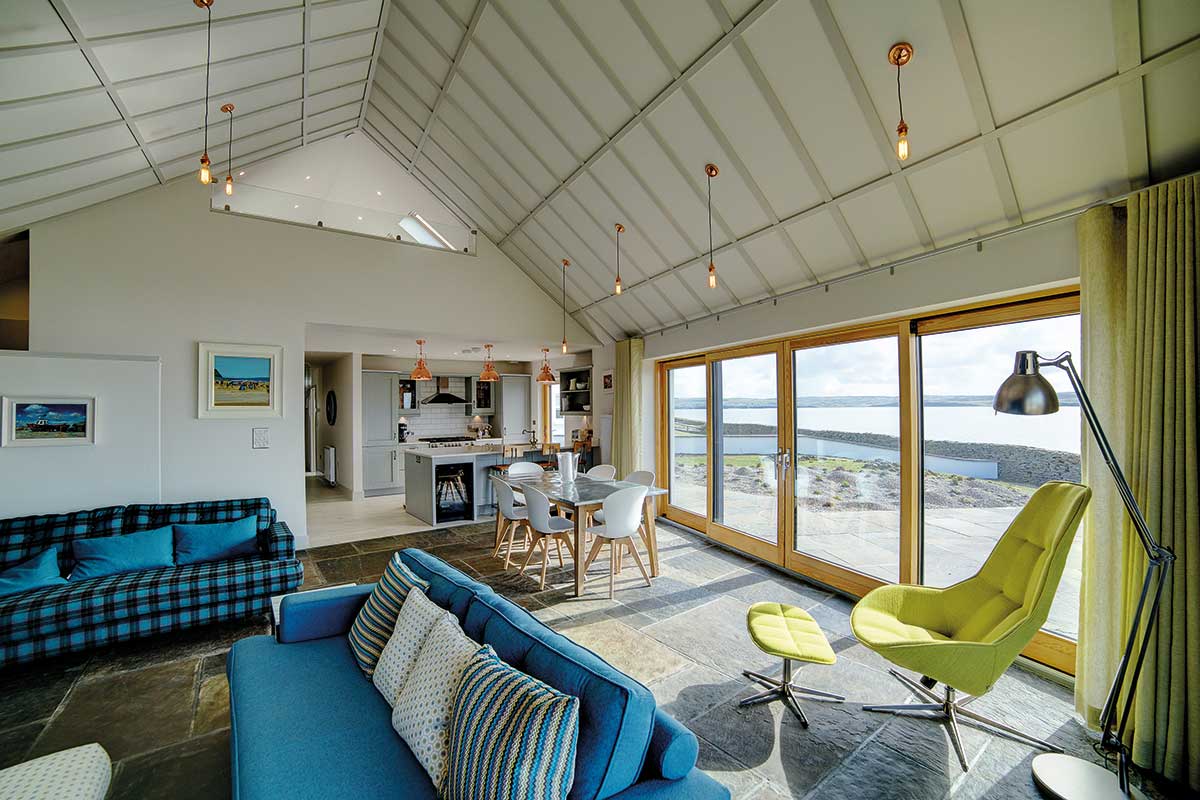
The original attic was large enough to allow the extension to carry through a vaulted ceiling, and the new living room was built into the original eaves. The mezzanine acts as an overflow bedroom.
“You immediately leave the estate feel when you walk into the house,” she says. “I especially love the hallway, for the size of the house it’s much bigger than you would expect. In many ways it’s an extravagant use of space but I love the warm welcoming reception it affords. It immediately makes you feel you are in a much larger, airier property than the one we originally purchased.”
“Both my husband and I know the value of storage and we absolutely insisted on large floor to ceiling hall cupboards. Making them handle-less was important – less fuss, less distraction to the eye, a lot calmer.”
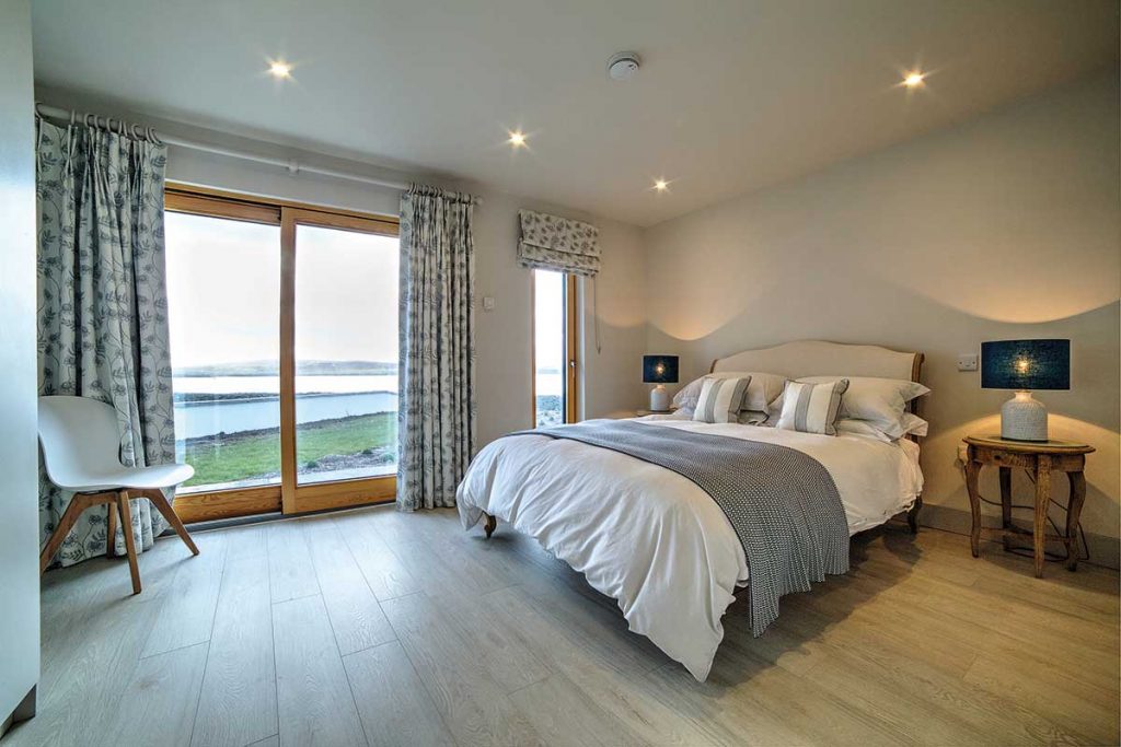
The rest of the house carries on the restful and neutral theme. “The bedrooms and bathrooms are smallish but I’m really happy with how they turned out. We installed fitted units throughout – for instance the bathroom cabinets were made to my specification – which give a very calm, understated finish to the rooms and continue the theme established in the large hallway.”
Shades from the same paint manufacturer were used throughout which she says was helpful in setting tone.
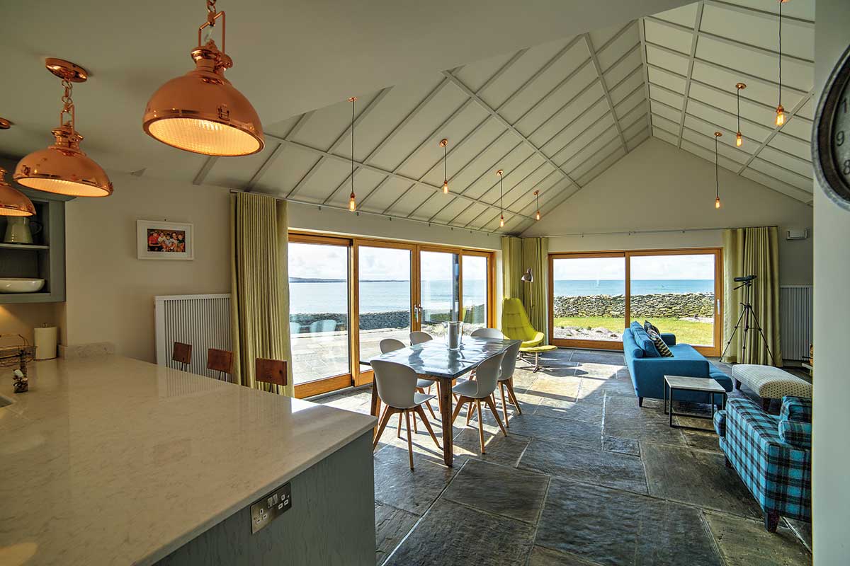
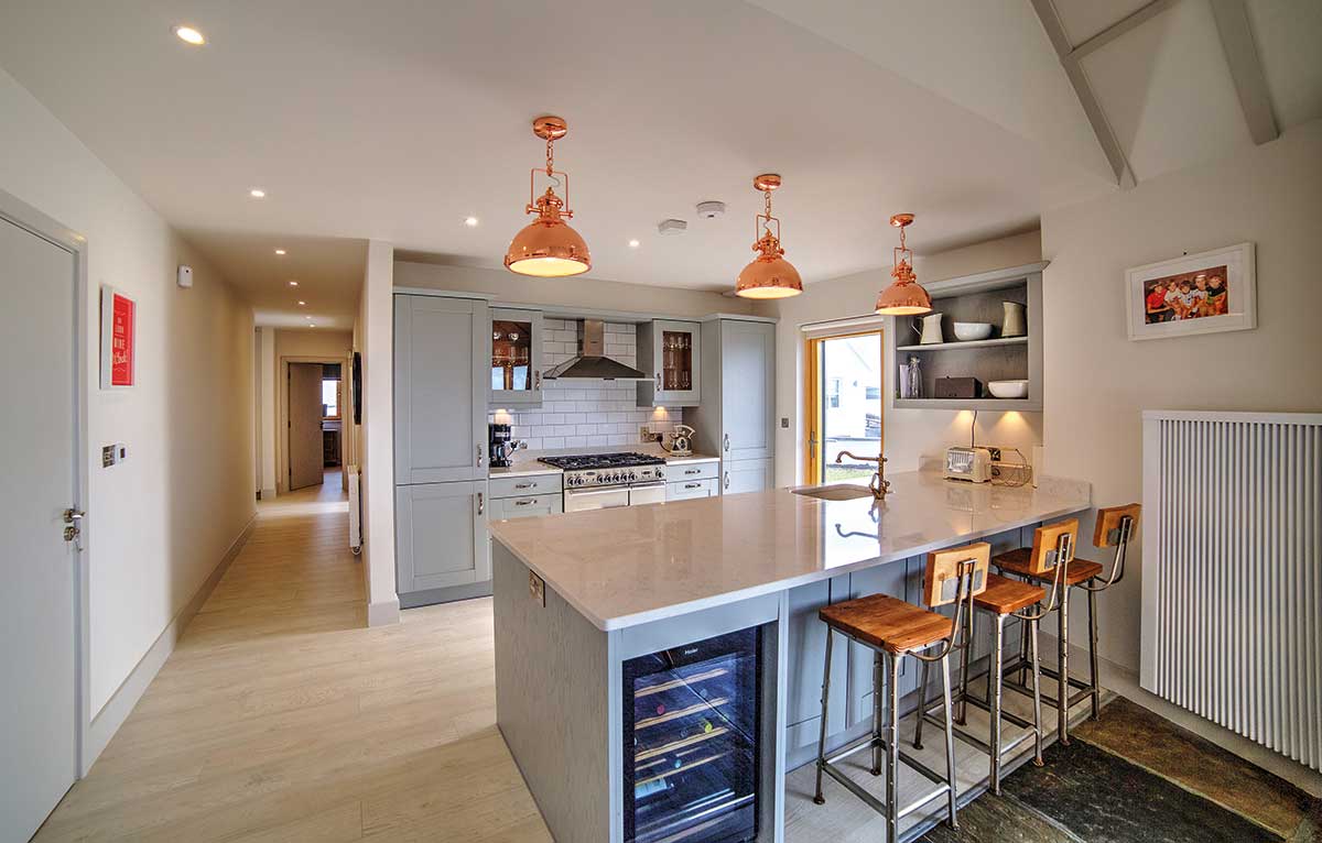
The design floods the living space with natural light but Sinead and Niall also like atmospheric lighting hence the industrial style hanging pendants. “I did want there to be a certain wow factor when you walked into the living room in particular and I think we have to some degree achieved that. The vaulted ceiling combined with the huge expanse of glass certainly helps.”
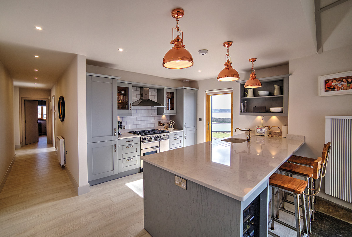
“I’m not sure the lighting is finished though, our architect had suggested spots but I didn’t want chrome, I find copper warmer, I like the battered retro style, pared down.”
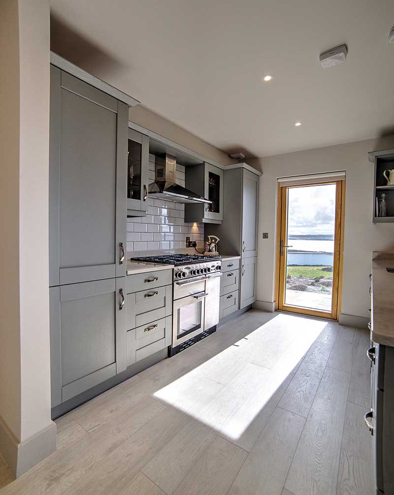
The space was slightly reorganised to accommodate the new open plan kitchen/living area with the original kitchen downstairs converted into a bathroom. Part of the new kitchen is located in the old footprint of the house and thanks to the same wooden flooring running throughout, the extension feels part of the original structure.
“I love the blue feature wall in the living room which is bold and dramatic, and the kitchen works beautifully and is lovely to look at with its shades of grey. Also the depth of the worktops adds character, it’s of a generous size. We have recessed units to accommodate bar stools and the top is a composite that has a Carrera marble look, complete with integrated sink.”
The original master bathroom was enlarged by encroaching on the airing cupboard and two of the bedrooms were left untouched. “The utility area was moved to underneath the stairs which was a really clever use of space by our architect.”
In fact for Sinead the design process very much had to do with making sure the house would function as a holiday retreat – ample entertaining and kitchen space along with plenty of hot water and instant heating.
The glitch came towards the end of the build. “It only became evident when the house was nearly finished that we had to upgrade to a triphase electricity cable, which delayed things a bit as we had to get the network operator to install it.”
“This was necessary because all of the heating and hot water is electrical, there were no other options available to us, and we insisted on installing a double boiler to ensure we’d have enough hot water for when the golfers/walkers come home – we can be up to six staying in the house and we all need to shower in a short space of time.”
“The original cottages were not built to run expanded heating and hot water systems, hence the need for the heavy duty cable. We eventually got what we wanted, and we even have everything running on an app so we can control the system remotely and turn the heating on 24 hours in advance of arriving for example.”
The upgraded boiler was also necessary because they now have an extra room (living room) to heat with underfloor heating. “I’m very happy that I insisted on it,” confides Sinead. “An unheated stone floor is horribly cold on bare feet but ours is lovely and warm and consequently very tactile.”
“The stone is local and cut from a quarry less than 10 miles away, it always gets a wonderful response from guests. That was one of my ideas and I really like it,” she adds.
Long distance relationship
“My husband loves a good project and was interested in every aspect of it but he couldn’t physically be there or put the hours in so I was the main person on the ground. For a good few months I tried to be there at least fortnightly for a day or two and in the last month I was probably there every week,” expounds Sinead.
Their architect Darragh was the driving force, getting the project off the ground and supervising it. “He put together a shortlist of builders and interviewed them with me, and provided drawings and specs for tenders,” says Sinead. “He dipped in and out but was down regularly to check on the technical specs and building work and also handled the large orders for items such as the glazing.”
“We were very fortunate in our choice of builder, he put a good team of guys on site, which was very ably run and I found everyone very easy to deal with, intelligent and responsive. In parallel with Darragh I began the project management of the interior fit out; I knew from previous experience how to manage a timeline and negotiate with suppliers and once the builders could see that I had an idea of how to get things done they were great to work with.”
The time everyone had to draw in a deep breath was when they finished the vaulted ceiling. “We added strips of wood to give the impression of beams being there and we went through various versions of the finish,” recounts Sinead.
“The builder’s patience was tested when we had to do it all over again. The question had to do with plastering between the batons, at first the aim was not to have them stand proud and to do this he had to work on his back. When he was finished, I thought you couldn’t see them enough so he had to take it all down,” she adds. “The look we achieved was worth the effort, and I think he’d agree!”
Her advice is to plan for everything. “The devil is always in the detail. Work hard with your architect on the design and remember it’s your house and you are going to be living/spending time in it so make lists of things that matter to you. Be prepared to sometimes compromise but equally if you feel very strongly about something then stand your ground and make your builder/architect work for your best interests.”
“Design-wise it does help to have an overall idea of the look you are trying to achieve, it makes selecting materials easier,” she adds. “And I think at times it does pay to spend a little more for better quality and other times good quality is available at great prices if you shop around. So be a canny consumer.”
Being away more often than not, you might expect the garden design to have been left to one side, but Sinead’s eye on the view motivated her to tackle it early on. “While the landscaping is a work in progress – we just planted drifts of spring bulbs and masses of local hardy plants – we simply had to get rid of the horrible old rotten wood plot dividers. We replaced them with a very nice low dry stone wall topped with Liscannor stone and put some great outdoor lighting which is particularly effective in highlighting it.”
Worlds apart
“This was my fourth design project and it’s very different from my other homes, although previous experience certainly helped,” says Sinead who constantly flicks through magazines and visits design stores for inspiration.
“I’ve been around the block design wise a few times and got stuck into this project quickly. Considering we had a limited space it didn’t take long to work out the interior design specifics.”
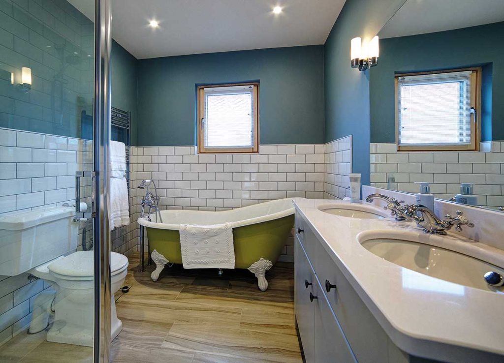
Their London home is very urban and restrained in comparison, she says. “There we went with neutral calm colours, pale grey walls, chalky whites, plenty of warm wood. In the bathroom I chose a very large bath but it’s actually too big for practical use – I get a drowning feeling in there, there’s paddling space! So for the holiday house in Ireland I wasn’t disappointed that the bathroom wouldn’t be able to accommodate large items.”
Sinead ‘splashed out’ going for a roll top bath and ordering it in from England. “We used local products where we could and bought from Irish manufacturers where possible, for instance our kitchen and all our cabinetry was made in Co Clare,” she says.
“But in a rural area choice can be quite limited, you’re mostly dealing with catalogues when you’re browsing for things to buy at the higher end and it nearly always has to be ordered in.” The bath came primed and they painted it on site. “It’s the bath I’ve always wanted. It’s a feature point but I don’t think it looks too luxurious.”
“The plain white metro tiles reinforce the somewhat Spartan but chic look I wanted to achieve. And they were relatively inexpensive, allowing me to spend more on the bath and good quality hardware, which I think are very important to invest in.”
Sinead’s strategy extended to the kitchen. “The tap was a big splurge relative to the cost of the kitchen but I think if you can, go out on a limb on one or two things and try to find less expensive options for the other items.”
The London project consisted of a big refurbishment that took a year. “This was four years ago, and the works included the basement, and overall it was an unmitigated disaster. We had a very tough time dealing with the builders so there was a bit of trepidation going into this build.”
But despite some work that had to be redone, their Irish experience went really well. “A very harmonious atmosphere reigned on site, it was a relief to see the London disaster was behind us.”
As might be expected a big difference between spending time in this Irish cottage and living in London is the fact that Niall and Sinead now have close and very friendly neighbours. “It was a bit of a novelty for us,” says Sinead.
“Both of our immediate neighbours are from Chicago, which is a funny coincidence because we have close friends who live there too. It’s just a dream to holiday down here, getting along with our neighbours so well and having carved out such a cosy little sanctuary for ourselves. It’s our home away from home.”
Suppliers for Co Clare Holiday Home
Architect
Darragh Lynch, Malahide, Co. Dublin, tel. 01 8168964, www.darraghlynch.com
Builder
Declan Casey, Coast to Coast insulation, Ennis, Co Clare, tel. 065 689 5060, email dcaseyeng@gmail.com
Kitchen and other carpentry
Burke & Egan, Miltown Malbay, Co Clare, tel. 065 708 4877, www.burkeandegan.ie
Bathrooms
PJ Matthews, Ballysimon, Co Limerick, tel. (ROI only) 1890 989 866, www.pjmatthews.ie
Curtains and Blinds
Interior Dreams, Limerick, tel. 061 315 799
Kitchen worktop
Silestone, www.silestone.com
Windows
Munster Joinery, Ballydesmond, Co Cork, tel. 064 775115, www.munsterjoinery.ie
Paint
Farrow & Ball, www.farrow-ball.com; rolltop bath: Churlish Green, kitchen units: Manor House Grey, living room: St Giles Blue
Colourtrend for external paint, www.colourtrend.ie

